#1206. Why shoot in monochrome? Why shoot in colour?
How we react to one, to the other, and how to blend the two for even more powerful images.
A lot has been written about the respective merits of b&w and colour photography, about the importance of colour science, about intellect vs emotion. To me, all of this is either too scientific (and hard to apply in the field) or understandable but too generic to really be useful. If a simple, actionable and founded theory of how/when to use either exists, I'm eager to read it :) My goal with this post is to provide actionable information that sits in the middle of those two extremes.
Famous photographers have tried to bridge the gap between the two. For example, Ansel Adams published work in colour and Saul Leiter published work in b&w. It's fair to say the number of famous photographers who are able to work equally well in both media is very low. To my eyes, Leiter succeeds where Adams fails.
And it's tempting to say that Leiter's photographs look similar in both colour and b&w, with colour making some ideas/moments in his images even more obvious, whereas the use of colour in Adam's work merely makes it more 'ordinary' (a personal point of view). So what's the reason for this?
I've commented in the past, about my own photographs, that they include colour only if they are largely about the colour itself, b&w being my default setting. While largely true, that's a bit vague and probably not entirely helpful. Besides, images focusing purely on colour "accidents" such as the one above, can easily become gimmicky. They can form the basis of a single project, but probably can't constitute the backbone of anyone's work or style.
So, how do we decide whether to use colour or b&w?
An empirical way of working is to make two versions of a same photograph and live with them for a few days or weeks to determine which you like best. In the case below, both please me and the colour version may even edge the b&w, but only because it is largely monochromatic itself, while still adding information and feel. Colour makes it look out of time, almost like a theatre set. That colour isn't neutral, I altered its contrast and hue in PP, but it is still believable and realistic. Here's where master colourists have a field day.
So, for me, a colour photograph is valid if the colour adds something to the feeling conveyed by the image, or makes my intention more obvious/powerful. It would take a more experienced photographer than me to reliably anticipate that while making the photograph, and it is something I personally decide in PP.
And I'm not alone.
Watch videos about film photographers using colour film (akin to digital presets, in that they lock you into a single style) and you'll notice the film's colour bias matches some subjects wonderfully and not others. Only a very experienced photographer focusing exclusively on a very limited set of films and lenses would be able to predict what subjects will work with the chosen lens/film combo and which won't.
And that's the problem with the empirical approach suggested above. It is merely a version of spraying and praying, and takes time to build any form of intuition to guide you in the field. So, for my attempt at a more general and usable framework, let's first see how monochrome and colour impact us.
How the eye scans images
A neurologist would have more interesting things to write than me here, but let's still examine these two versions of a same photograph, one with intense contrast and no colour, and the other using the opposite slider positions : no contrast and intense saturation.

Neither really works, but it's how we react to both that's interesting.
In the colour version, the eye doesn't have anywhere to settle down. We tend to scan more, particularly in the bottom of the scene, full of details. In comparison, the stark monochrome version feels more static and guided towards the central statue. Impressionist painters discovered this effect and their paintings used strong colours but very little luminance contrast to induce this "forced inspection". A desaturated photo of "Impression, soleil levant" reveals that the sun is the exact same grey as the surrounding sky. It is only the differences in hue that make it pop so much.
So that's one point to consider. Flat, colourful images will make the viewer's eye roam more freely, while stark monochromes impose the composition with more authority. So you can mix and match, to various degrees.

Here, I believe light and gear play a crucial role.
A vertical sun on a torrid mediterranean summer day isn't going to help create a low contrast colour shot. Predawn, post sunset and overcast conditions will be more suited.
And wide dynamic range camera will also help. Apologies for sounding like a broken record, but this is where film cameras, particularly of medium and larger format walk all over digital, regardless of price. Negative film can have such huge latitude (16 real stops) that their colour and tonality of highlights is unparalleled in the digital world (13 stops, real-life, and hard shoulders that clip easily). See the videos on the Grainydays channel for many stunning examples of this pastel effect in highlights.
Contrast and PP
The natural extension of what is discussed above has also been used extensively in painting, notably by Rambrandt and Caravaggio: chiaroscuro.
For the longest time, most painters illuminated all of the canvas equally, providing detail everywhere in the scene, and using colour lavishly because that's how things were done. This produced flat looking images. Almost abstract in spite of their author's best attempts at realism. Chiaroscuro painters allowed themselves to throw large parts of the scene into dark oblivion and upped contrast significantly to convey a sense of volume and, therefore, of realism.
The two photographs above attempt to show the difference between the two approaches (though there is still too much contrast in the first to really seem flat).
DS regulars aware of my predilection for contrasty monochromes will not be shocked to learn that Rembrandt and Vermeer are among my favourite painters (along with Turner, for other reasons).
Chiaroscuro-like photographs, and bad jokes in labels, are a big part of my approach to photography. It therefore comes as no surprise that lenses that accentuate that sense of volume - such as the Distagon 1.4/35 ZM - are also very close to my heart.
In photography, chiaroscuro (or contrasty monochromes, for a less lofty qualifier) has a lot to do with post processing. Blow the highlights, and you can kiss chiaroscuro's realistic 3D goodbye (now you also know why REAL dynamic range is so important to me and why film is always so tantalising).
Colour anchors realism
Of the two above photographs, the b&w if my favourite. No big surprise here. But the colour version is more realistic. No big surprise there either ;)
Colour is everywhere. It's how we experience the world, day in, day out, except for people affected by severe colour-blindness (if you are one of those people and feel OK discussing it, please weigh in on how you perceive the various pairings on this page and the paintings discussed above). It's how we make sense of our surroundings. Colour conveys realism.
That doesn't mean all colour images have to be straightforward and documentary.
Here, I'm out on a limb, even further out than in the previous two sections ;)
But things get really interesting when you incorporate colour into an unrealistic photograph.
That can ground the image, if there is some measure of recognisability in it, or it can make the warp even more intense than the monochrome version. I strongly believe that's where the (grossly underestimated) genius of Saul Leiter resides.
This photo, above, is a bit weird (and I love it for that reason). In b&w, it would look a bit more fine-arty, but puzzling. With the colour included and even slightly intensified, it becomes more interesting. While colour helps recognise bits and bobs more, it's still hard to put a name on everything and a logic to the image.
Our very own Paul Perton ain't half bad at that. Look at many of his posts and you'll find a wealth of disorienting images made only even more beautiful and interesting by the strong, but realistic, colour. See here, for instance.
That's about it. Let's try to bring this all together in a workable framework.
In summary
Up to this point, I've discussed :
- How the two impact our interaction with an image
- The impact of contrast on realism
- The impact of colour on realism
Let's end with some notes on what to use and when. Because there are endless combinations of the previous 3 points, this post could go on and on.
So I'll stick to just a few key ideas and let you fill in the blanks for your own work.
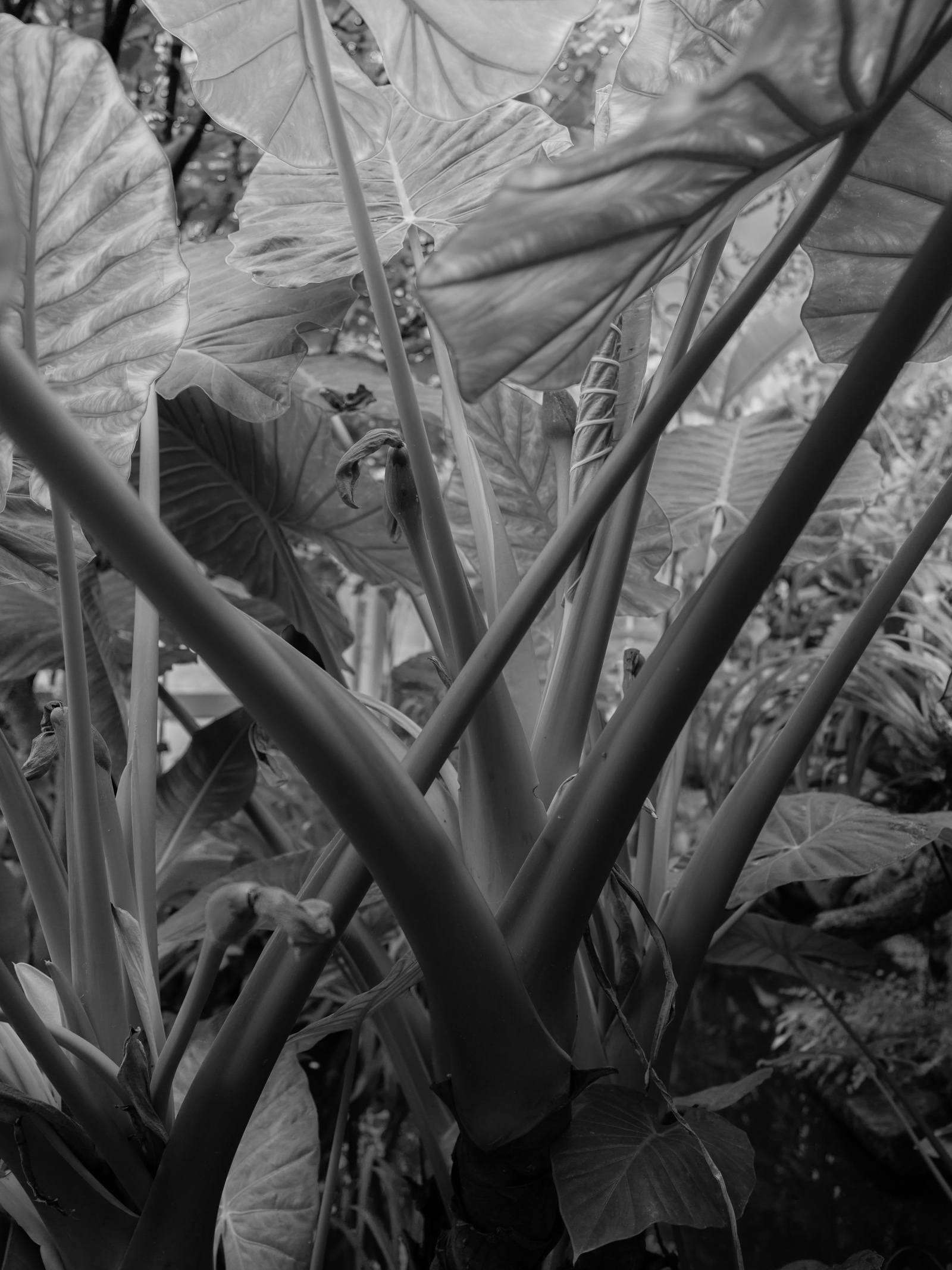
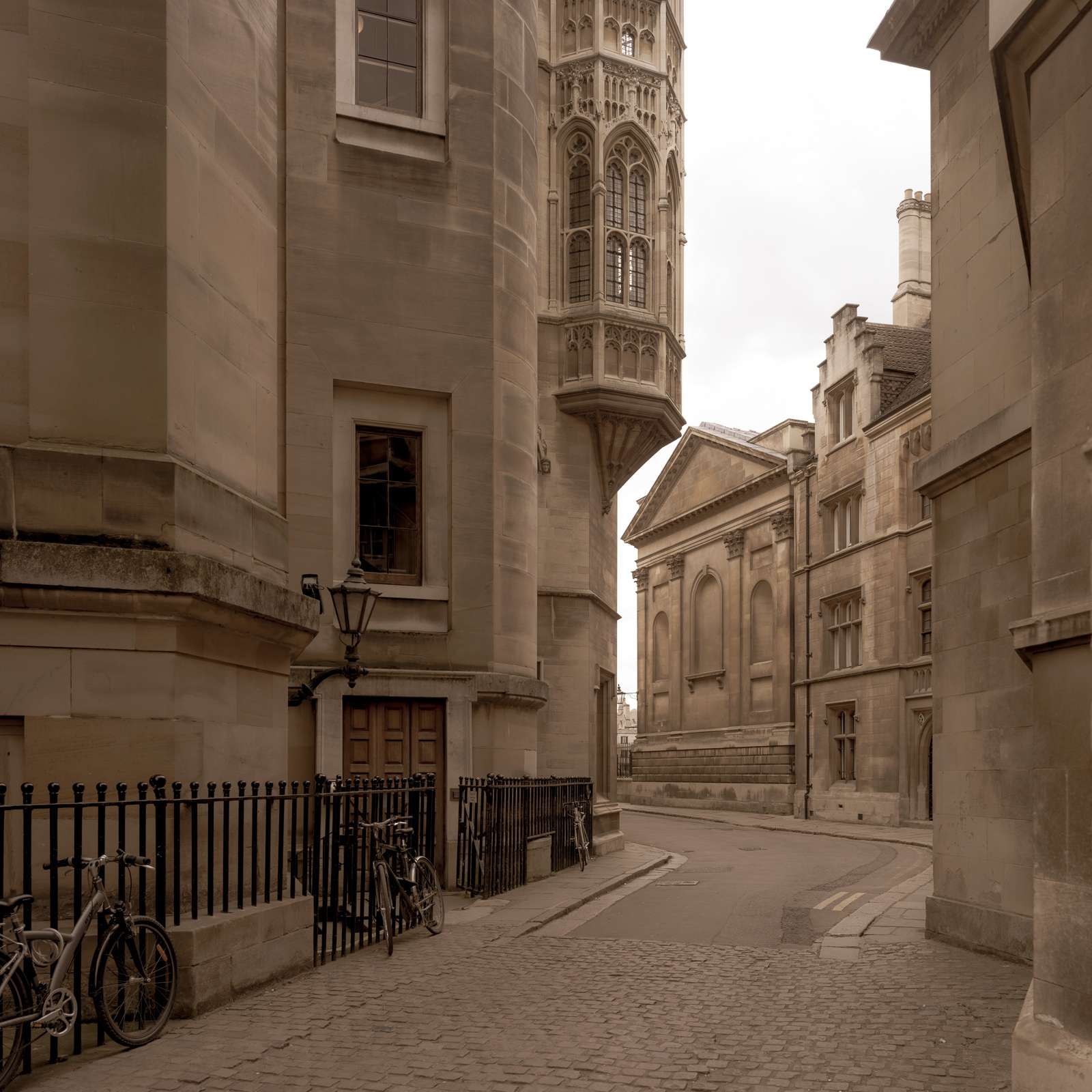
B&W works best to highlight shape. Put differently, b&w is better when you are photographing light, rather than a subject. The photograph above shows interesting shapes everywhere, but only works here because of the quality of light available to me at the time the photo was made. Adding colour would bring some realism into this scene. We'd recognise plants more easily, rather than let the weird shapes evoke a walk through a forest on Felucia. Remember, much of the power of photography is in evocation. Composition is your main ally to seed stories in the viewer's mind. So, if you enjoy shape, light and composition, b&w is your friend.
B&W works best if you love post-processing and fine art. Some colour work is fine art! Please don't misread me ;) I'm just saying that fine art (photography) is the manufacturing of a beautiful object via a photographic process. No print (or tactile media), no fine art, in other words. And post processing, particularly in digital b&w, is how you create the subtle tonal ranges, and control contrast that get you closer to a fine art print. With film, particularly in larger formats, darkroom printing (which still yields results that no amount of digital wizardry or money can yet equal) is obviously the equivalent of that post-processing.
And I think that's one of the keys for making that choice: B&W allows you to go to town on your PP. Colour doesn't as much. Since colour brings realism to the image, any sharp colour departure from a realistic look can feel terrible. See 100% of landscape photographs with overcooked colours, and tone mapping, for example. Those would look far better in mono. If the colours in the scene are that uninteresting that you need to resort to insane PP to bring them out, stick to mono to - not only save the shot - but make it personal through your monochrome PP. Note the italic emphasis on realistic, not neutral!! We have been taught to equate the two, but that's a lie. Strong, deliberate colour casts don't take away realism near as much as blown highlights or messed up tone mapping.
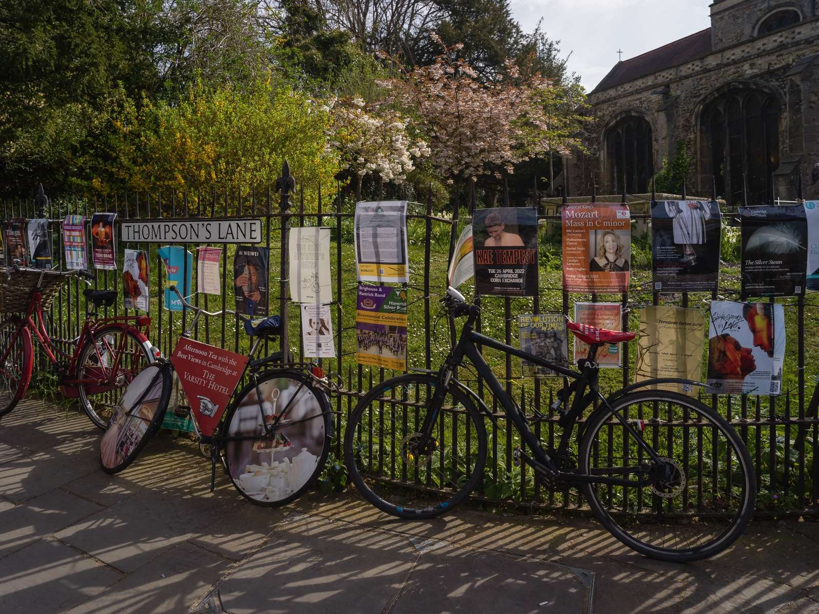
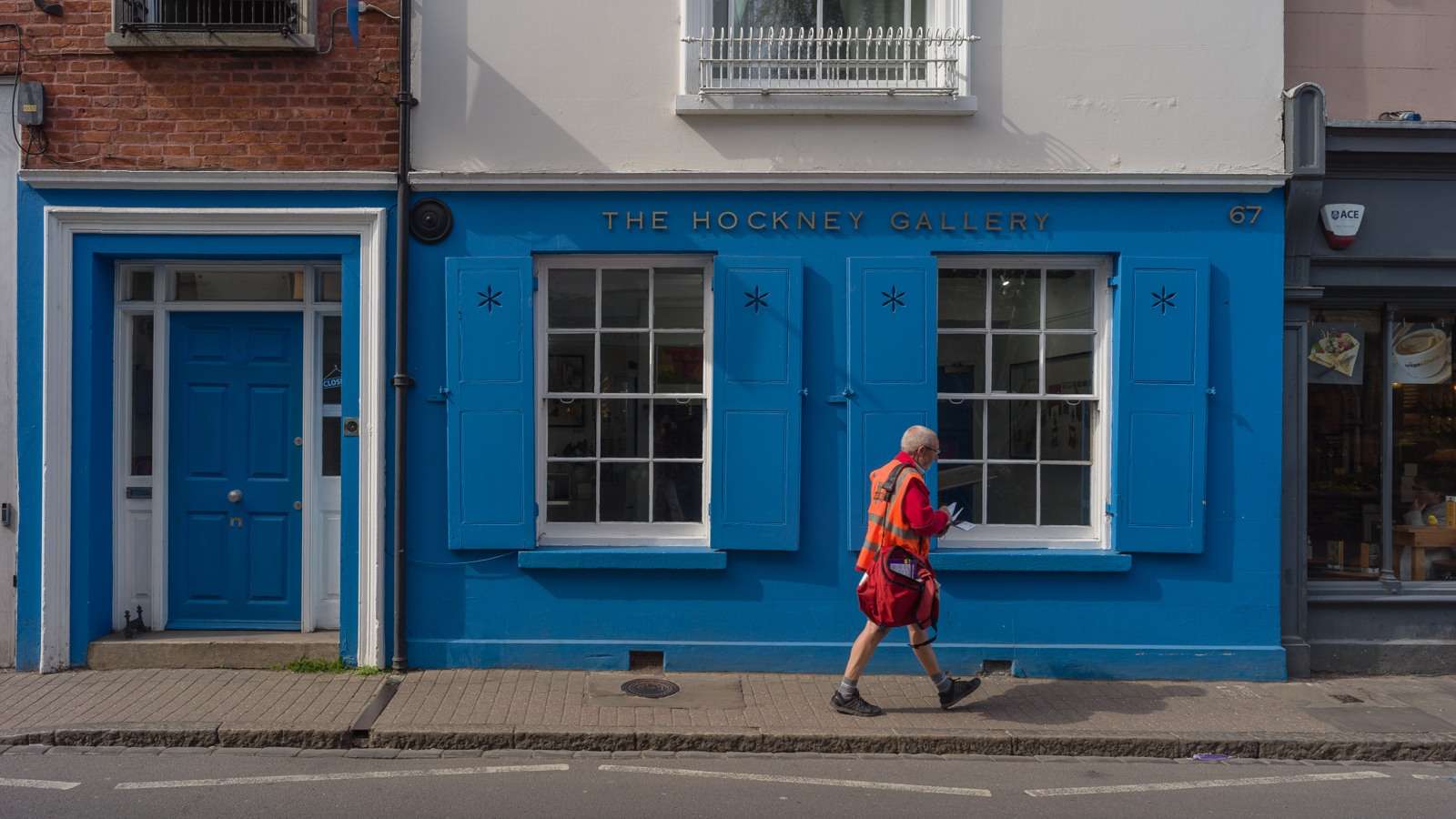
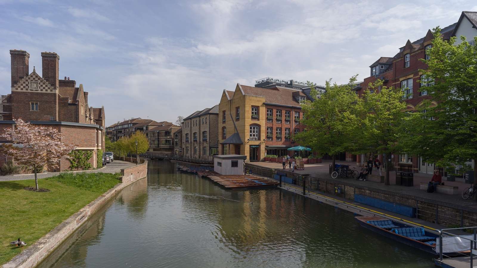
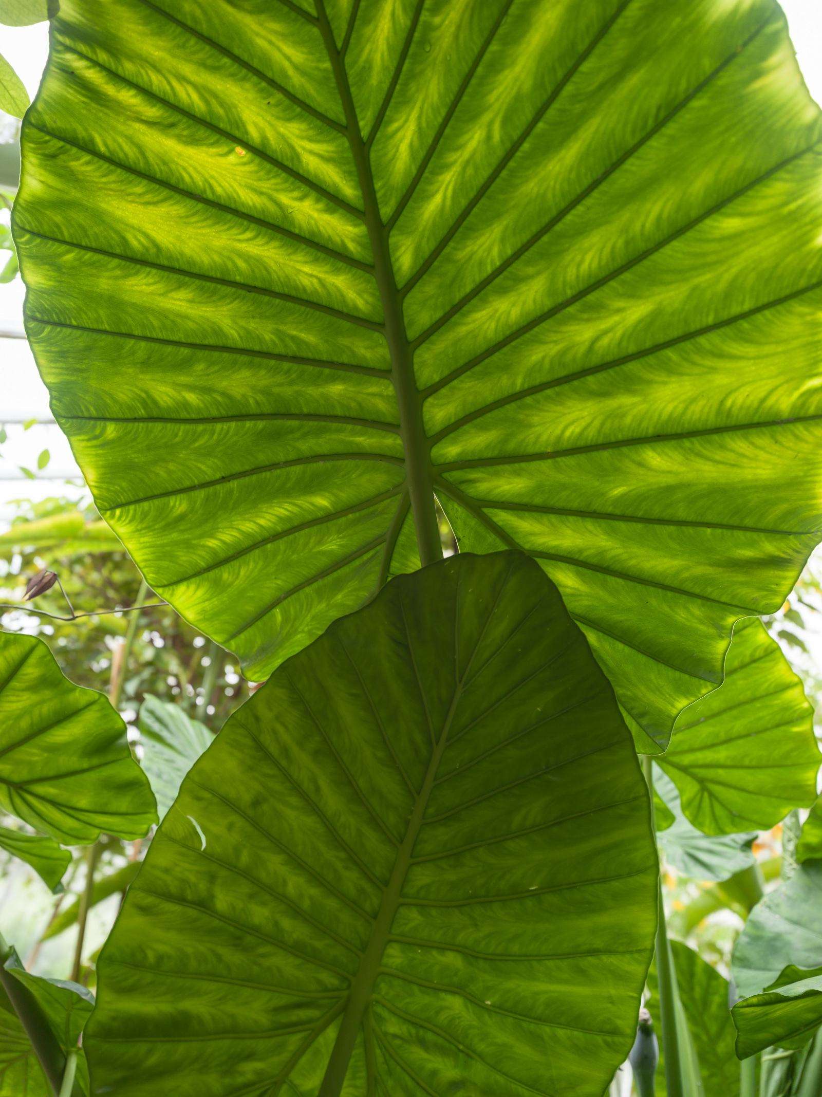
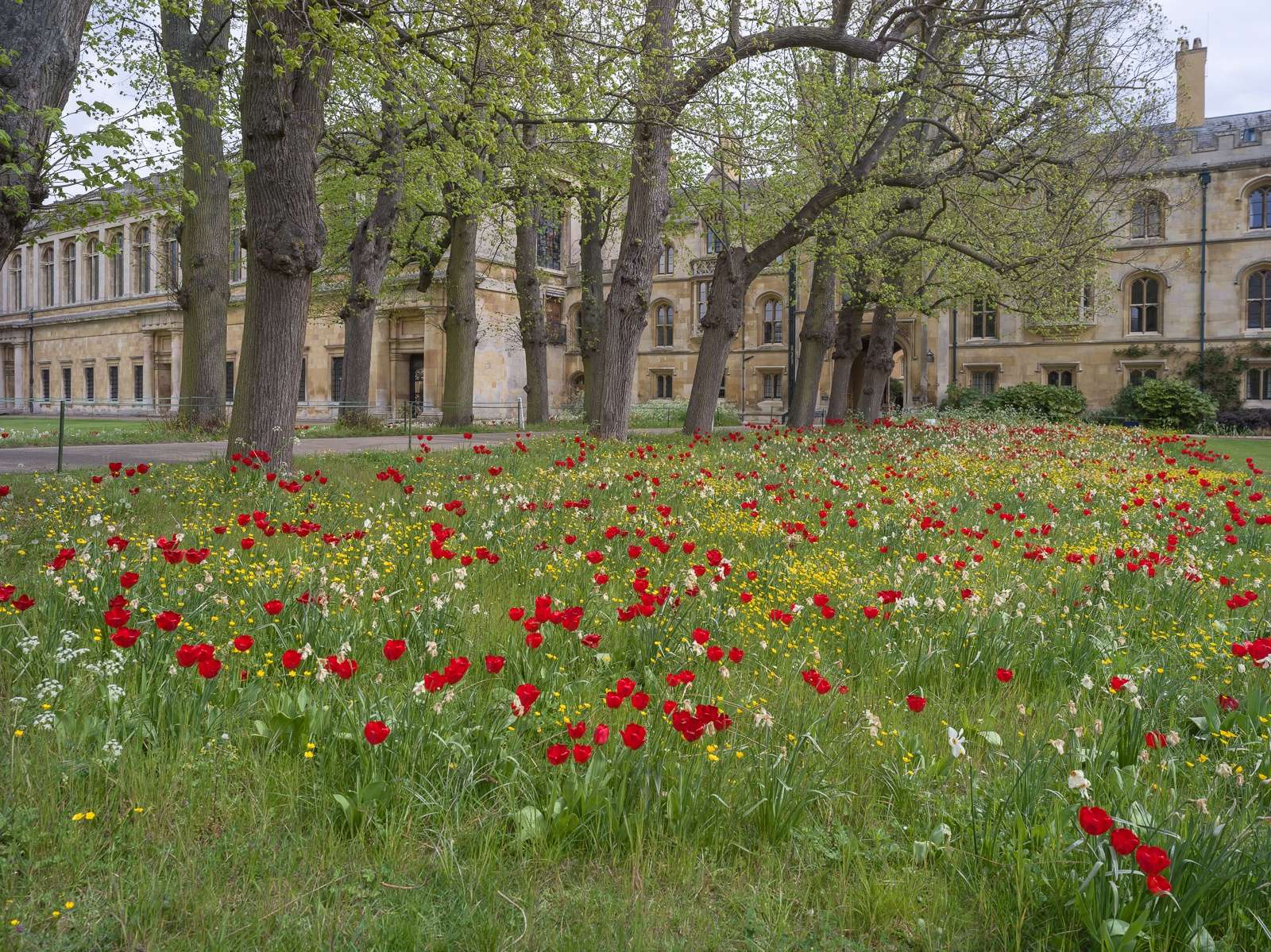
Explore the realism of colour. The image above would have worked in b&w. But the variety of hues in the trees, lawn, bikes and posters make it much more interesting in colour. Your eyes can't stop scanning.
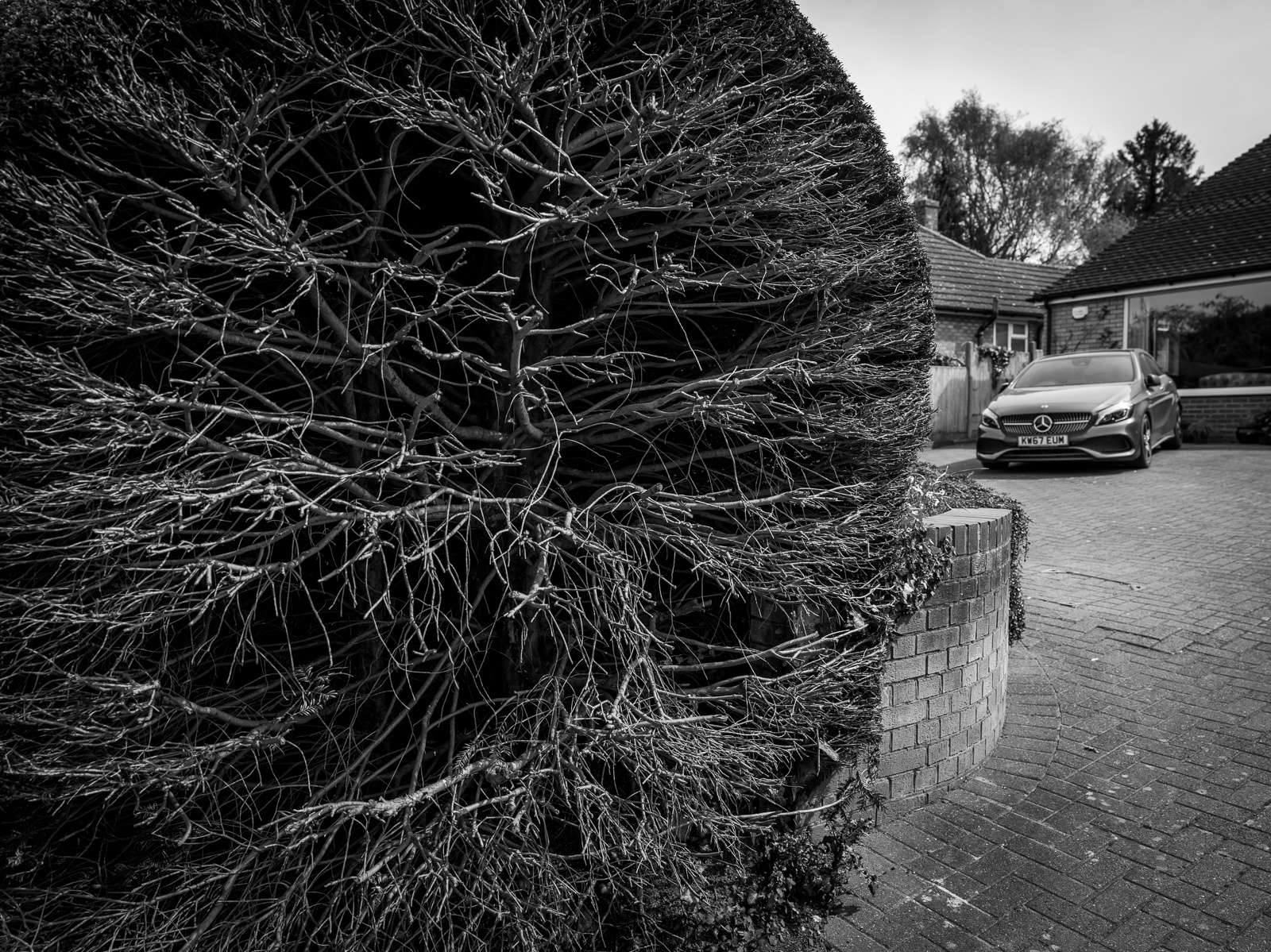
It's interesting to include/reinforce colour in photographs that are (deliberately) hard to read in monochrome. In the photograph below, colour would add nothing, and the car might draw attention away from the hard clipped hedge. The photo is perfectly readable in monochrome, the light was flat, and I see no interesting reason to add colour to it.
But in other situations, the luminance information alone may be insufficient to keep your interest high, and the inclusion of colour can add just enough information to make the puzzle interesting. Or the colour might simply add interest. Or the colour might be beautiful in itself and might need no other justification for the photograph to exist. This is where good colourists make us drool, and this opens up a whole other exploration of colour theory (maybe in other posts ;) )
And, to me, a pinnacle of photography is reached when you are able to combine the grounding or misleading aspects of both colour and b&w. Which is, again, why I hold Saul Leiter's work in such high respect.
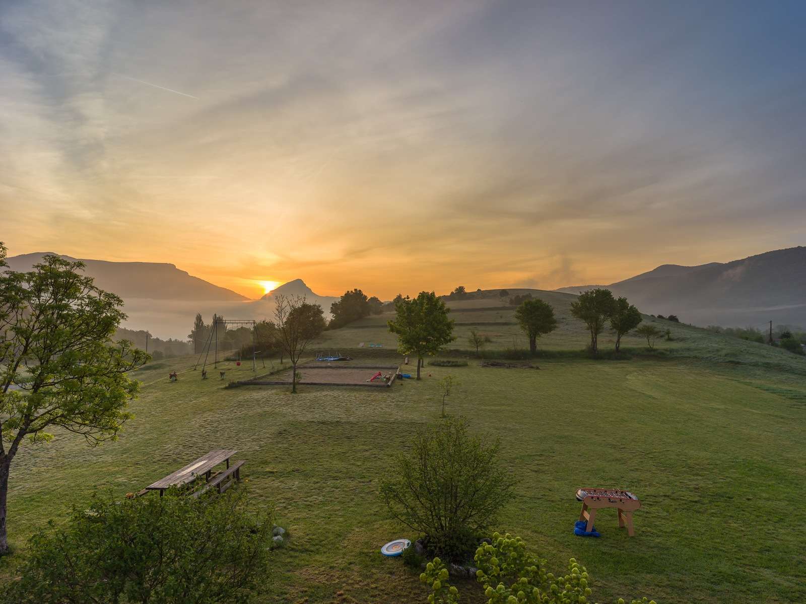
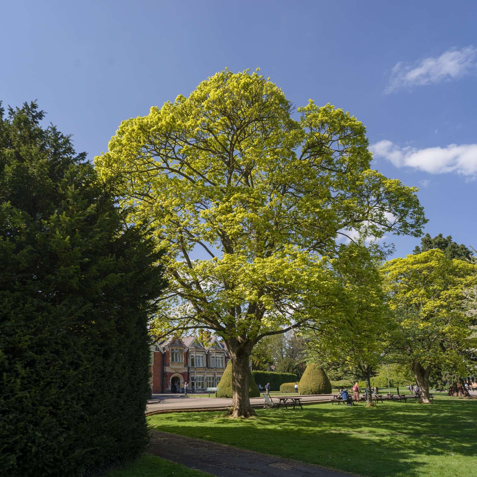
Enjoy memories, enjoy natural colours. Not everything has to be intellectualised. Not every photograph needs to have a fine art goal. There's a lot to be said about simply documenting moments. And in this, the added realism brought about by colour helps recall the memories and enjoy the sensual sides of the events. A nice warm spring day in Bletchley Park, for example (below). This was lovely, with loudspeakers in the bushes simulating conversations and the laughter of children, as a way to convey relief from the complexity of codebreaking and the harsh realities of war, cold nights, exhaustion, fear, tragedy ... Nothing soothes like a beautiful tree under a blue sky. Turning this into b&w would have been sacrilege to me. This is not about any deep meaning, but about enjoying and recalling a beautiful moment.
At the end of the day, it's your choice, there are no hard rules. Only principles which you can choose to judge your photos by, to decide how to take and process future ones. The two photographs above work in their own way. I increased contrast in one (the monochrome) and reduced it in the other. I used a central composition (including strong vignetting) in one (the monochrome) to reinforce that formality, and a more (shall we say) distributed one in the colour version.
Where and when you decide to emphasize contrast over colour, or vice versa, or push/lower both, is what defines your style and brings your vision to (digital) life :)