#1081. Covid Photographic Ramblings #4
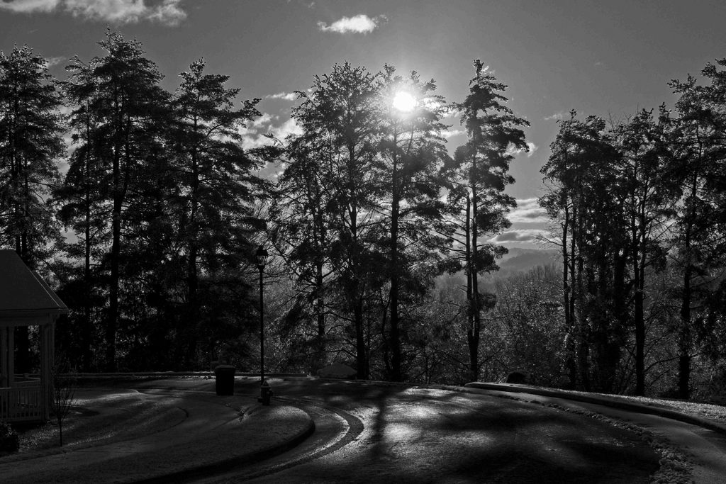
As fall foliage gave way to wintry scenes, I have increasingly gravitated toward black and white imagery; in the bleak midwinter, images apparently turn monochromatic.
Naturally, given my bent, this tendency prompted reflection. I enjoy making black and white images, learning as I go, though I do not feel especially competent. I offer the following thoughts in two parts: the first is speculative, the second experiential. Neither is authoritative, and doubtless Dear Susan readers know much more about either subject than I do. I am just trying to make sense to myself of my rambles in the monochromatic world. I welcome other views, and I would like to think I am open to tutelage. (My friend Lash LaRue, who has patiently tried to instruct a willful student, may beg to differ.)
Let’s begin with speculation. I want to distinguish four kinds of light, what I will call physical light, lived light, living light, and photographic light. These distinctions are not terribly relevant to the practice of photography: photographers learn and understand by making images, but I also try to understand in a different way. I hope these reflections are helpful to some.
First, physical light. No one actually sees this light; it’s an abstraction—albeit a very potent and useful one—for purposes of causal explanation. Physicists tell us that the data ingredient in what we sense as light are only a very small portion of the vast electromagnetic spectrum (only 0.0035%, in fact!). It’s amazing that so much information can be packed into that tiny fraction, and one wonders what we would “see” if we had receptors for some other regions of the spectrum. Imagine observing via X-rays! But while the scientific study of light is fascinating, and its insights profound, I don’t think this is where photographers ought to spend most of their
time.
Second, the lived light we actually do see is not just bare electromagnetic radiation, even if that’s where it begins. The light we actually experience is the illumination of the world in which we all live. Visible light is processed by our optical system and then our neural system (really they are but one system), in extremely complex ways. So what we see isn’t physical light, as a
light meter registers photons William James once suggested that our entire sensory apparatus might be considered not so much (or just, or even) as a sensitive register of reality, much less as an amplification device, but as a “reducing valve” on the firehose of reality, constricting and limiting in various ways the enormous flux of data (not just physical light) that reaches us. We know this lived light because we live in it, but we can never grasp its full reality.
Further, lived light varies among people, with different visual capacities, to be sure, but also with different experiences, training and cultures. The light we actually see depends also upon context and “set”—what we’re looking for, attentive to, perceptive of. It’s ridiculously complex, and I can’t hope to explore it here, save to note the complexity. Lived light differs from person to person: a game hunter and a nature photographer notice different things and notice them differently even when they see the same thing. We can be trained to see things we wouldn’t have seen otherwise, as well as inured to seeing what is obvious to others; and as always, it helps to practice, practice, practice.

Third, there is living light, which is only a trope, but a very powerful one: light itself is like a living thing, with the power to animate whatever it touches. For some thinkers this is perhaps the most fundamental analogy of them all. Plato’s story of the Cave pictures the sun as the One, the highest principle of being that gives reality to all else and illuminates the deepest
knowledge we have, and Plotinus expanded on this idea, as did ancient Christian theologians when speaking of God.
Photographers sometimes speak of flat, dull and uninteresting light, or even dead light, but also of sparkling light and golden light. Moreover, this sense of living light is something we experience in and through the multitudinous things light makes visible. It can’t really be described literally—certainly not in the mathematics of optics, the physics of sensors, or the physiology of the eye—but only metaphorically. No doubt we can agree that a certain cast of light has a peculiar vivacity, and we usually nod our heads in agreement when certain terms are deployed: everyone knows what “golden light” is, having experienced it, though “golden” hardly does justice to the infinitely-varied gentle tones and hues of twilight. But we really can’t pin it down in words.
Living light, like lived light, must be experienced to be known.

Fourth, there is photographic light, not the light that causes photographic images nor that which a photograph tries to image, but the light in a photograph. Imaging introduces further complications to the first three senses of light. Photography is made possible by physical, lived and living light, but its light is not actually any of these, only the appearance of these in a different medium. It is a “drawing” of light, an image of an appearance.
At some level photographers make their drawings in, by and of physical light, albeit extensively cultured and curated physical light—now digitally processed to the nines by cameras and post-processing programs, even before entering our eyes again to be processed as images of the original light. (The intricacy of this whole process gives me vertigo!) Such images rely essentially upon a photographer’s keen and cultivated sense of lived light, and if gifted or spiritual a photographer may also dwell in living light.
Still, we all recognize that the light in light drawings is not the same as the light they draw, although both are infinitely complex and subtle. It’s not clear to me that reproduction of lived light or living light should even be a goal of photography.
Perhaps creation of photographic light for its own sake is worthy all on its own?

One way of sorting photographic light is to distinguish between monochrome [which I’ll confine to black and white in this post, although I recognize there could be monochromatic variants in various hues] and polychrome [here confined to visual color].
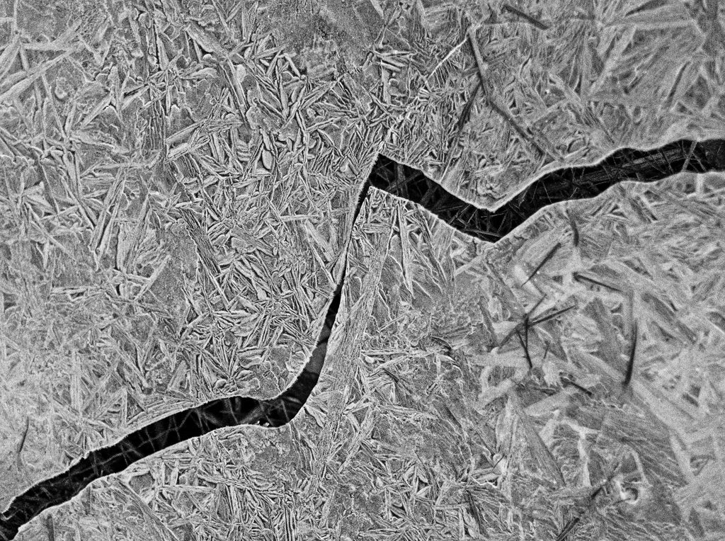
Monochromatic vision or images are inherently less rich in physical information than polychromatic ones, just as the visible spectrum is less rich than larger regions of the electromagnetic spectrum. Polychrome contains monochrome, as digital desaturation will show, although this subtraction isn’t a simple one. So in this sense monochrome is less than polychrome. But on some occasions less can be more—e.g. by isolating and highlighting the essential, by bringing to the fore shades and degrees of tonality, by emphasizing patterns and textures.


Here’s an analogy (it has its limits, I know): polychrome is to monochrome as painting is to drawing. Painting (at least representational painting) incorporates drawing, but drawing is an independent and exacting art. In a sense, I think polychrome and monochrome give life to somewhat different worlds. Each kind of imagery is rich enough to contain all kinds of properties and relations and to be populated by different kinds of beings.
You can live in each, or both, of these worlds of appearance, even though both are somewhat truncated. And this suggests that monochrome and polychrome are different ways of seeing because they somehow draw us into two different ways of being—two distinct yet overlapping worlds of appearance.
Now, the second part, where I descend from the stratosphere of abstraction to where the air is easier to breathe: my personal experience with monochrome. I don’t have a specialty camera with a dedicated monochrome sensor, like the Leica M-10R. My mostly trusty Sony RX10 “captures” color as well as black and white information. I don’t very often set out to make a monochrome image, though I may sense intuitively that the light is right for one. Usually a given image strikes me as suitable for monochrome—indeed, almost as predestined for monochrome—only in post-processing. I make a copy in ON1, which I find very versatile for this process, and then as in the darkroom of old, I “see what develops!”
Sometimes I merely de-saturate a file and then fiddle with various sliders, especially whites, blacks, shadows, highlights, haze, contrast and structure until I satisfice. Other times I resort to a number of useful black and white ON1 pre-sets as starting points, depending on my inclination, and then fiddle. I usually don’t have a preconceived idea of how a given image should look in monochrome, so this fiddling can involve comparing alternative looks—as much a matter of creating and discovering as of satisficing. Sometimes, in fact, I’m a bit surprised by the outcome—I didn’t know this image could look like this. It follows, of course, that I don’t think there is only one way to process an image in monochrome (just as in olychrome, or both, I should add).

So there is as much rambling in my processing of black and white images as in my “capturing” the original files. Even so, there must be features of a scene, or kinds of scene, that make it more interesting to me in monochrome than in polychrome. I don’t have an exhaustive list, but here are some initial thoughts about what I have found interesting for black and white; they are generalizations and so of course there will be exceptions, and you will have additional categories to add.
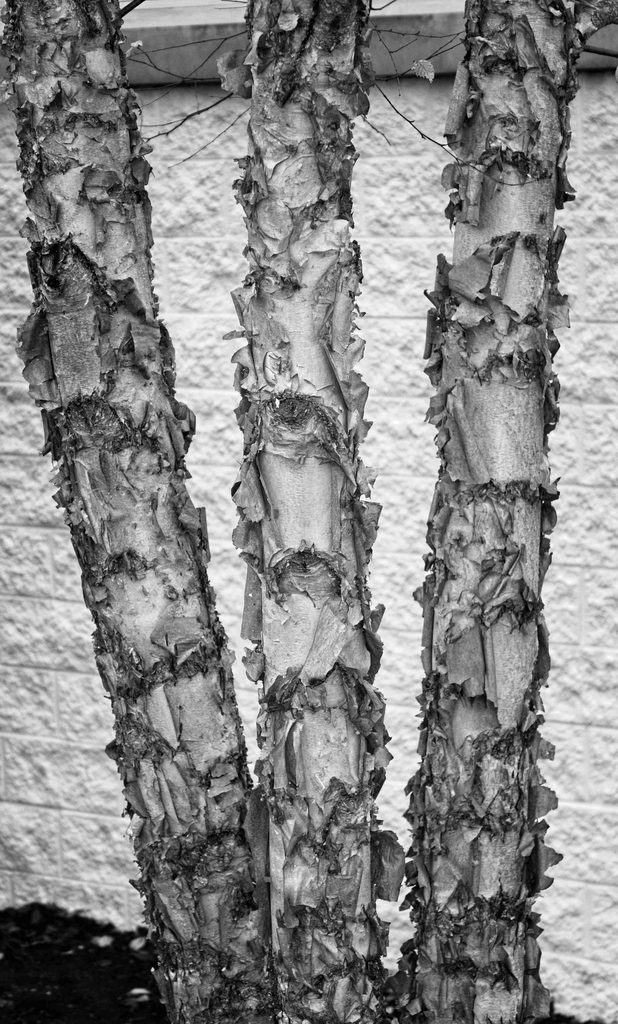
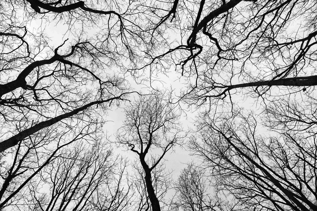
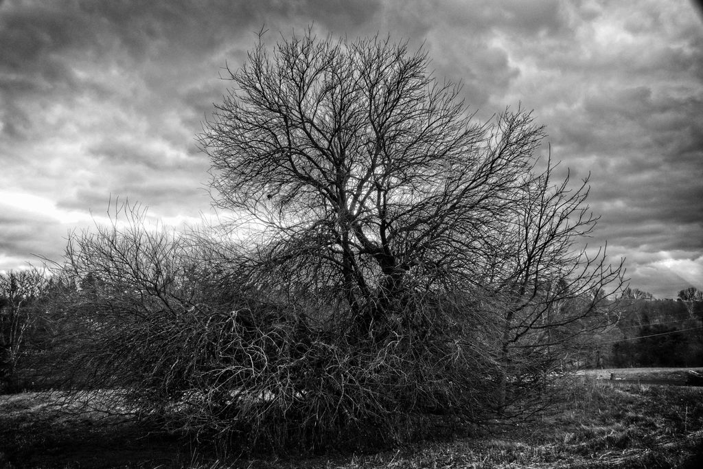
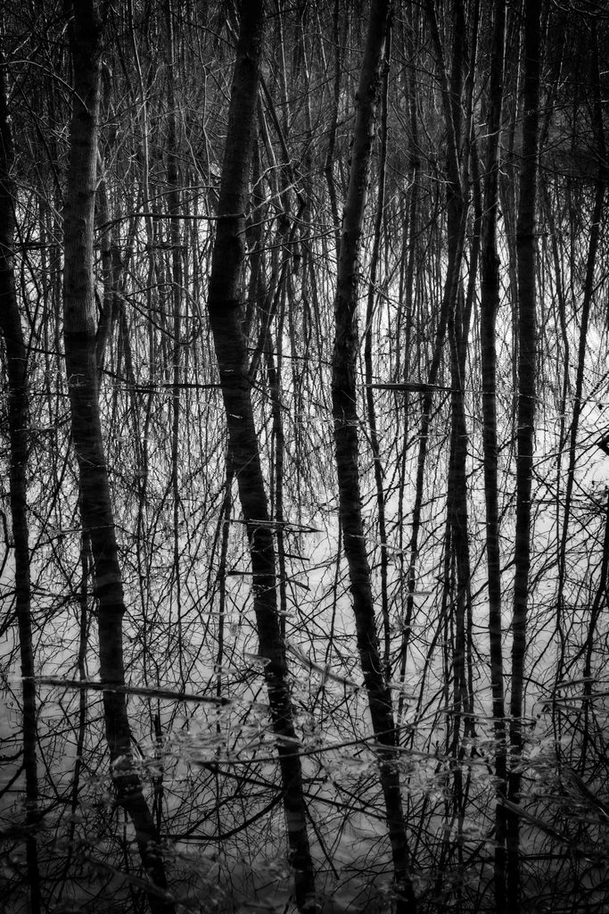
- Certain subjects just look better to me in monochrome: especially bare tree limbs, vines or entire defoliated trees (which I think of as tree skeletons—a decent metaphor for monochrome itself, getting down to the “bare bones” of living things)
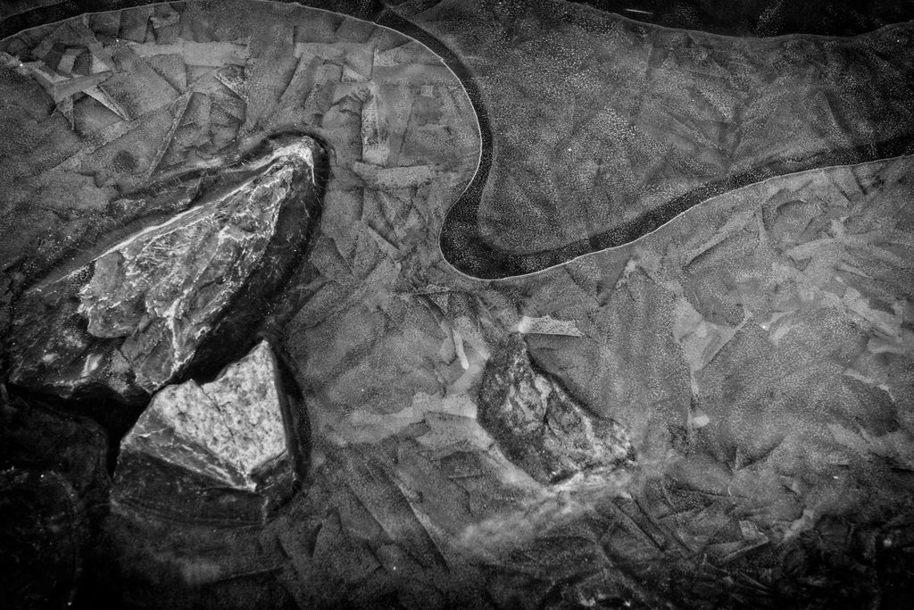
- But also rocks.

- Also suitable are moving liquids such as streams and waterfalls.


- I think portraits in monochrome can be stunning, bringing out the depths of persons that can get obscured when light-drawing flesh-tones. Here less can indeed be more. The tones, patterns, textures of faces glow in monochrome. But not here.
- Another kind of subject is non-representational abstraction, whether patterns, tones, contrasts, textures, or all of these. Monochrome allows us to concentrate on these aspects of light without the distraction of hue. (Sometimes, of course, hue is not distracting but almost the whole point.)
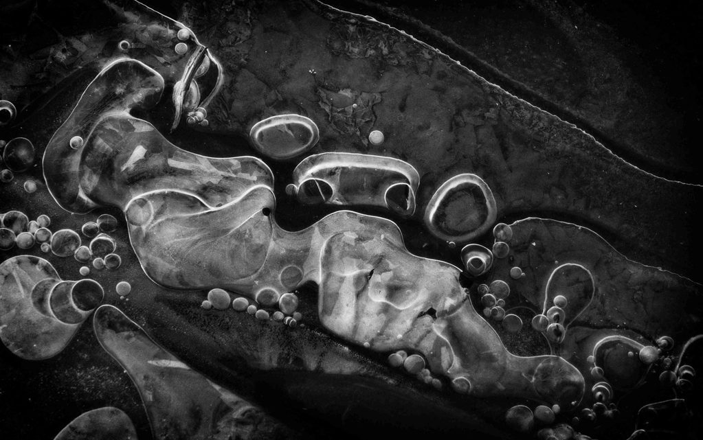
Connectedly, removing hue is well-fitted to minimalism, images that have few objects situated in wider expanses, perhaps in snow or on placid water or sheets of ice.
Certain kinds of light seem more conductive to monochrome: often back-lit, or with strong oblique or undiffused light, though fogs and mists and twilights of all kinds are always eligible, as are low-key and high-key looks.

- Contrast is often (but not always!) a major factor: the contrast of light against dark, certainly, but also of light alongside or within or surrounding dark. Gradations from one to the other usually are not as striking. Often it is okay to lose detail in shadows or highlights, where fine structure isn’t needed.
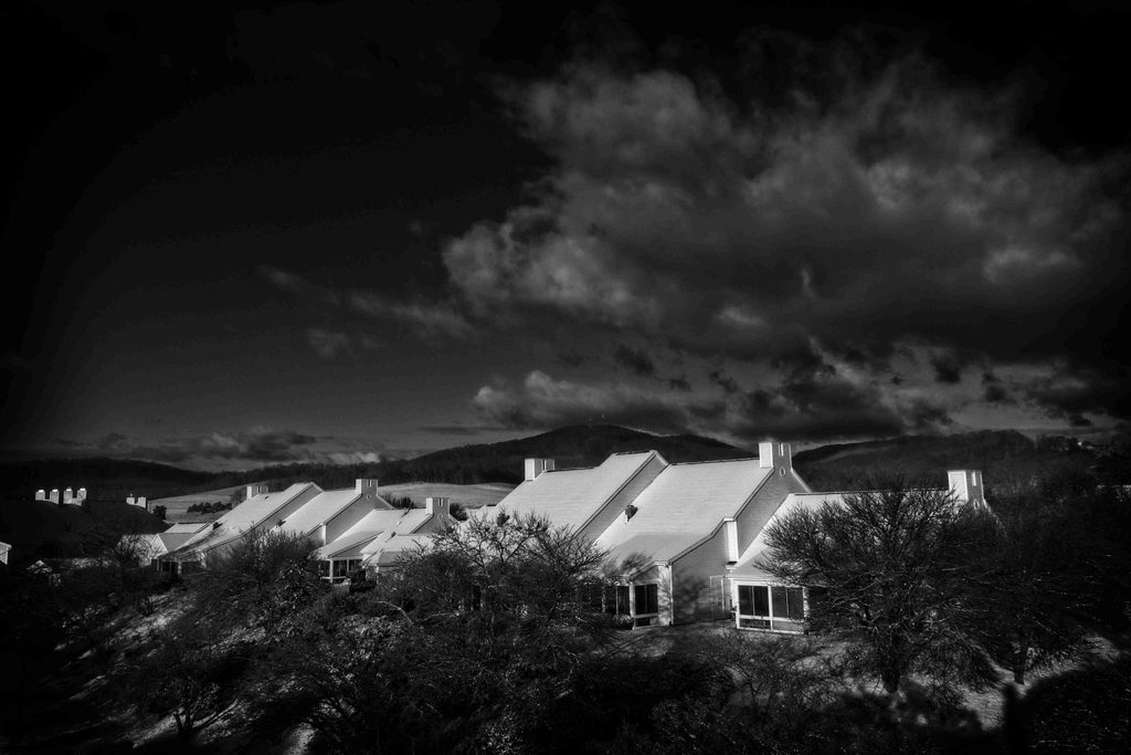
- Strong lines, especially diagonals but also verticals, horizontals, grids and concentric circles, are always arresting in any image, and they are even more prominent in monochrome.
- Snow and ice (and less often rain), with their sparkling reflections and refractions, dazzle the eye and also the digital sensor. Getting exposure right can be difficult, but also rewarding, though sometimes the best snow and ice pictures are studies in minimalism.
Both simplicity and intricacy can be effective in monochrome, the former because it isolates elements (minimalism), the latter because it highlights details (maximalism). Some will prefer one kind to the other, but I like both.
- Moods: Stark monochrome can reflect heightened alertness, while subtle grays can reflect a more pensive mood.

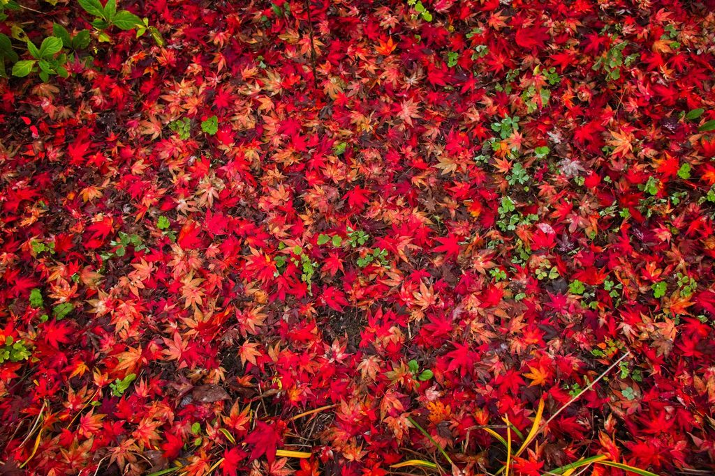
What doesn’t look good in monochrome? Well, often the reverse or absence of the points made above. But also sometimes color is essential: to make certain elements stand out, where monochrome just can’t do it all; when color conveys an unmistakable sense of time or place; when chlorophyll must be given its due in plants, or blues in sky or sea, or browns in logs or mushrooms, or reds and yellows in fall foliage, or flesh in humans, or distinctive bird plumages.
Besides, some of us have an intrinsic attraction to vivid hues, though others prefer pastels.
Perhaps this is a weakness on my part, but I think it is perfectly harmless, in moderation at least.
I conclude with a brief note on evaluation: I do not think monochrome is inherently superior to polychrome, despite the competing claims of purists, though I do think it is harder to produce a satisfactory black and white image than it is to make a colorful one. Both are thoroughly capable of expressing a great variety of moods and associations, often different but with some overlap, quite apart from their suitability to subject matter. To my mind, in the end they are just different, and I delight in both.
You can find all episodes in this series here :