#669. London in colour
You'd expect someone who's visited London over 50 times and regularly rants about unimaginative tourist shots to serve up something better than the Eye playing darts in the sunset, right? But no, that's exactly what you're getting with this post. That, and more of the same ... 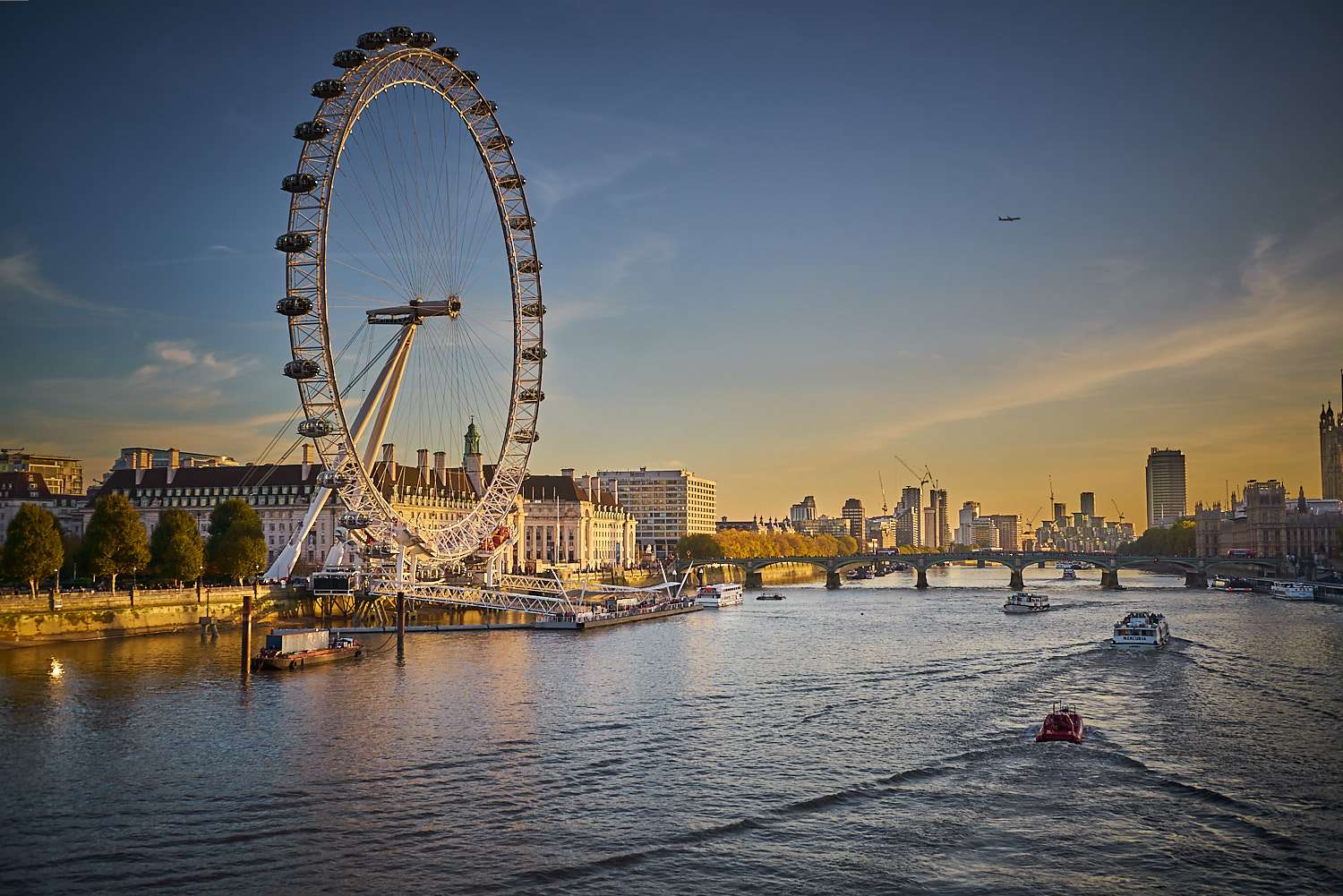 Have I gone potty ? Well, yeah, a long time ago. But that's not (exclusively) what this is all about.The fact is that, if you love flashy colour photography, forget Valparaiso. Come to London and go nuts. It's like this city has been designed by generation after generation of worshipers of bright hues. Add the frequently colourful skies and exotically dressed cars, and all the ingredients for a very bright recipe line up.I recently spent 5 days in the capital of Brexit, during which I decided to focus on two extremes of the chromatic spectrum. So let me report on my wanderings in two posts : one in full, over the top colour. The other, in stark B&W. All this to conclude that practising both is essential and fun.
 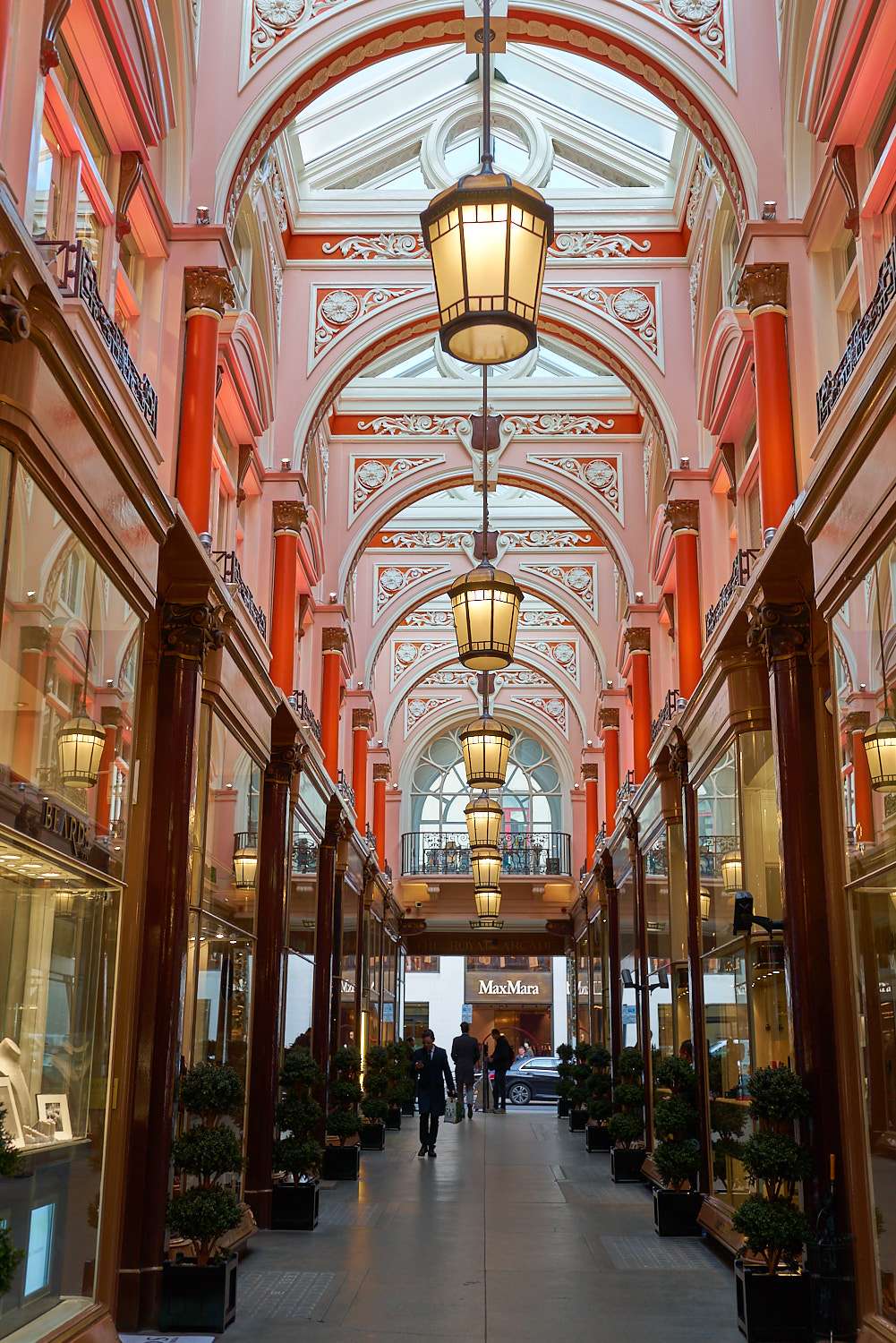 All too often, people either specialise in one and neglect the other or hesitate between the two and end up missing the point of either entirely. So, in separating the two visions, I have deliberately gone overboard in my processing as an exercise to get the most impact from both. My aim is to let colour convey emotion and B&W convey information.The shot below is a mix of both, and analysing the two components separately make it easier to recombine them for powerful shots.
 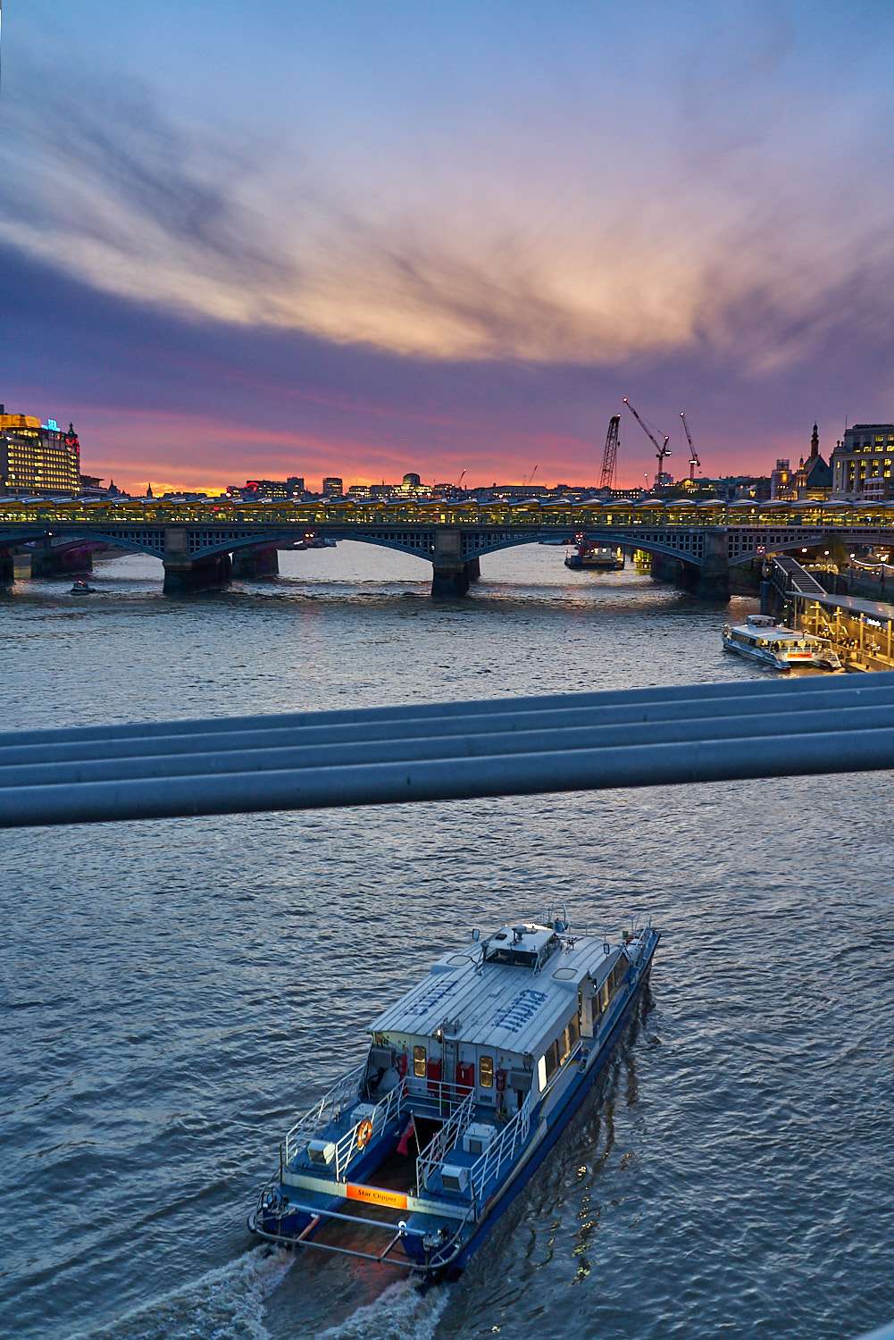 Colour is tricky. It is very easy to fall into that viral territory with golden hour light and over-processed shots. Great for social media's goldfish attention span, but the underlying photograph needs to carry more than just crazy colours to keep the viewer interested for more than 3 seconds. More easily said than done, so here are a few pointers. 1. Go for colour contrasts. In a photograph dominated by a group of neighbouring tones (the crazy purple sky and walls below), even a smallish patch of contrasting colour (the blue & green glass) goes a very long way towards balancing the photograph and making it less syrupy, more interesting.
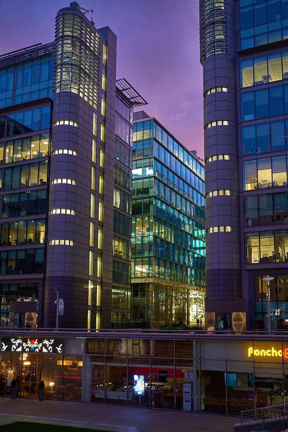
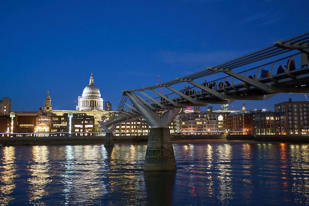
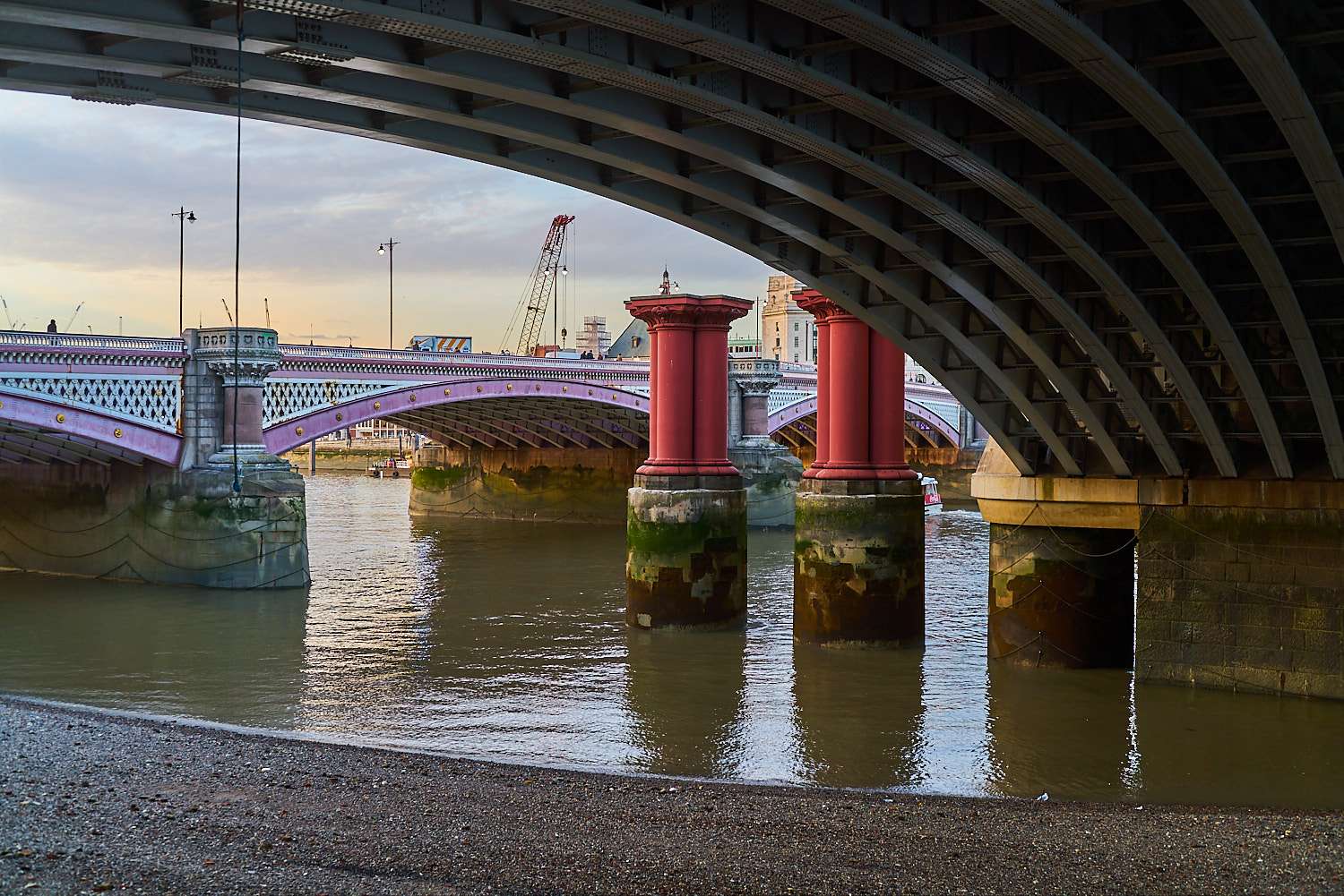
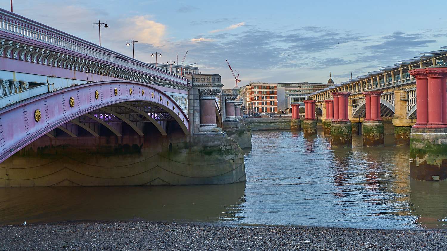
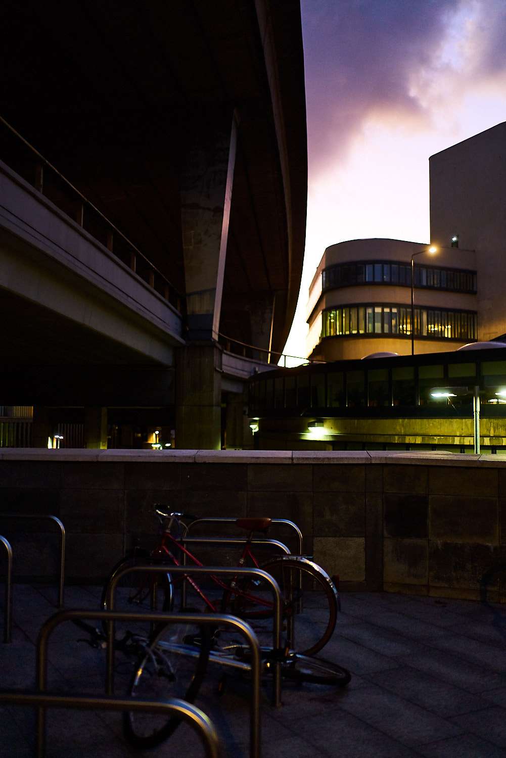
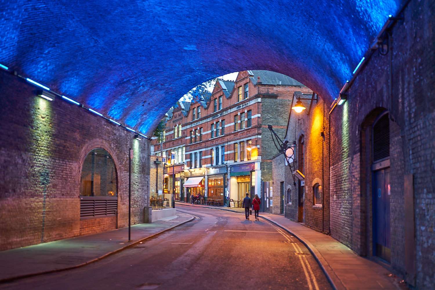
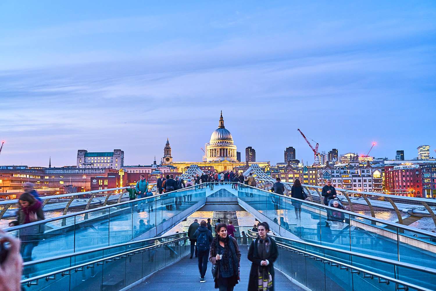 Be bold in your processing if the colours of the scene are what drew you to making the photograph in the first place. This is not about photographing a stamp for archival purposes but about expressing what it is that impacted you enough to lift the camera to your eye. Above, the bridge's shape makes for a very strong composition, but the yellow-red buildings also contrast strongly with the dominant blue in the image. It would be a shame to lose that supporting ingredient by being chromatically timid.
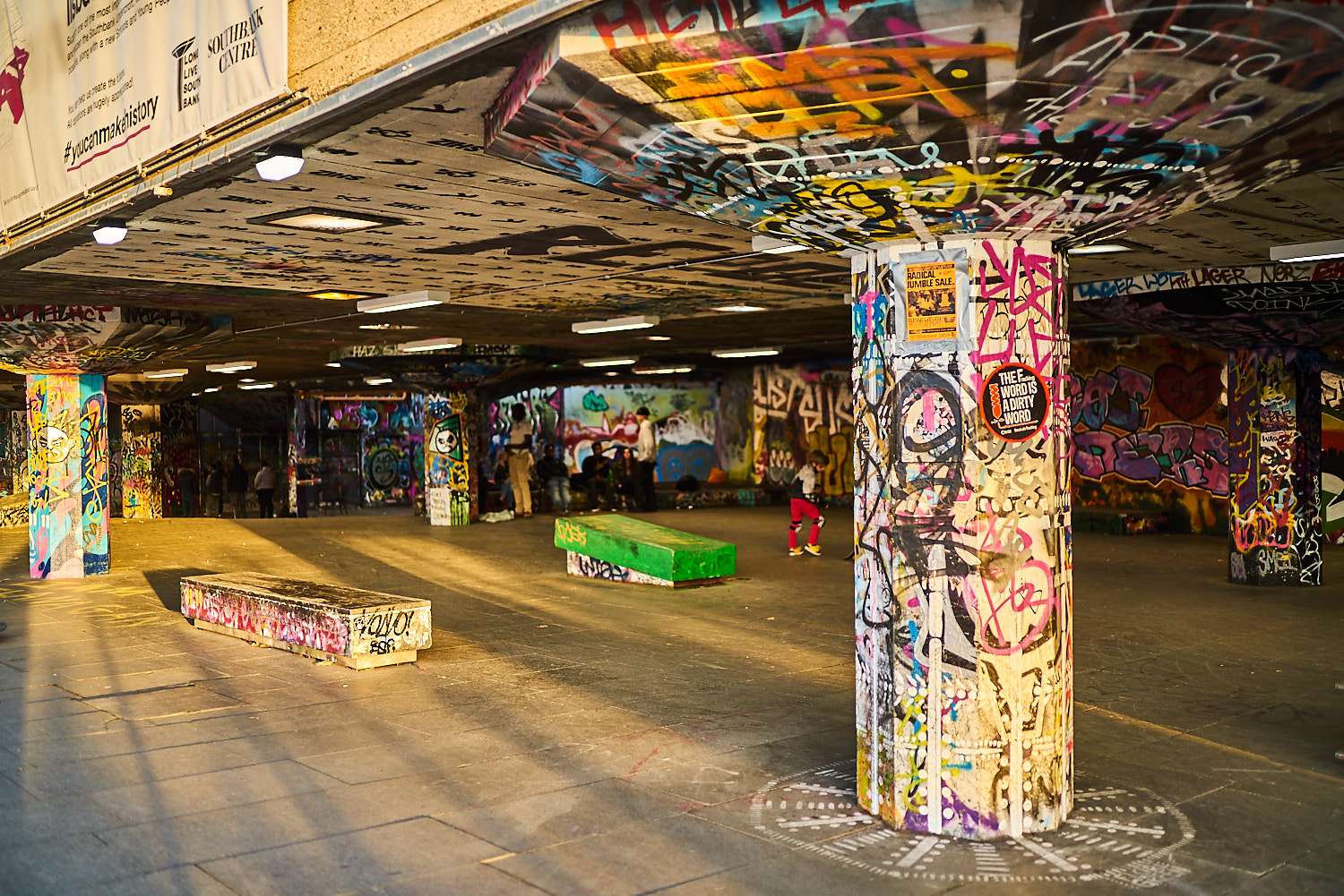
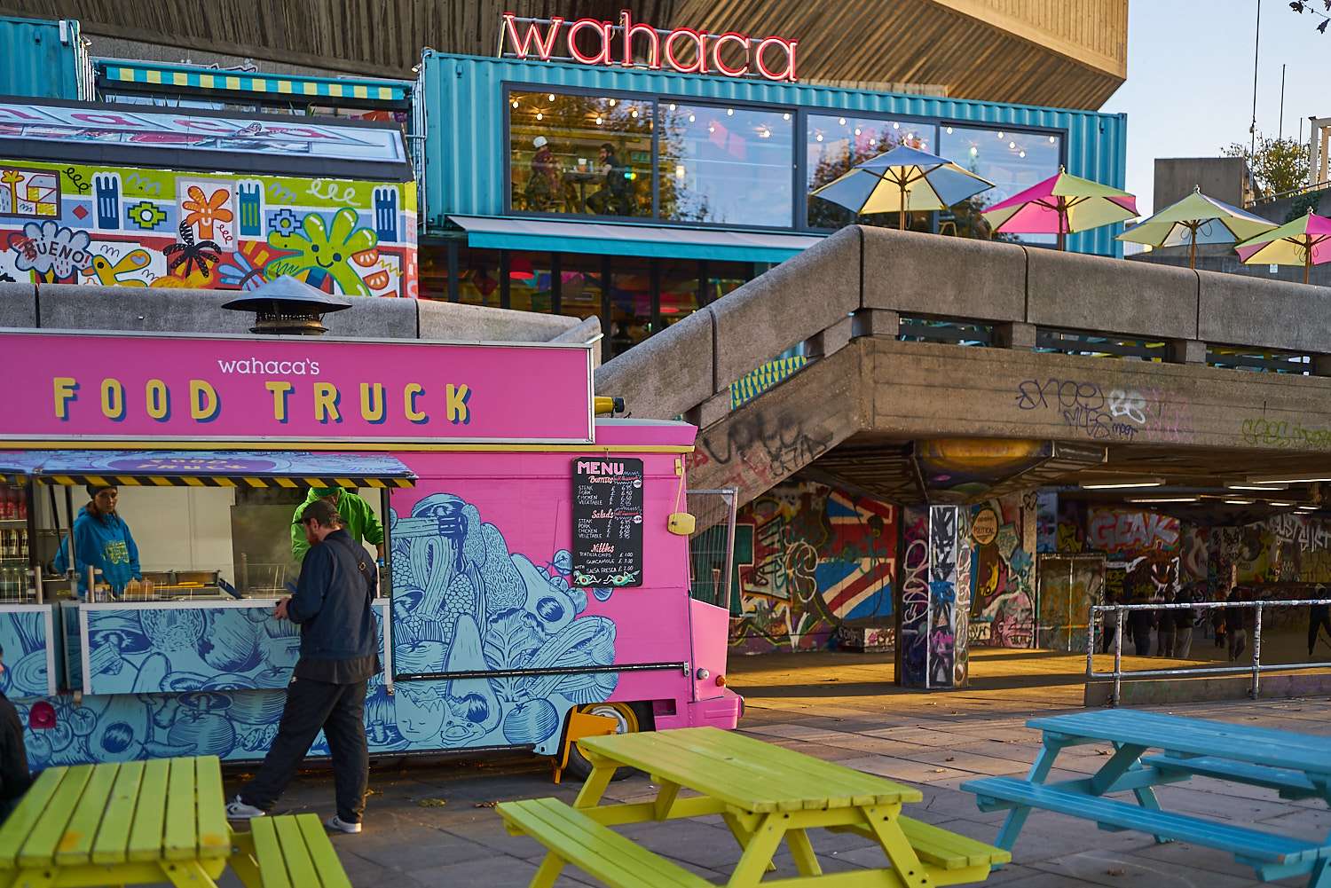
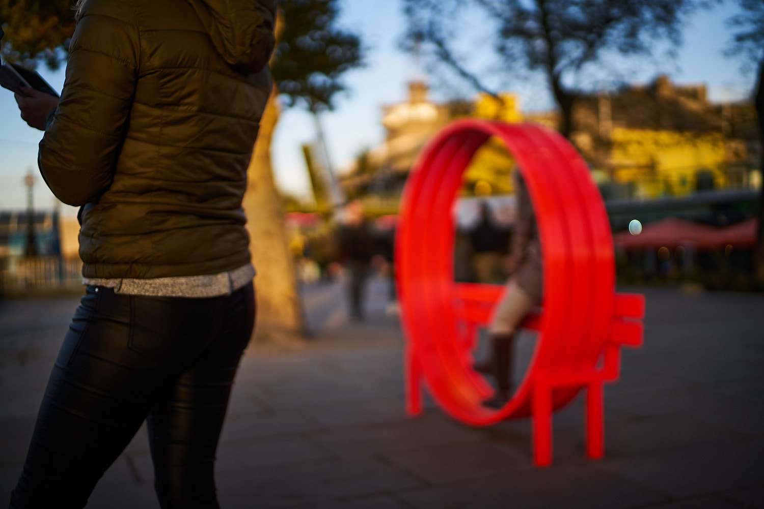
 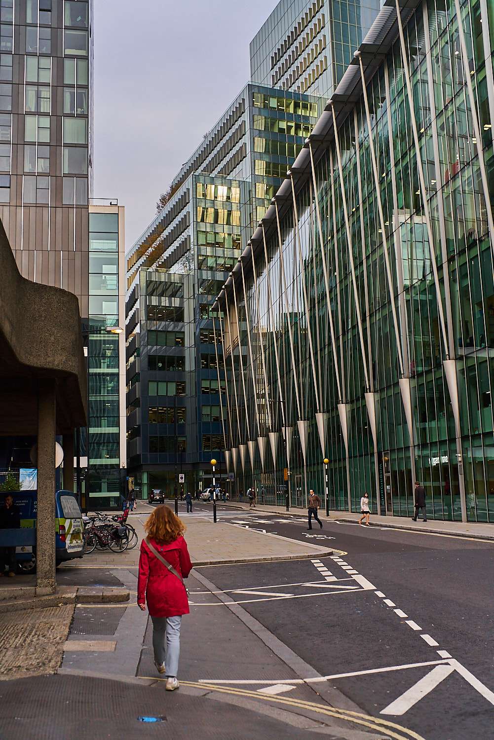 A little contrasting colour goes a long way here too. In this dominantly green-glass environment, the small splash of red is enough to create a strong focus point and make the image much more interesting (visualise the same image with a grey coat, for instance).Also, as much as I love going grungy / grainy / contrasty / dirty in b&w, over-the-top colour needs a super clean image to avoid falling into the outright tacky. Given how "at the limit of vaguely acceptable taste" the image below is, it's essential to remove distractions and PP flaws to maintain the notion that you are in control and that the psychedelic colours are a deliberate choice, not a hickup-induced nudge of the saturation slider.When you're going overboard in your processing, balance and imbalance will become more obvious. It's a great exercise to push the colour info in your files to their limit to learn how to maintain (or not, if that's what you're going for) that balance.
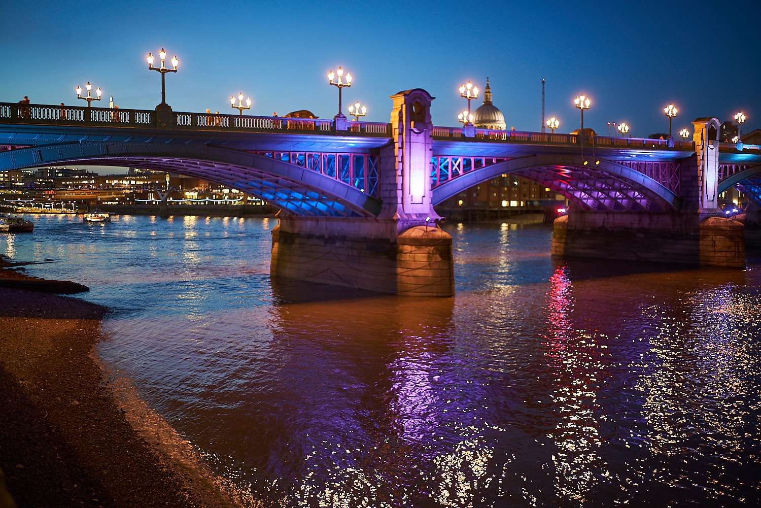
 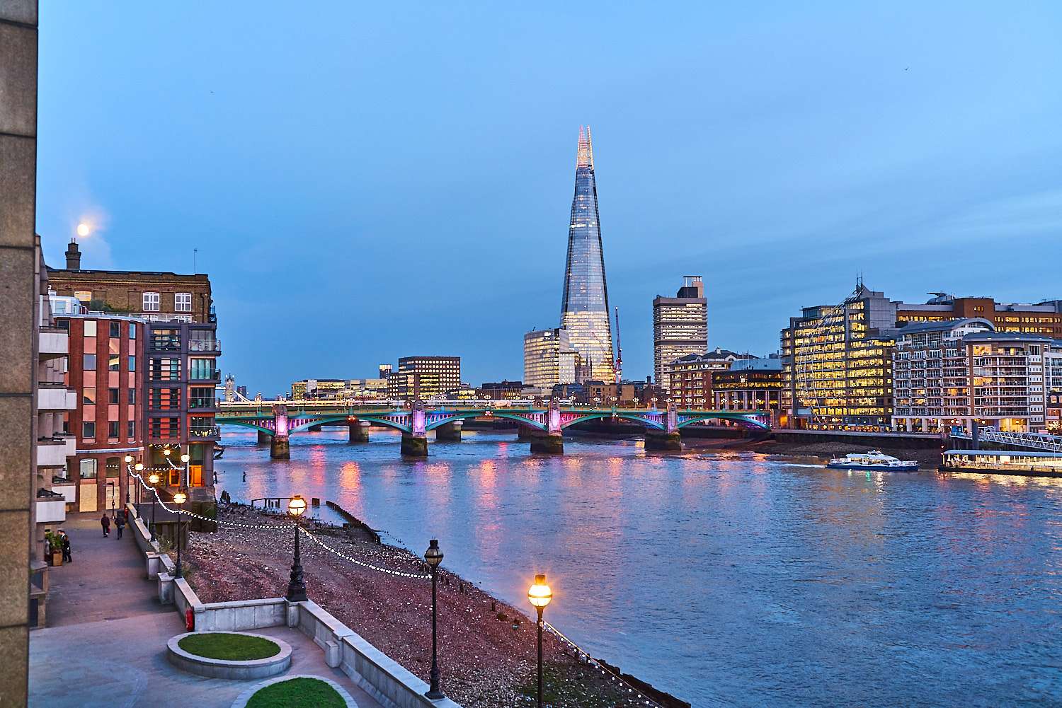 2. Create worlds within your composition. However careful your PP, pictures such as the one above are a step too far for my liking. But when only a fraction of the image is subject to the craziness, it all feels a lot more interesting.The first image below is a bit more saturated than the second, but the large presence of the grey bridge brings some grounding. Also, the very tight composition with little space to breathe compresses the two "worlds" creating a contrast between them that makes the image interesting (remember, composition is not about taste, only about retaining and directing the attention of your viewer to better convey a message).
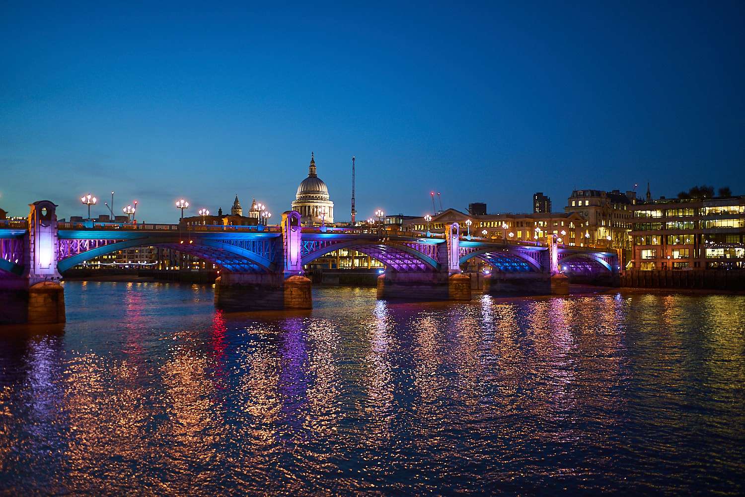
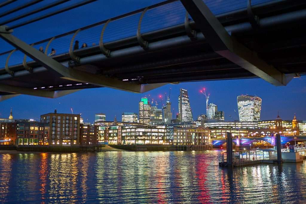
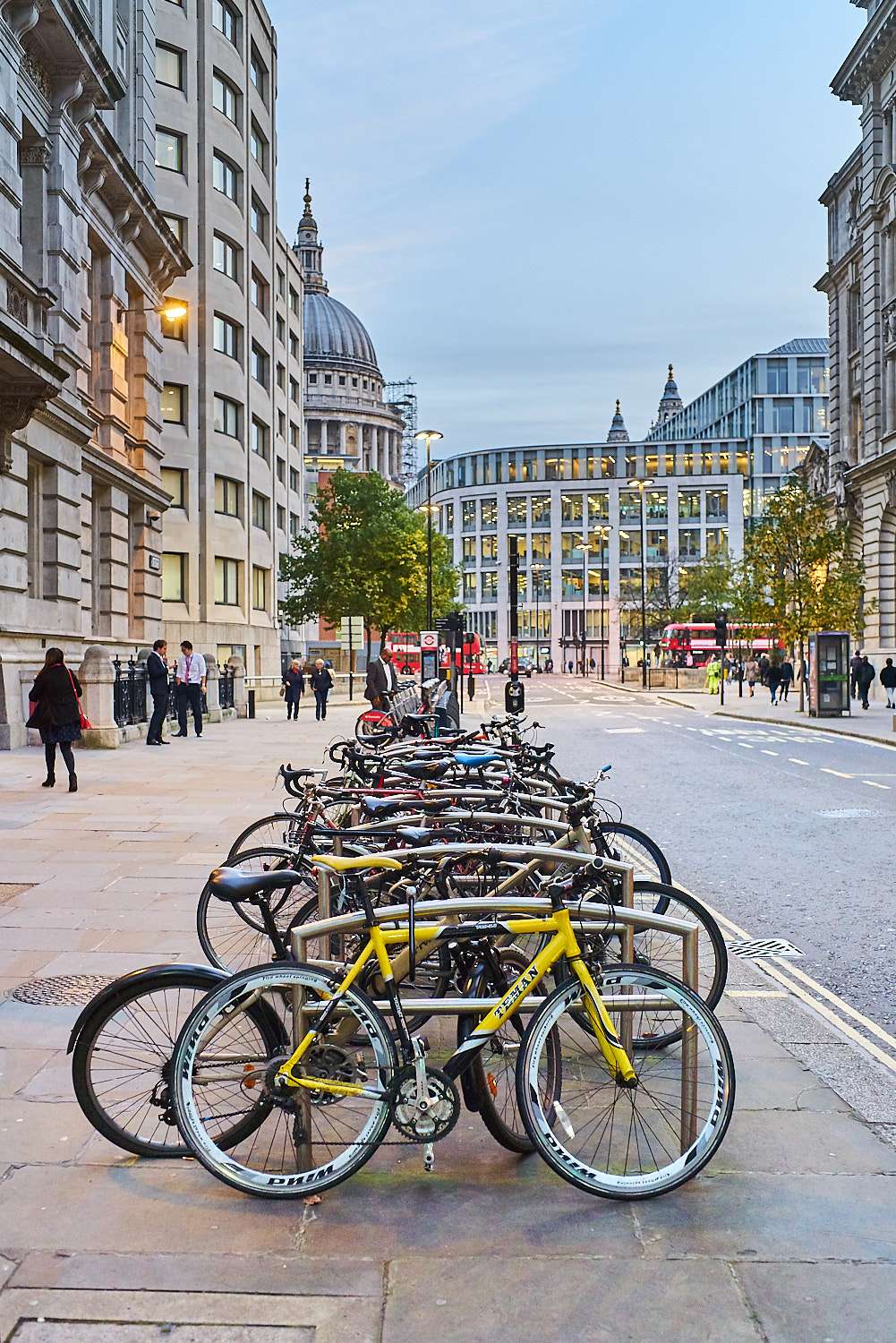
 The framing also works the other way, with crazy (but real) colours defining the boundaries of a less saturated world. The second & third images below are more of an eyesore than the first because and yet there is far less colour everywhere. In the first, the flashy blues and pinks are used as a compositional tool, creating a frame within the frame that focuses your attention onto a portion of the image that's much more lackluster and "normal". The interplay between the two is what makes this photo interesting while the other two are a bit garish.
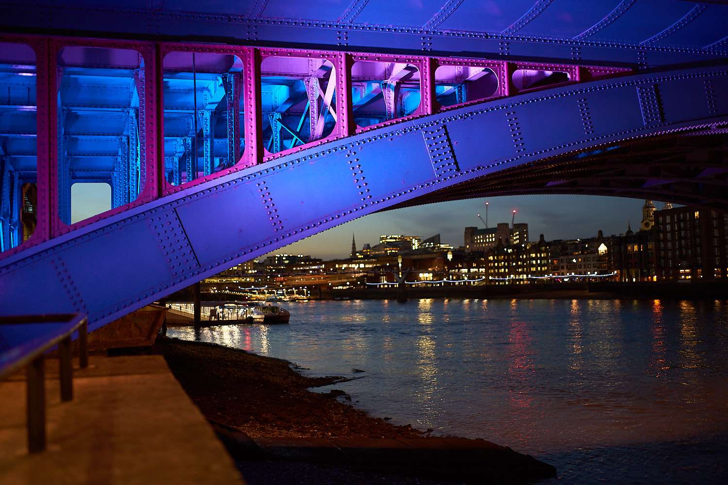
 3. Love your sunsets. Worshipers of colour landscapes often insist on shooting while the sun is still below the horizon. Not my cuppa. While the reduction in dynamic range can make PP far easier, it also makes the resulting image much less vibrant. The sun is our greatest source of light. Honour it by making the best use of its rays. In harsh mid-day light, monochrome is often your friend. When a golden studio light of infinite power is handed out to you, however, say thank you and let it infuse your shots.
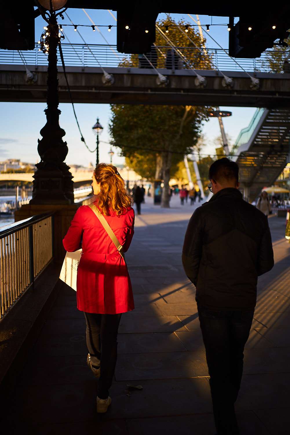
 4. Lower the contrast. Remember the part about colour conveying emotion and monochrome conveying information? Contrast is the monochrome component of the photograph. By lowering it, you are deliberately minimising the situational information and feeding the brain only hues.Monet used this regularly to his advantage by producing paintings that would look close to middle grey if you removed colour information (very little contrast). Our brains are wired to use shape to understand the topology of the world around us. By reducing the amount of 'monochromatic shape information' in a picture, you make it less stable. The eye moves about more in search of topological clues and the image feels more alive, more vibrant.
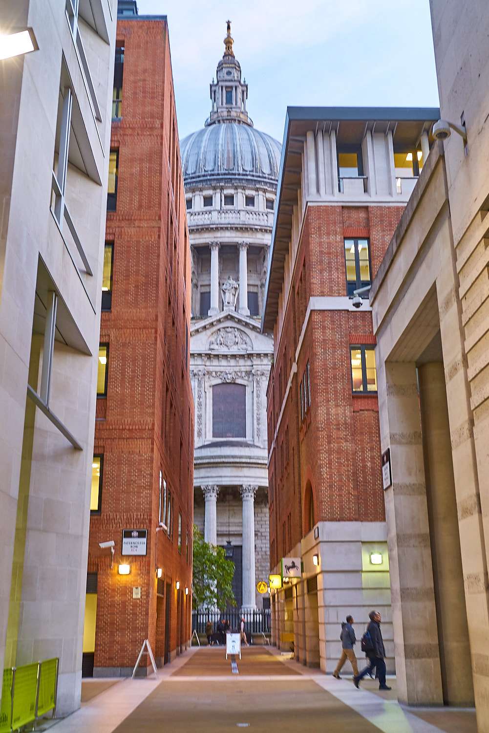
 No need to go overboard with this contrast reduction (I tend to add a little clarity to make up for the lost punch, but that also diminishes the effect). Even though subtle, the effect is clearly there and the images take on a more pastel look without requiring heavy lifting on the saturation sliders. Compare the 5 images above with those of sections 2 & 3 (more saturated but less colourful).5. Increase the contrast. Of course, once an effect is identified, you can use it both ways, right ? When a scene is high contrast, why mess with it ? The contrast drew you to it, the contrast must shine through in the final image. Increasing what contrast is already there will produce more menacing colours, the opposite of the Miami Vice pastels above.
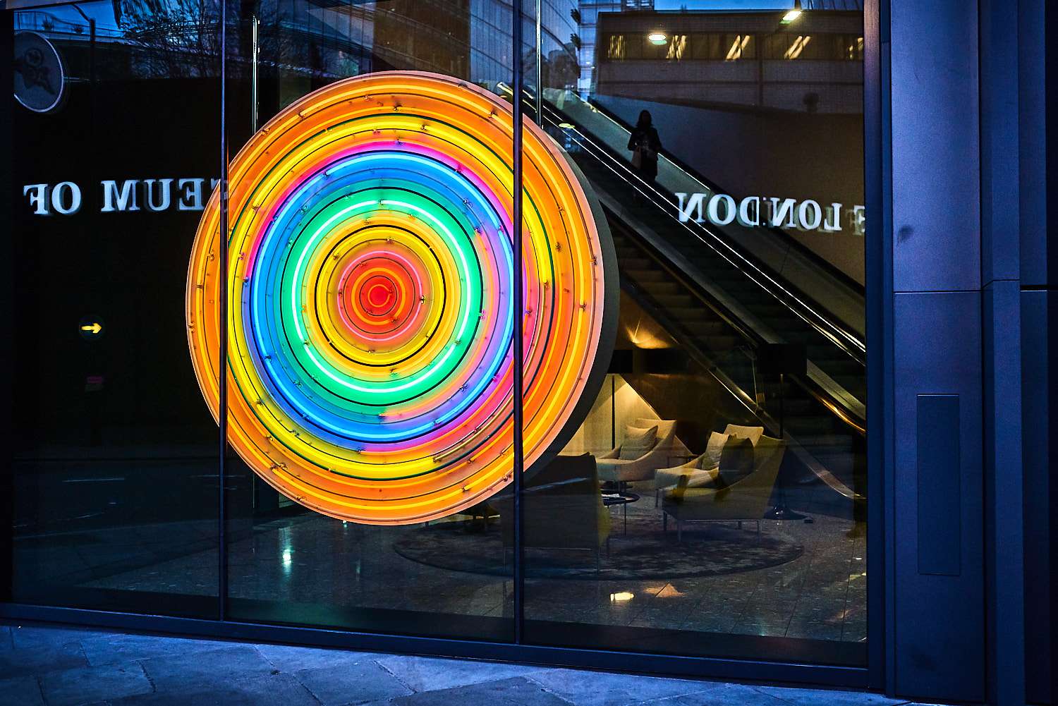
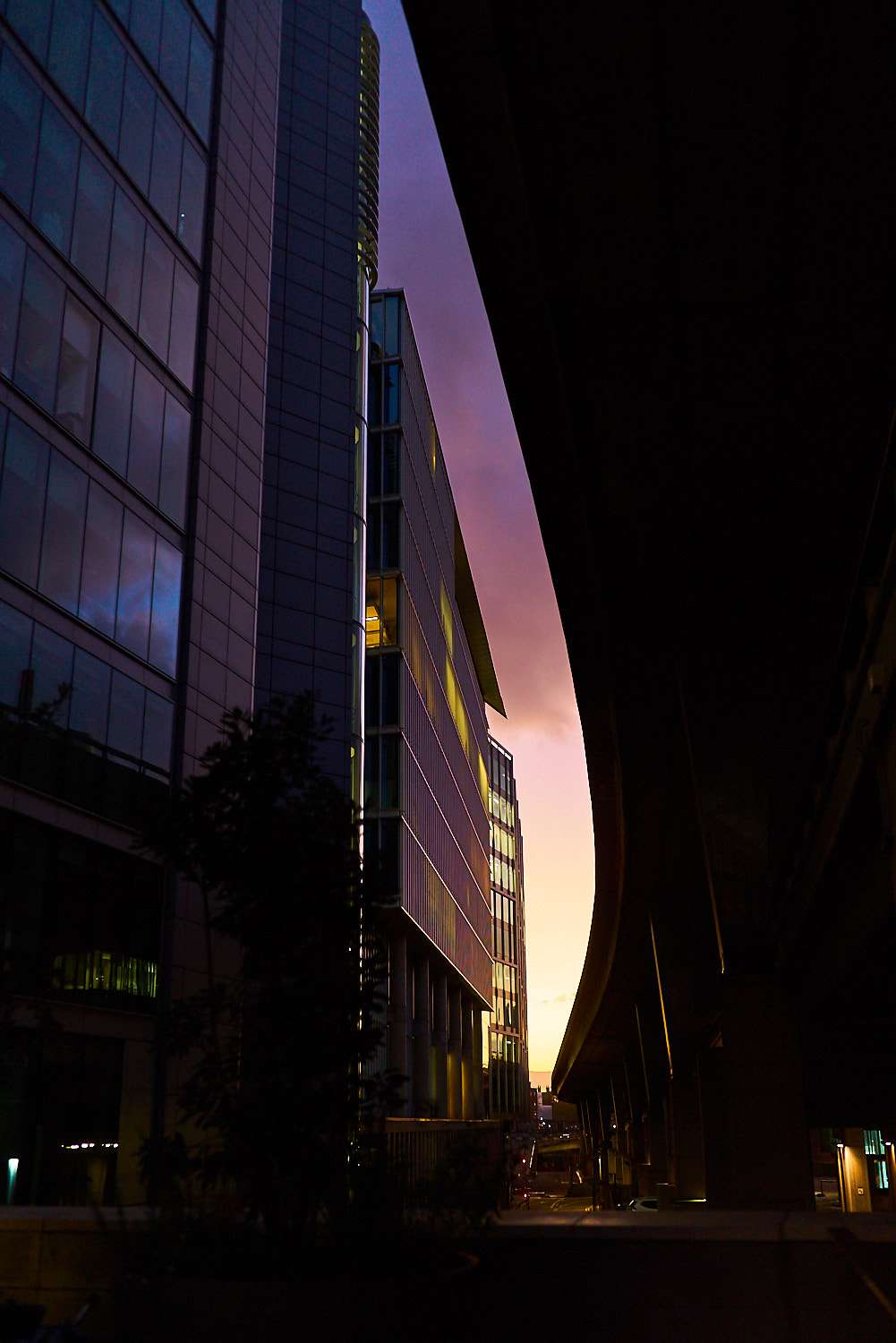
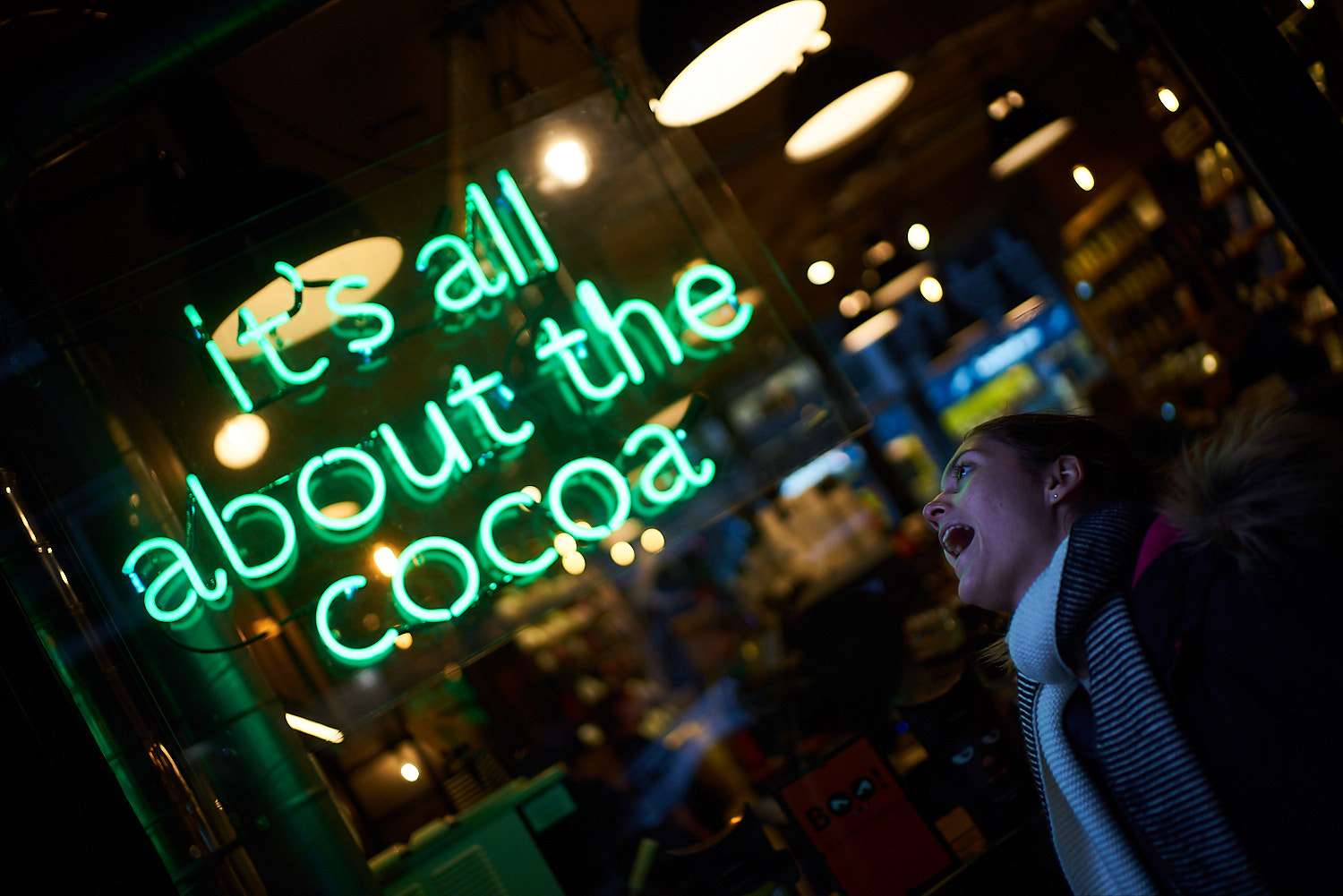
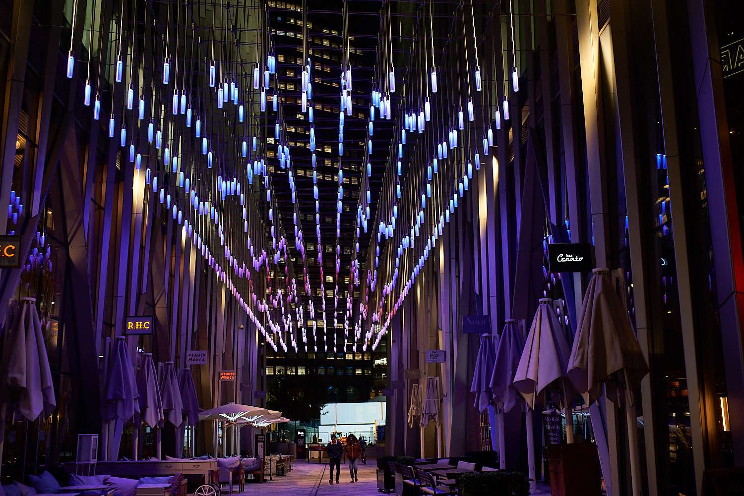
 In essence, the middle two photographs are monochromatic. Simply not shades of gray but shades of purple. They would have worked well in B&W. They are all about the shape and contrast, but the crepuscular hue adds a lot to them.6. Make the most of colourful lights. When natural light is super harsh or the sky is very dark, contrasts tend to become very high and I feel those times of day are better served by B&W photography. But artificial light can be a colourful saviour in those situations and however nuts you got with them, it takes a lot a misbehaviour to create something that looks distinctly overboard (unlike some 'enhancements' of natural light). The variety of colours present in artificial lighting isn't always completely obvious with the naked eye and can be more visible in photographs. Wonderful compositional opportunities ahead, then ;)
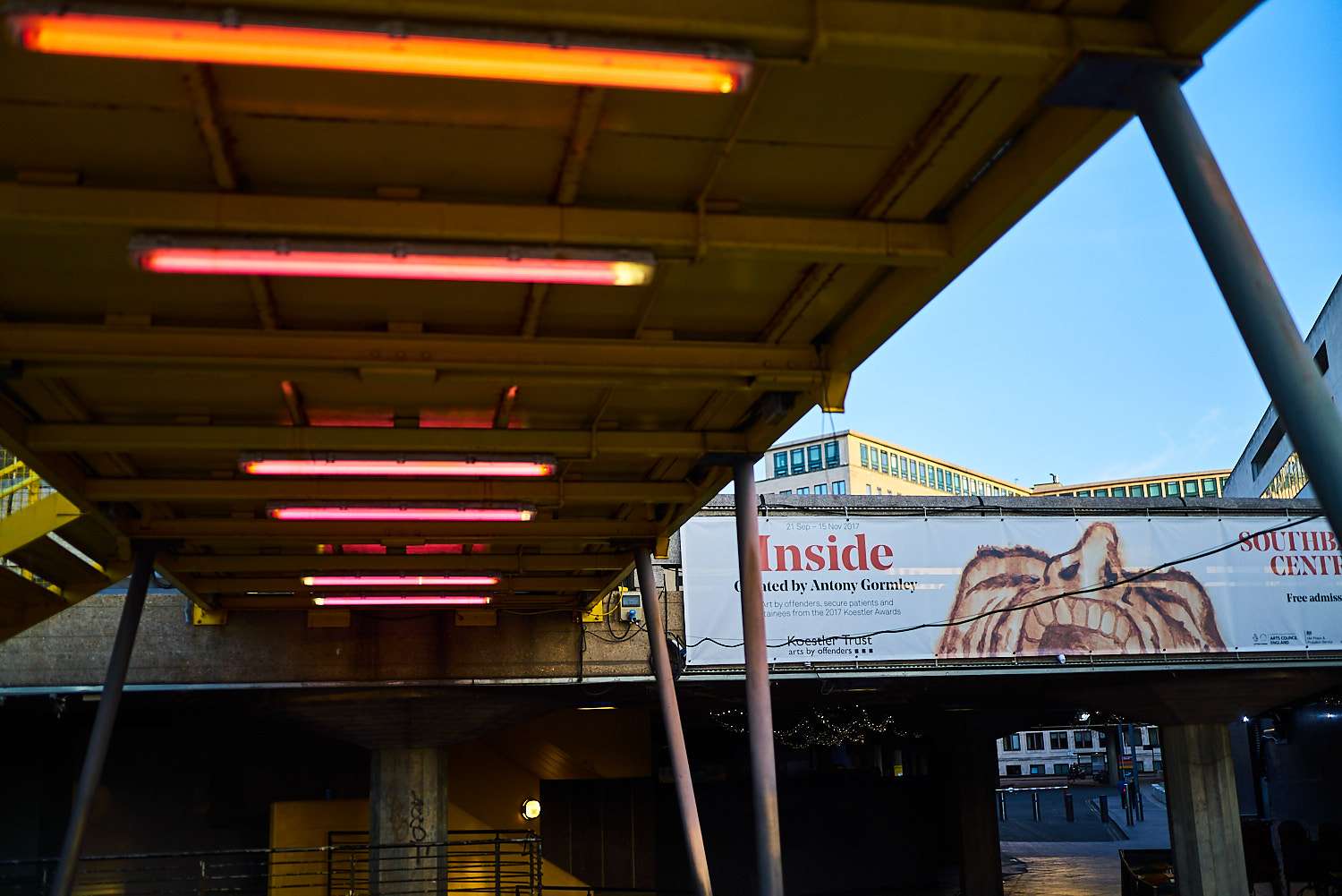
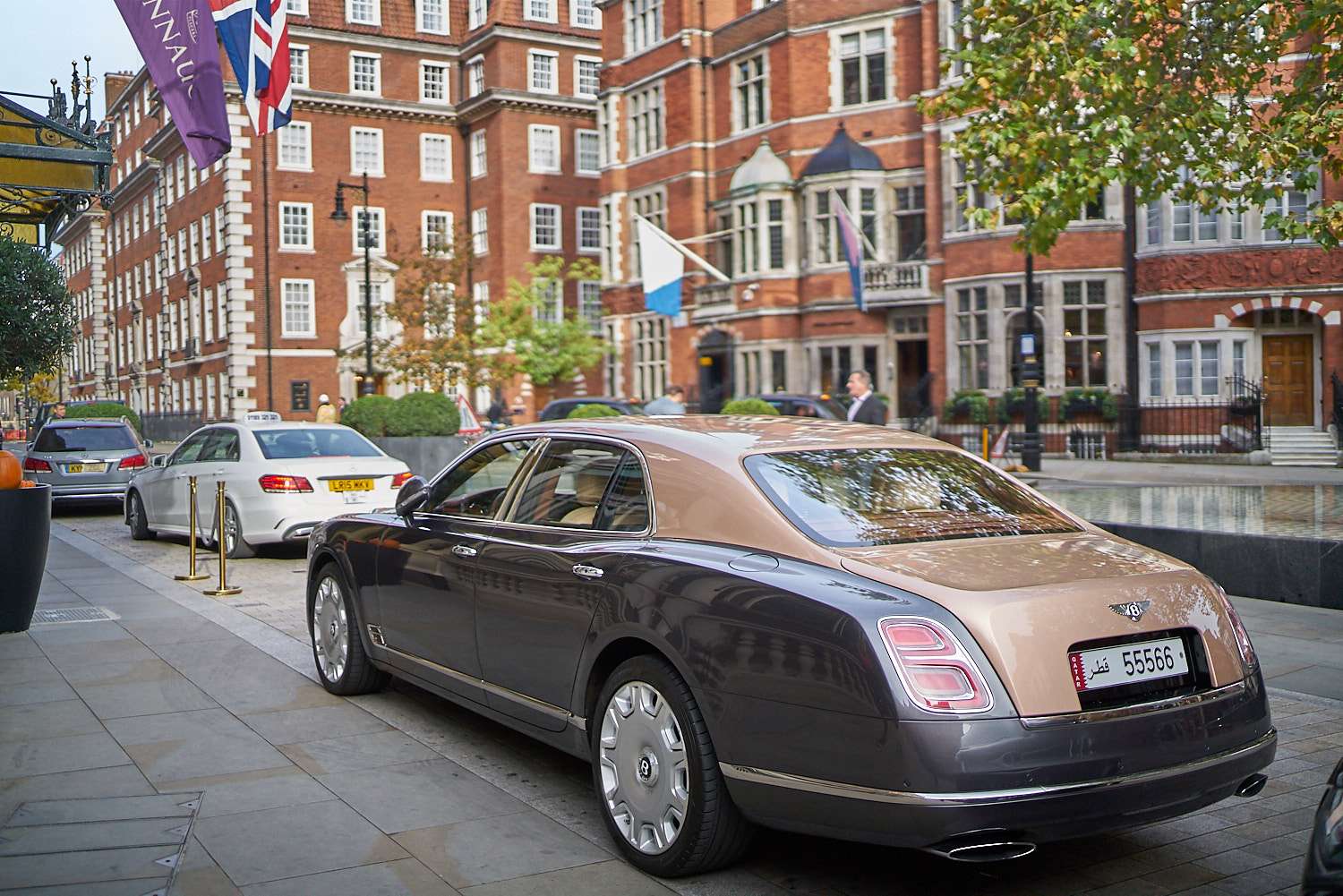
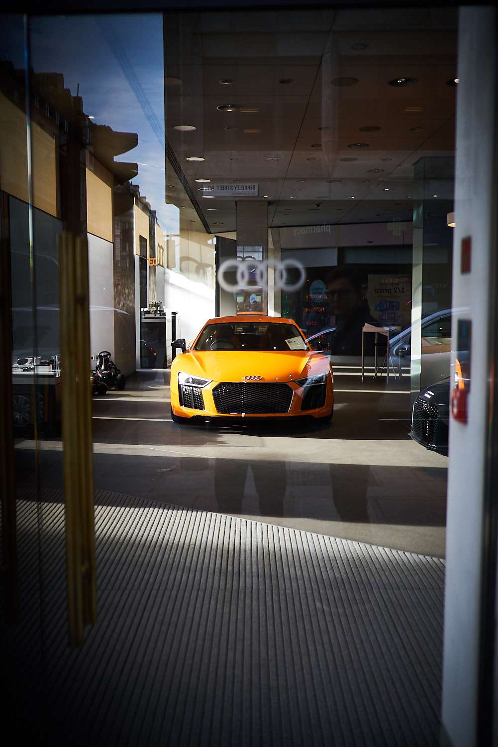
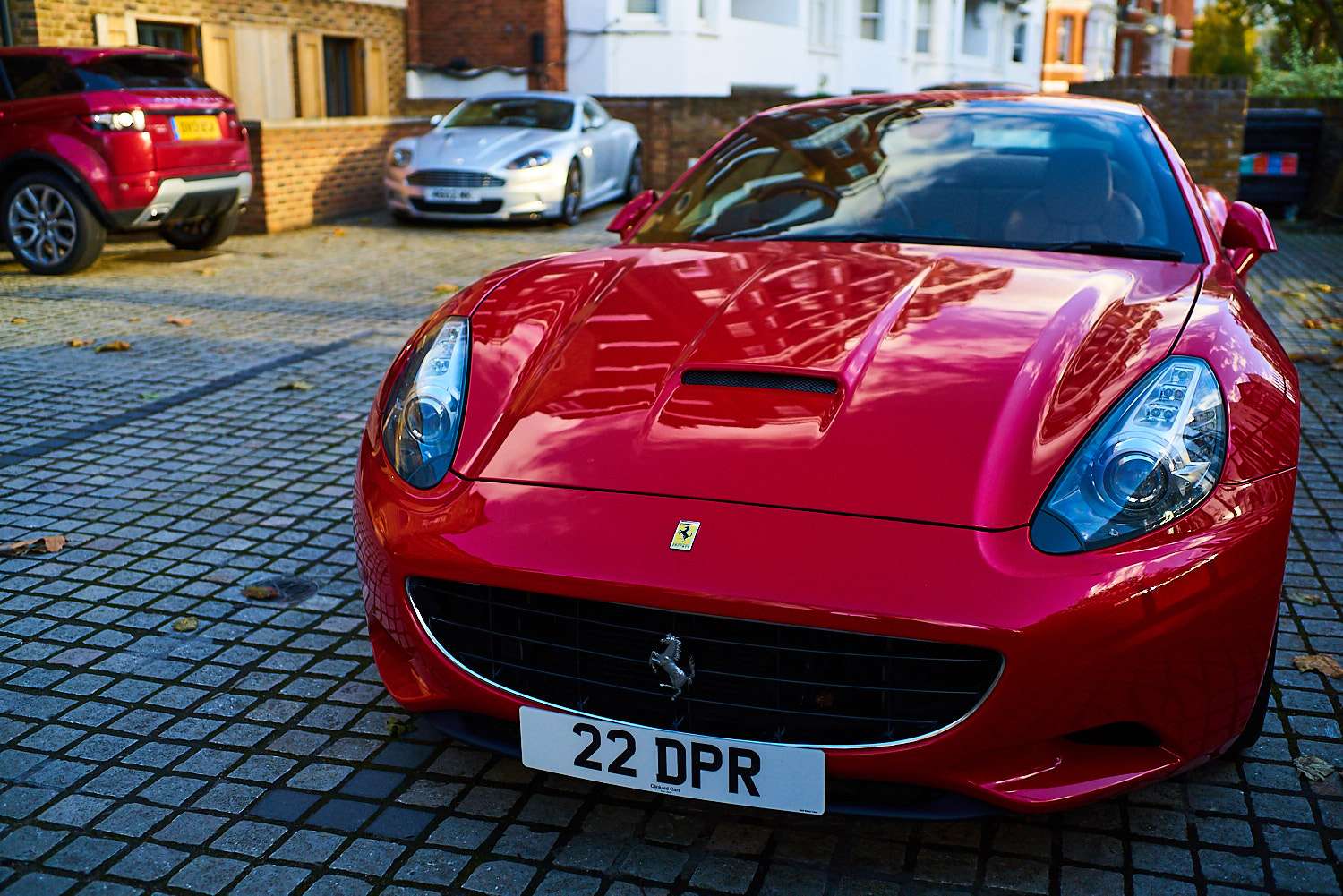
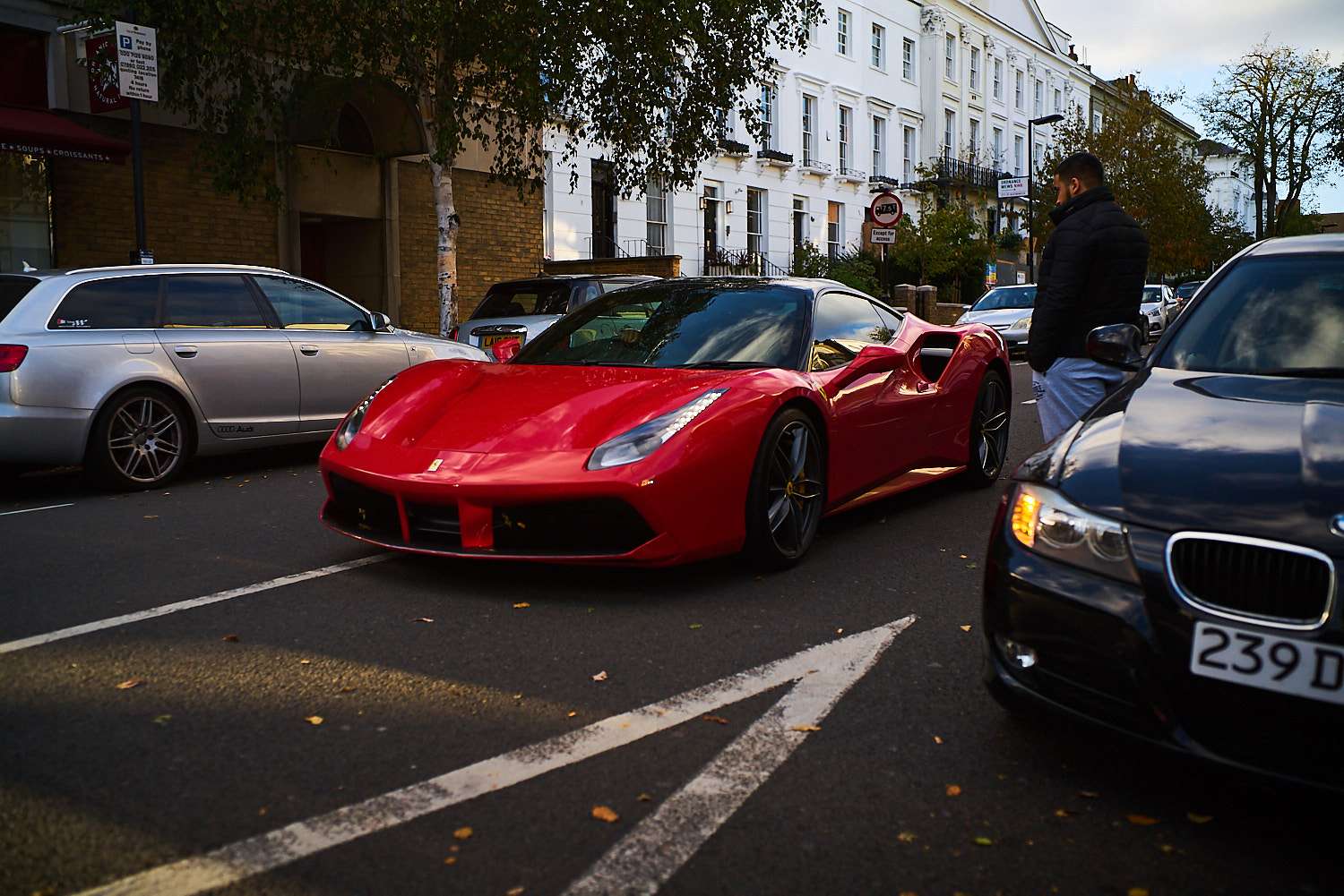
 7. Go to London. This was my intro and it will be my conclusion. If you live in a place where car dealerships will let you order any colour provided it's a shade of grey, London is going to seem psychedelic to you. This is a city where car designers seem to be on acid.
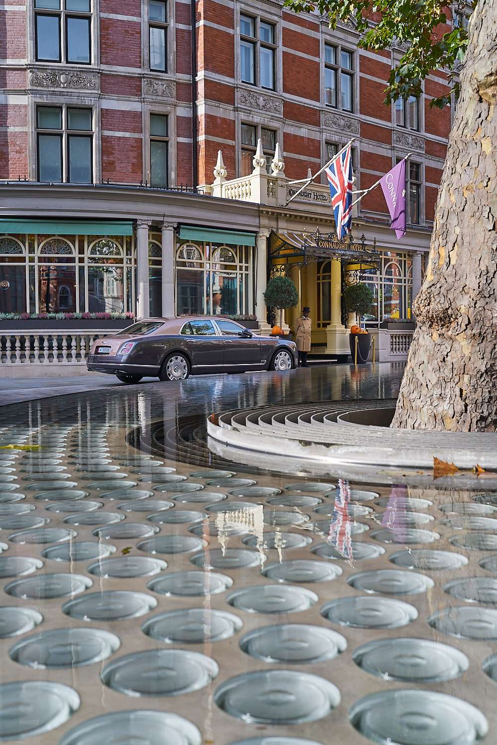
 Bus designers seem to be on acid.
 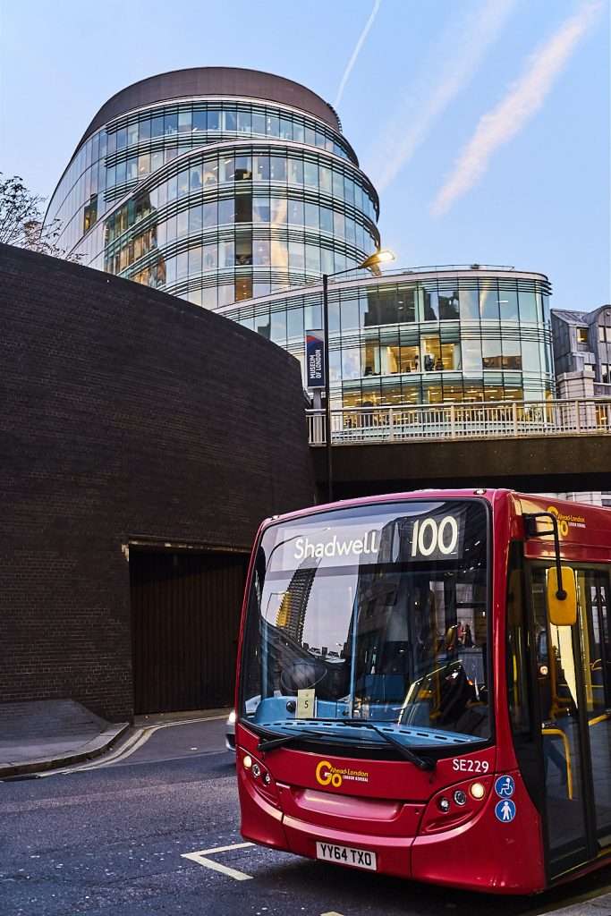 Plants seem to be on acid.
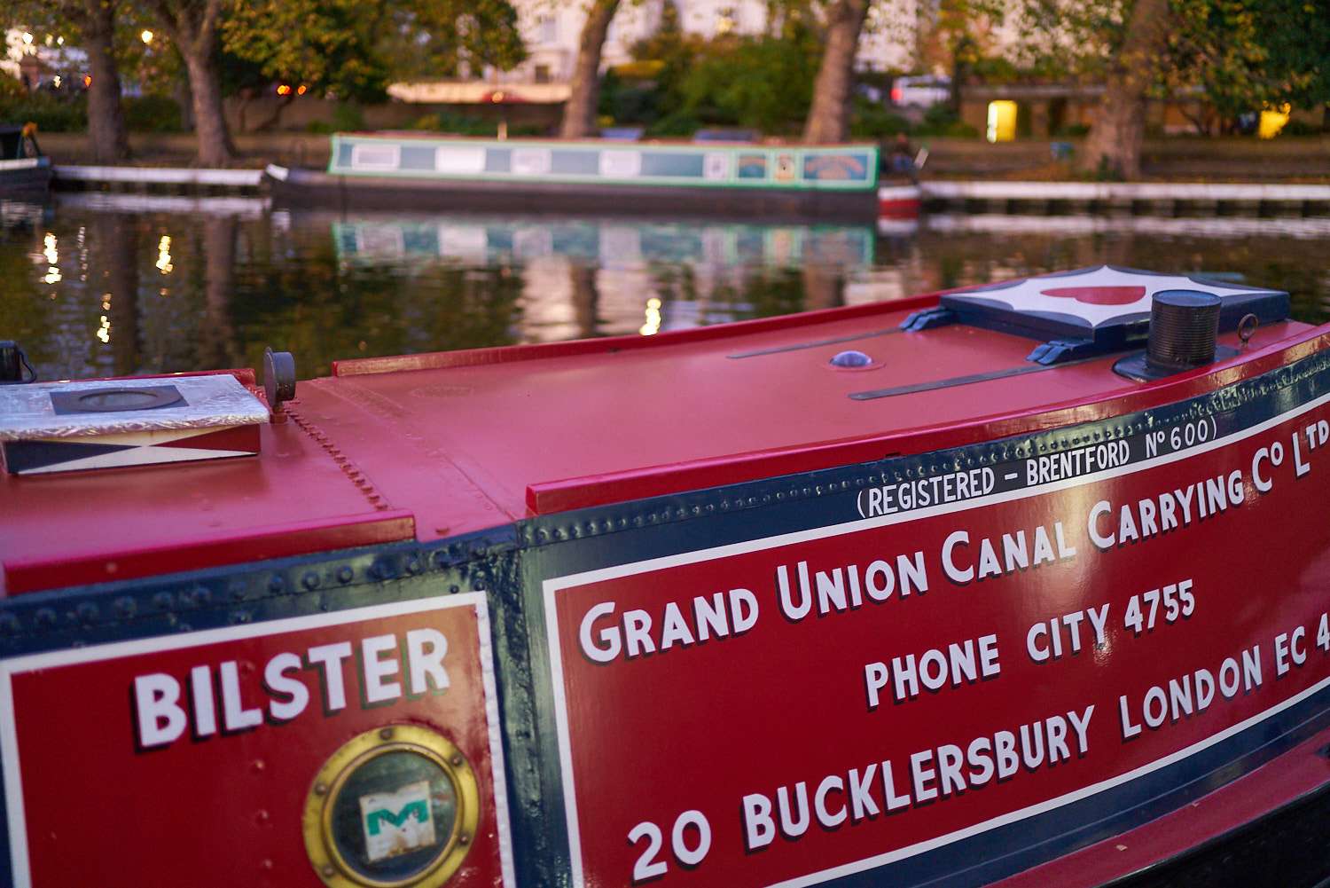
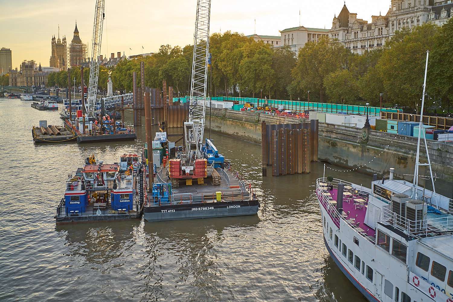
 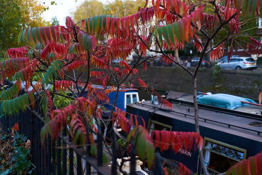 Boats seem to be on acid.
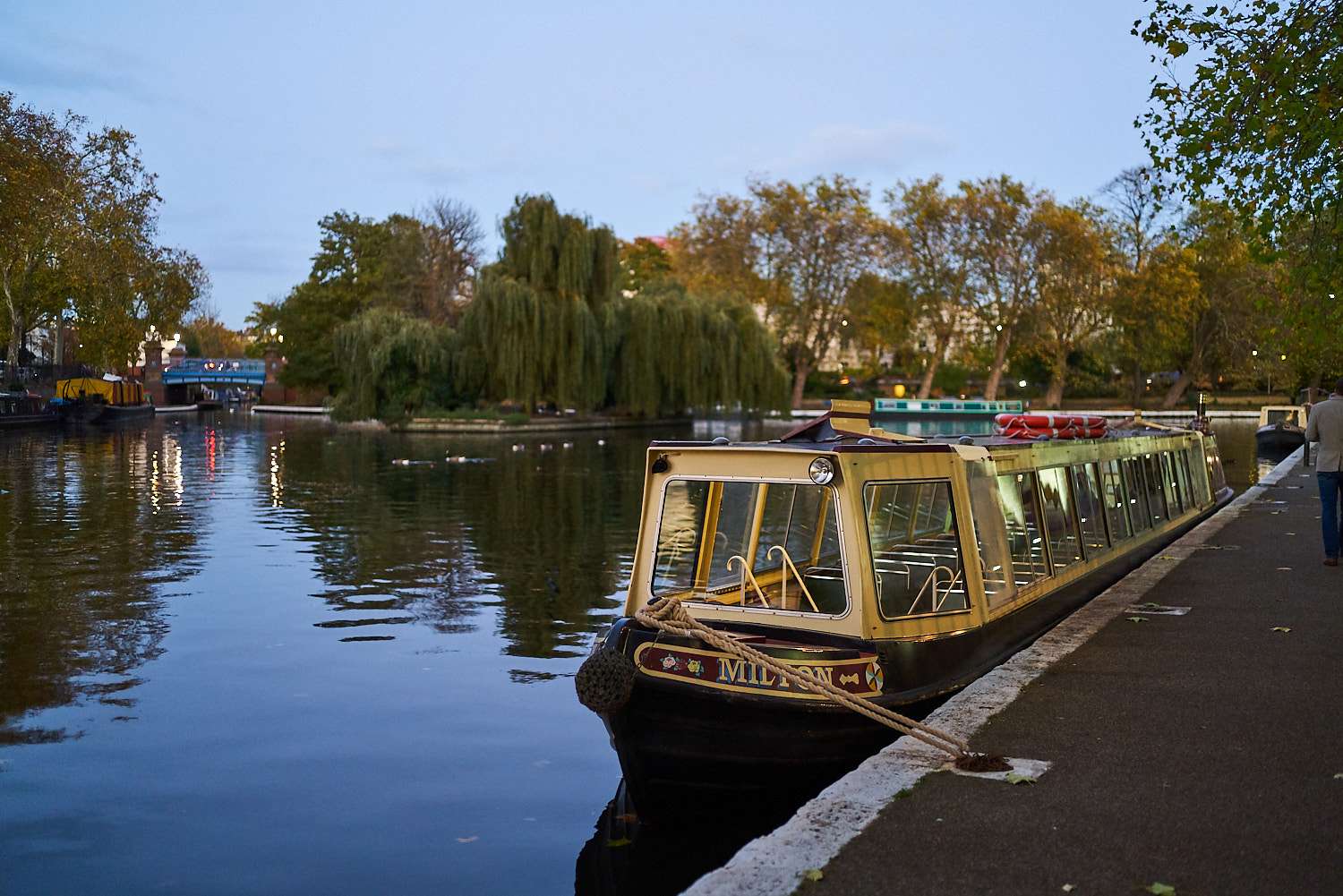
 Taylors seem to be on acid (and you should see the bright orange Kingsman suit just next door ...)
 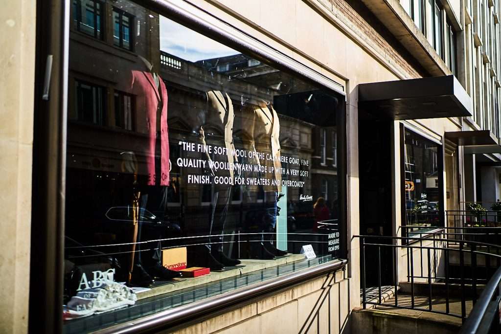 Architects seem to be on acid.
 Given the highly colourful nature of the subjects at hand, I took very little risk to create those images, simply making obvious or enhancing what was already there. In low contrast light, this means lowering the contrast even more to create soft palettes and dreamy images (probably the reason why so many people love the period just after sunset or before sunrise). In high contrast light, this means increasing the clarity or contrast of the image to draw bolder lines and let colour take on a deeper, more fierce, hue.At the end of the day, the aim of this exercise is not to argue for strong contrasts or bold palettes. Subtlety is the master-key to success in my book.
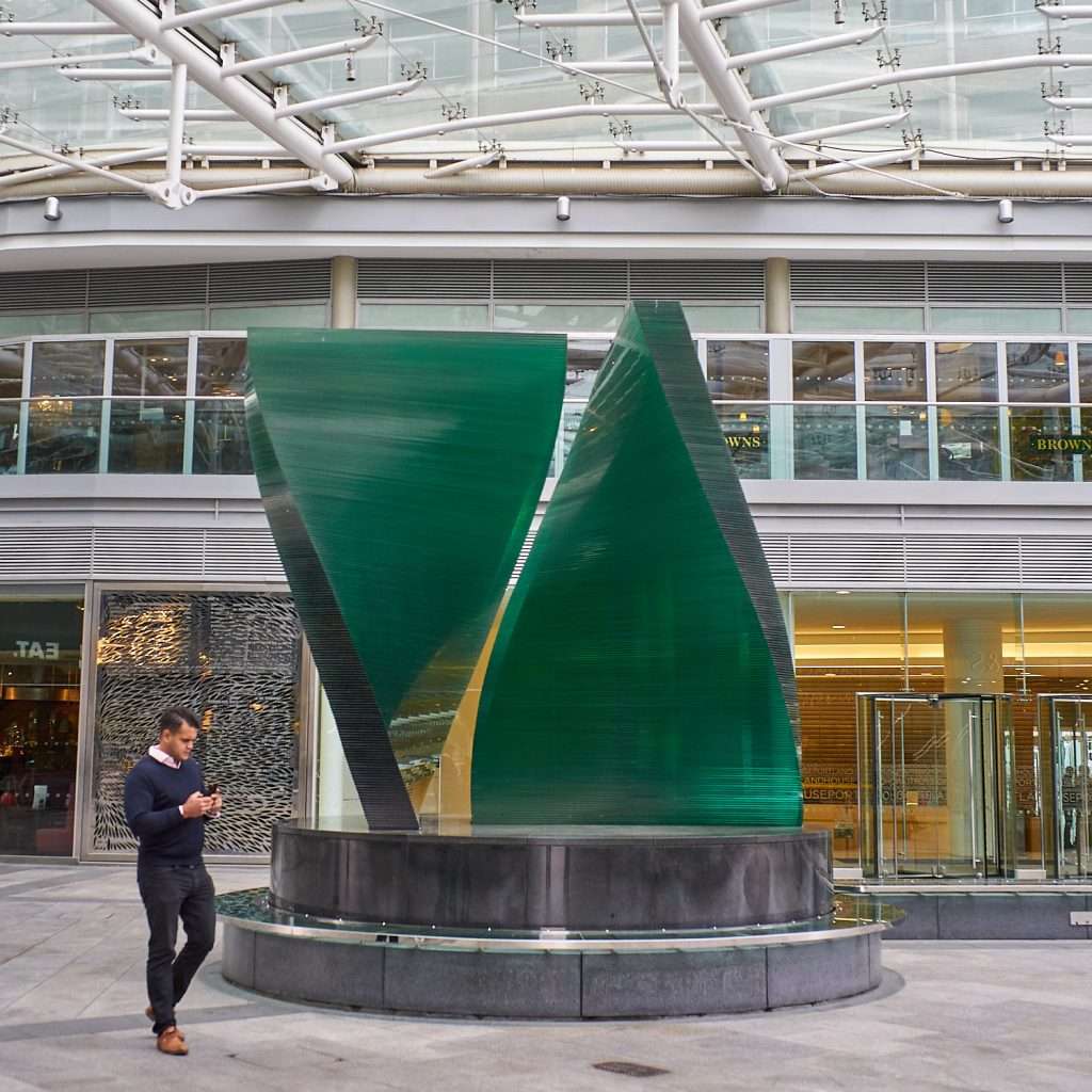
 But, by taking things to extremes, you soon get a feeling of how to retain balance in exaggeration and how to direct your post processing in a way that blends in the strongest elements of contrast management and colour theory. I don't believe in low-impact images, that's a personal thing. But the harder you press, the more balanced your pressing must be if the processing isn't to take the focus away from the intended story. And that's what makes the game fun and images meaningful!
 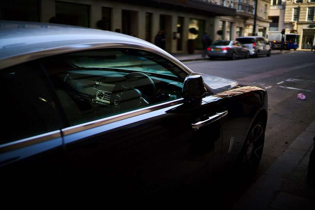 Next up, London in Monochrome. What say you ?
[hcshort id="7"]