#1225. Calibration and Color Grading: Two tools to up your colour game in Lightroom
The usual sliders in Lightroom don't give you enough control over colour to define a consistent style or get the most impact out of your files. Here are two alternative techniques.
6 months from now, I'll probably turn back to this post and see only all that I didn't understand about colour grading ;) But there's still enough to play with using those two tools to create a worthwhile post and get others started on their own path of exploration.
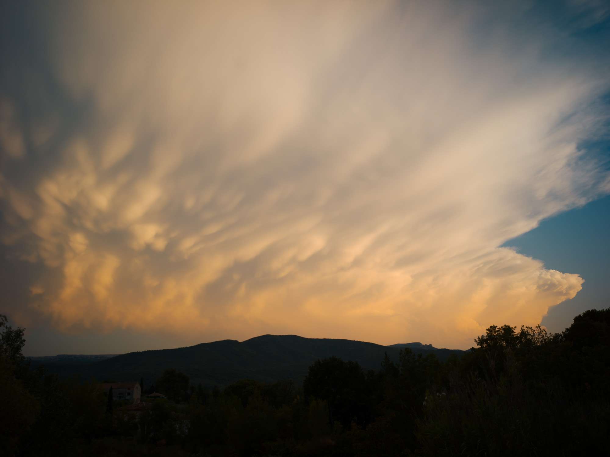
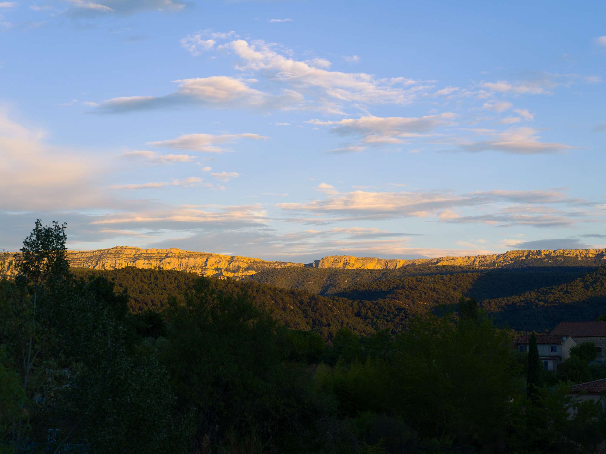
Open any Ernst Haas book, and you'll be stunned by the vividness of the colours in his photographs. Something like this storm cloud at sunset is the norm rather than the exception. And think about any other great colourist, Steve McCurry, Saul Leiter, Henry Lartigues (yup), among others, and you can't fail to be impressed by the sheer impact of the colours in their compositions. On top of contrast, light and size, those giants of photography introduced another element into the power-distribution games that define composition in a frame.
In fact, my default setting has long been b&w because I have been unable to produce such incredibly powerful colours in my own photographs. Note the emphasis on powerful, not oversaturated, not necessarily neutral, but still realistic. This is where the Calibration and Colour Grading tools come into play.
The limits of Saturation
When we return from a shoot, most of us edit our colour photographs using the white balance, saturation and luminosity/contrast sliders. If we're feeling lazy, we can just click 'Auto', which sometimes lands on a very acceptable finish, as below, but sometimes looks terrible.
And, if something more exotic is required, a preset can be slapped on in a click. Something like this.
I think we all more or less understand how exposure, contrast, highlight, shadows (...) work. All of those work on luminance levels at various places along the histogram, and relative levels between more or less distant pixels in the frame.
Saturation is a lot less easy to comprehend.
In fact, I'm not sure many people outside Adobe really know exactly what the saturation slider does. But one thing is certain: overdo it, and the photograph looks terrible.
The problem with saturation is the same as any single-metric solution to a complex problem (CO2 & global warming, eg). It doesn't work in most situations. In the photo above, the leaves are roughly OK, the walls are a bit over the top, and the sky is shocking.
Lightroom has a solution to this, the HSL panel.
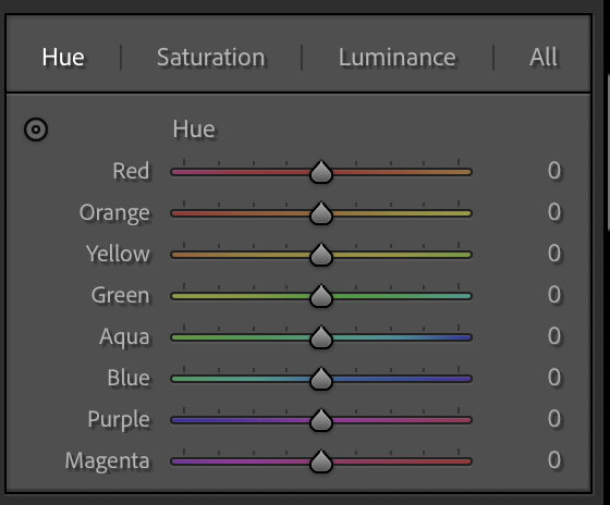
Here, you can correct the hue, the saturation and the luminance levels of 8 colours individually. The good thing is that this gives you control over a specific set of pixels in the frame (only the red, only the orange ...) rather than all of them, as with saturation.
But, in some situations, that's also their limitation. Cue the other two tools.
Calibration
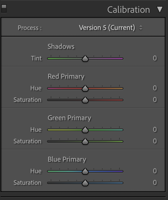
Lightroom's right panel is meant to have been designed to follow a logical process of post-processing. In spite of this, I'd like to present Calibration, which sits right at the bottom of the frame, first.
This is because I'd apply this before using the Color Grading panel.
Calibration is essentially what we all call "colour science". When a sensor receives photons through its Bayer filter, those are transformed into a number of electrons. Reading a sensor is simply filling in a bix matrix with numbers. What colour we assign to a certain number is often quite subjective. And no two manufacturers make the exact same choices, so Nikon red isn't the same as Canon red, Sony red, Pentax red, RED red (sorry), Pixii red, ...
Calibration will help you change that colour science to your own taste. If you knew the recipe, adjusting the proper sliders on a Sony image would make it look like a Nikon image, a Leica image ... It can also let you move away from neutral-looking images in a way that can remain natural looking. The most famous example of this is the Teal & Orange look found in many films after Michael Bay popularized it (and others overused it), which gives a golden hour vibe to shots.
The principle in this look is to push blues towards teal and reds towards orange. Since those are complementary, you can make the contrast between blues and reds stronger without adding saturation to any other colours in the frame.
This can be used to good effect, as above. This was very pale and grey. Pushing saturation just looked unnatural. But pushing reds towards orange and blue towards teal, with a bit more saturation each, without touching any of the other colours, gave it just enough pop to be visually interesting. And it remains balanced looking, though comparing it to the original would show how un-neutral it is.
And, as with any technique, you can go overboard. Sometimes in ways that are pleasing. Sometimes in ways that aren't ;)
This is the calibration panel. For the purposes of this post, the images presented do not make any use of the first "Shadows" slider.
To recreate the Teal & Orange look, simply slide the "Blue Primary" Hue slider to the left (towards Teal) and add or remove saturation to suit your tastes. And slide the "Red Primary" Hue slider to the righ (towards Orange) and add or remove saturation to suit your tastes. Green doesn't have to change, though you can alter this as well, to suit your tastes.
Since most pixels combine some R, G, B information, you'll notice that all of those actions affect the whole frame, as if a glass filter was used on the camera. This is very different to what happens in the HSL section, where only red(ish) colours are affected by a touch of the Red slider. This means a sky can go magenta or purple when you try to alter a tree, for instance. Calibration is a global tool. And, as far as I know, there are no rules to follow. Just like chefs, experienced colourists have perfected some recipes, and you can just experiment in various lighting conditions, for various types of subjects, to gain the same experience. You can't break anything :)
Color Grading
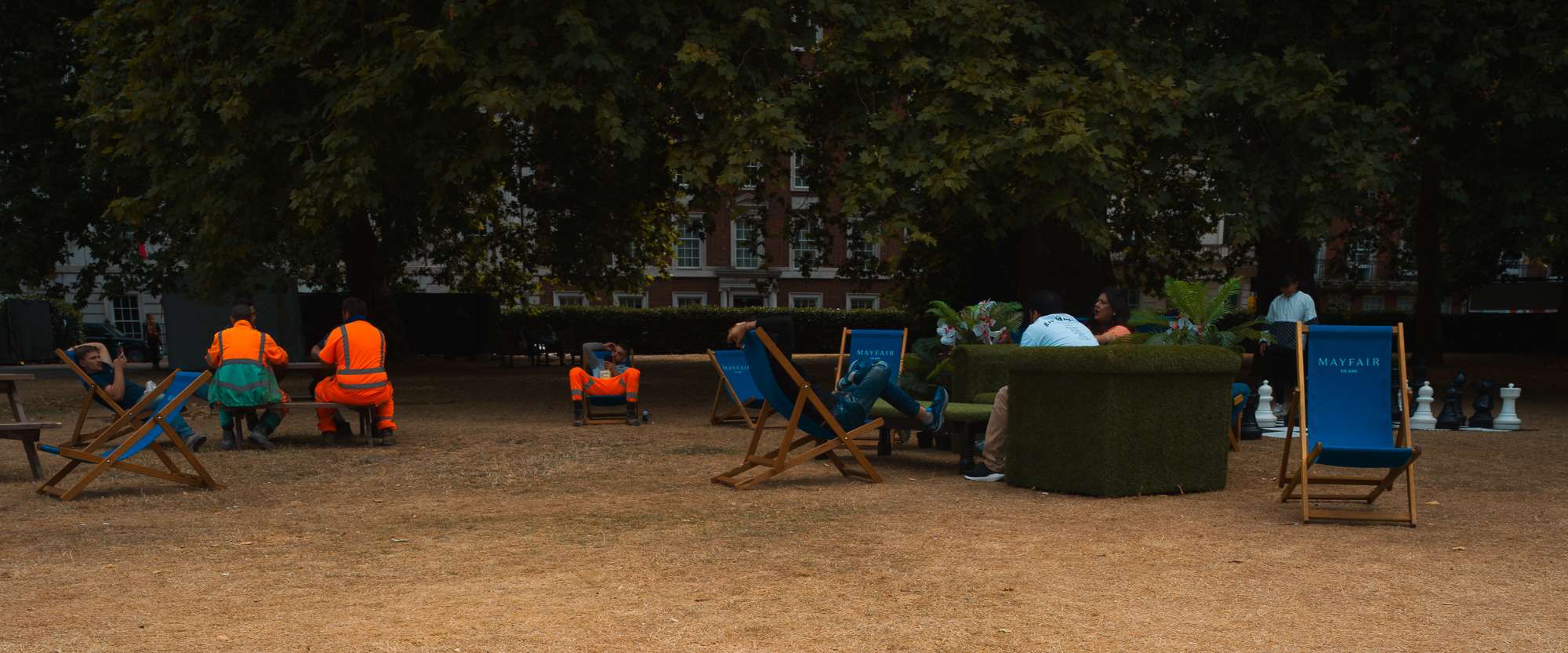
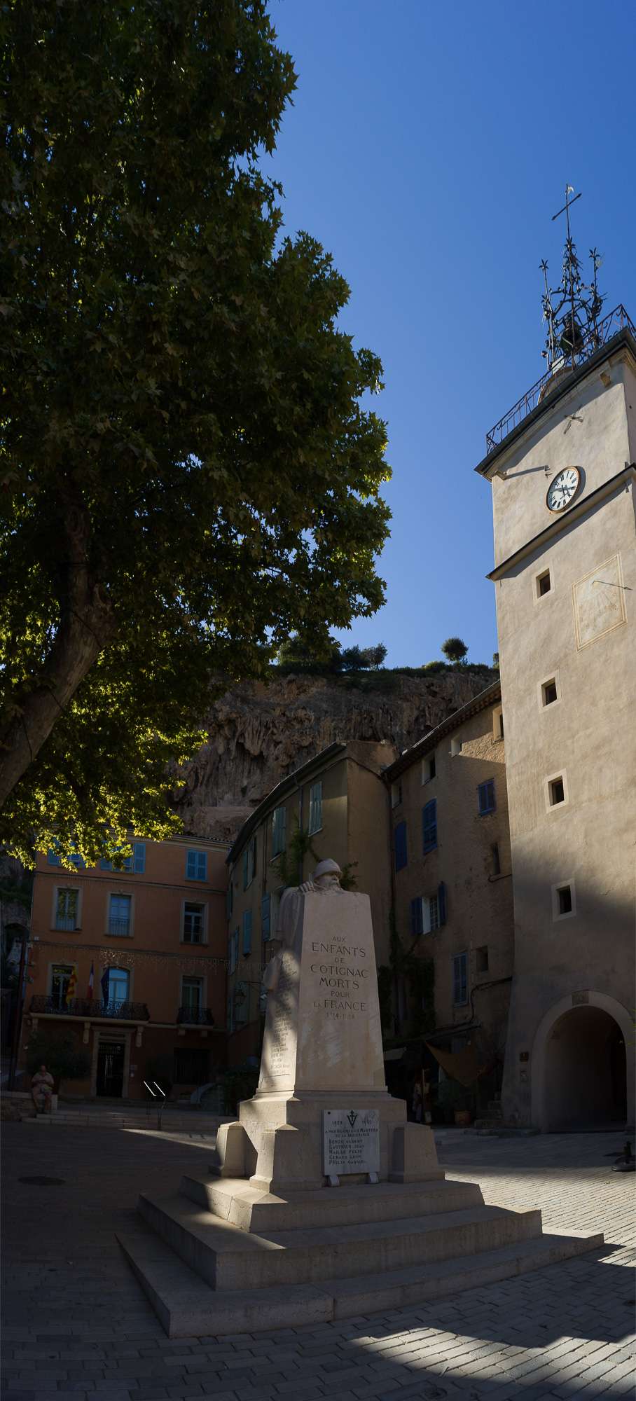
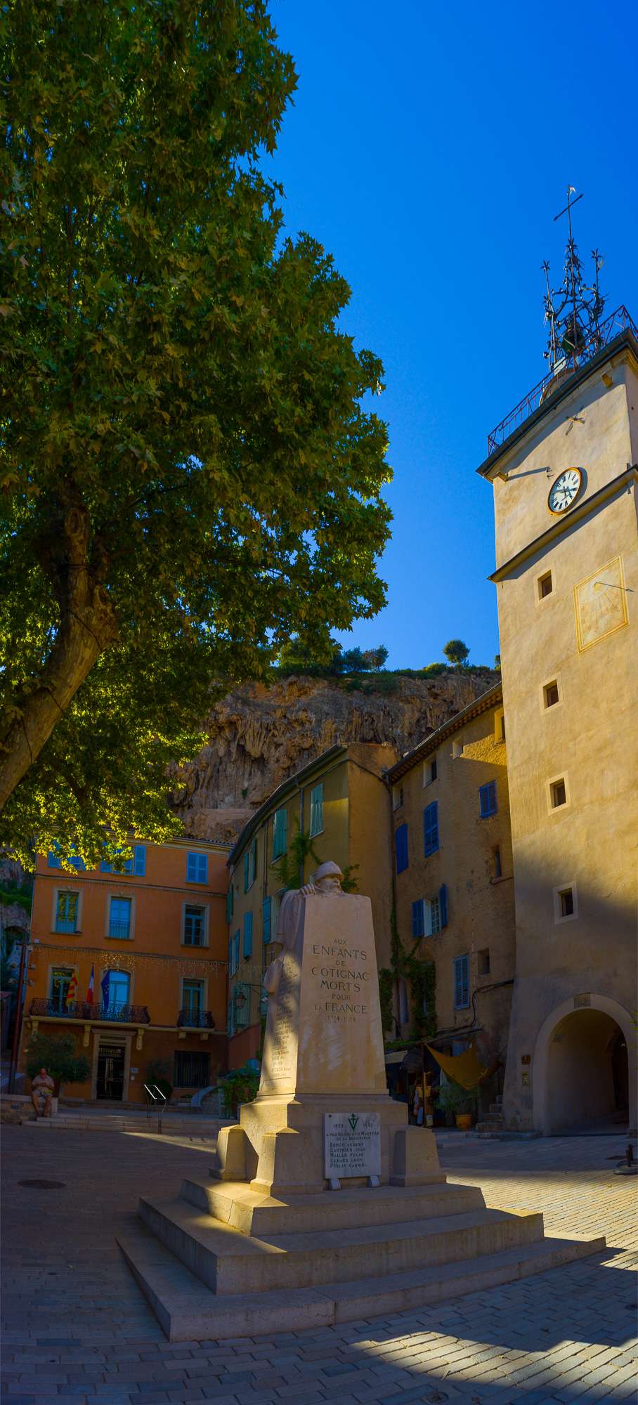
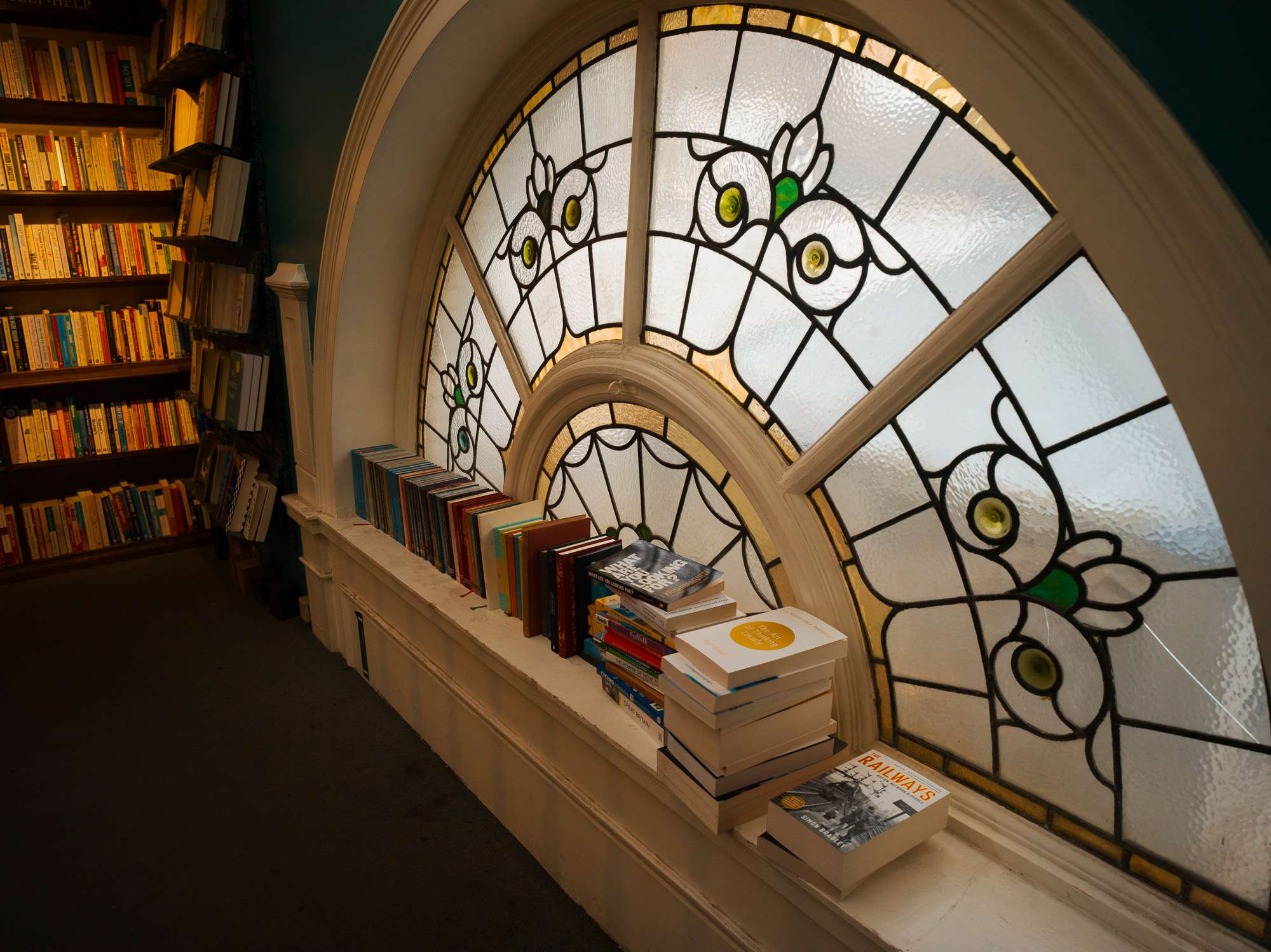
The Calibration tool is amazing to work on the global look of an image. In two of mine (the men in orange pano at top, and the semi-circular window), I tried to reproduce the sort of look you would see in a movie. And you could simply "copy/paste" the edit to a whole bunch made in the same conditions to create a very homogeneous set.
The Color Grading tool, in comparison, feels more like a final seasoning step, which you can sprinkle after fundamental edits to fine-tune the aesthetics of each image to your taste.
Basically, it lets you edit luminance and saturation separately, and in different ways for shadows, midtones and highlights. The most basic adjustment is a boost to midtones luminance, which adds a bit of sparkle to an otherwise dull image, as below (although this still needs work). It won't save a dud, but can make difficult lighting somewhat easier to tame.
The Color Grading tool offers the option of editing Midtones, Highlights and Shadows separately, or the whole picture. To access each option, click on one of the circles at the top of the section.
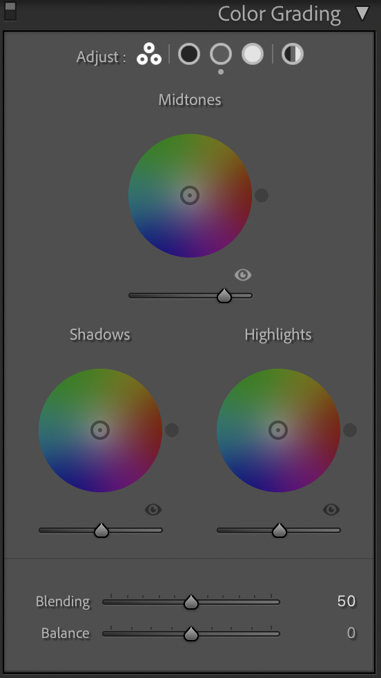
Each of these lets you adjust Hue, Saturation and Luminance separately, for the chosen wheel. Note that the saturation is applied to the hue you select, not to all the hues in the midtones/shadows/highlights. So you can work on, say, shadows, apply a purple hue on them and saturate this hue more or less.
You can also adjust the luminance of the selected range (shadows, midtones and highlights). So, on top of that saturated purple filter, you can also make shadows (e.g.) darker or lighter.
At the bottom, the Blending slider lets you specify how much you want to separate or blend the modifications made to shadows, midtones and highlights. So, you could just lift the midtones, and choose a low blending value to leave shadows and highlights more untouched than with a high blending value.
And the Balance slider lets you decide which of the modifications applied to each zone (shadows, midtones or highlights) is more important than others. You could decide that the dark purple midtones are not very important and shouldn't be the dominant theme in the image. Pushing balance up will give precedence to highlight edits over shadow edits.
I hope all of this makes sense. But it's best to just experiment and see for yourself. I'm just saying this tool lets you isolate luminance zones, edit their hue, saturation and luminance and blend the results or favour one over the other. Other tools with different names in other post-processing software should let you perform the same sort of task.
All together, now
Of course, you get the most of those techniques when you use them together. I'm in no way qualified enough to recommend a process at this stage. But my approach would be to adjust basic settings (underexposure and convergence, for me, usually) then consider calibration, then color grading, then fine tune with local retouching if necessary.
As fun as those sliders can be when you go wild, I find their best use to be in small deliberate touches, to avoid slamming the saturation slider.
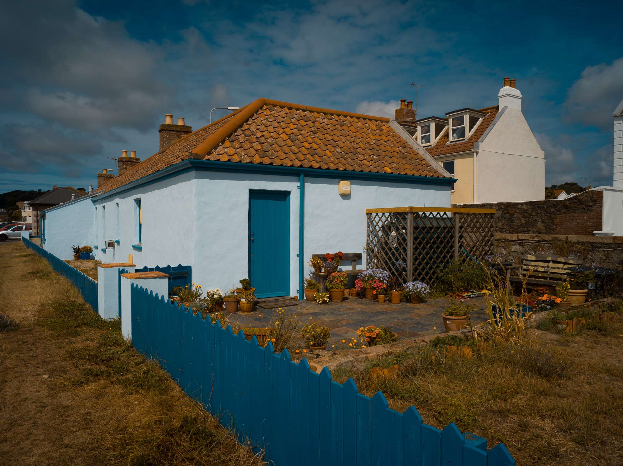
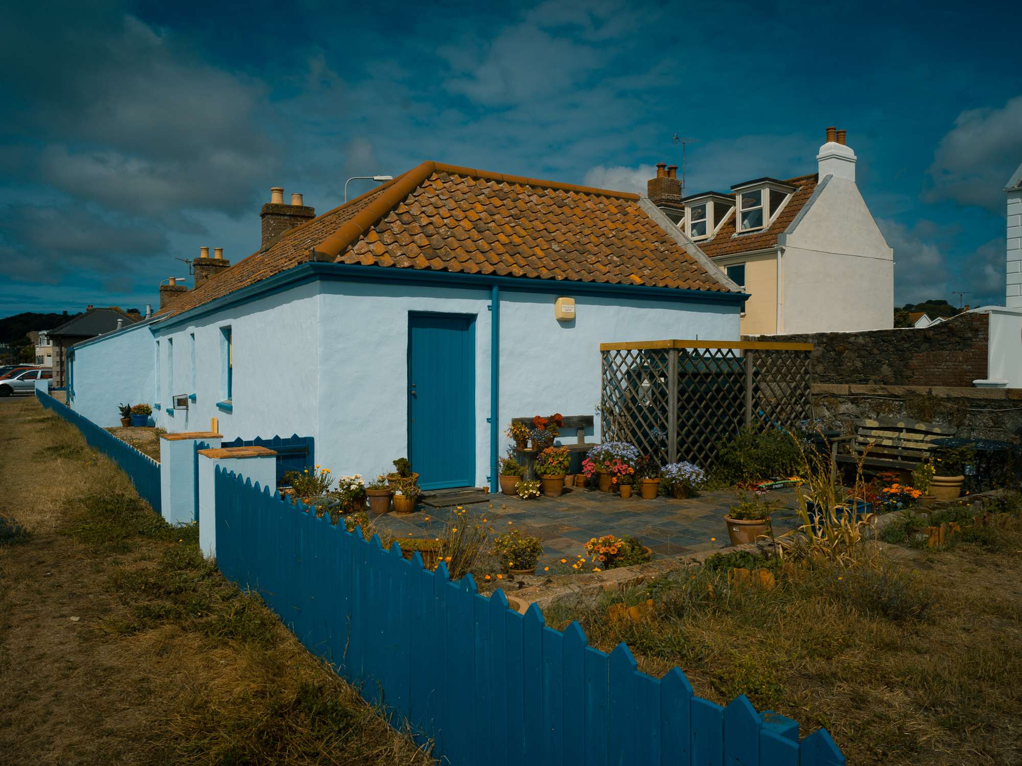
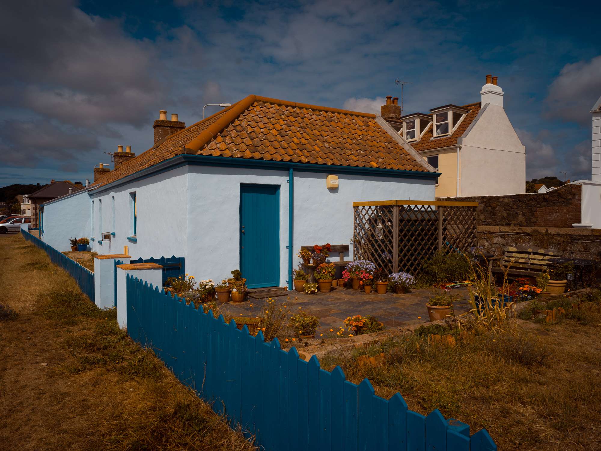
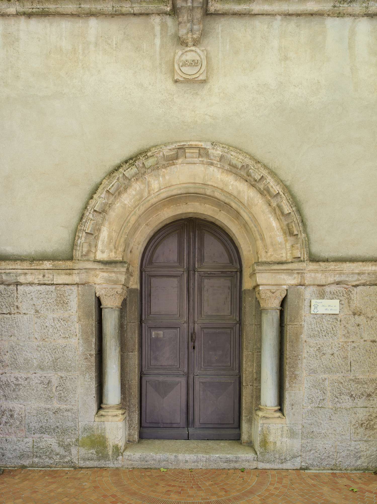
Below, this French post office was in the shade and dull. Correcting exposure was OK, but saturation was never really right. So, using a tiny bit of each technique made the image pop more while remaining more natural.
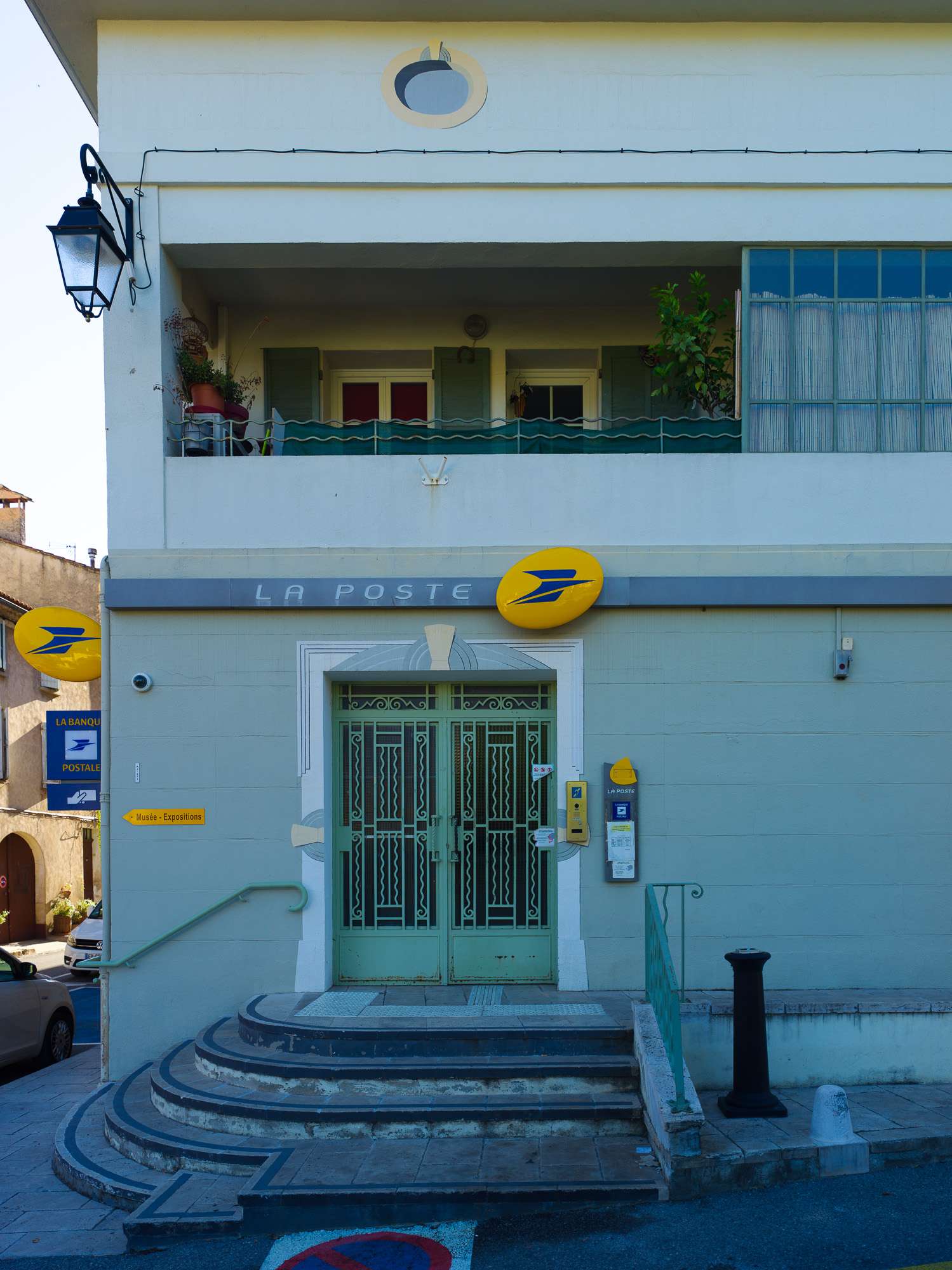
To my eyes, Color Grading helps adjust the dynamism of the image, how flashy it is, while Calibration is devoted to the mood.
What's interesting to me is how this helps you introduce colour into the considerations of composition. (see the "Work rest" pano up top, with orange workers on the left and teal t-shirts and deck chairs on the right).
When a colour photograph is colour-neutral, colour-perfect, it looks documentary, however spectacular the subject. When you introduce your own twists, you start prioritising one element over the others. This is what has always fascinated me in the work of someone like Saul Leiter.
The beauty of those techniques is that you can go pretty far out while remaining balanced.
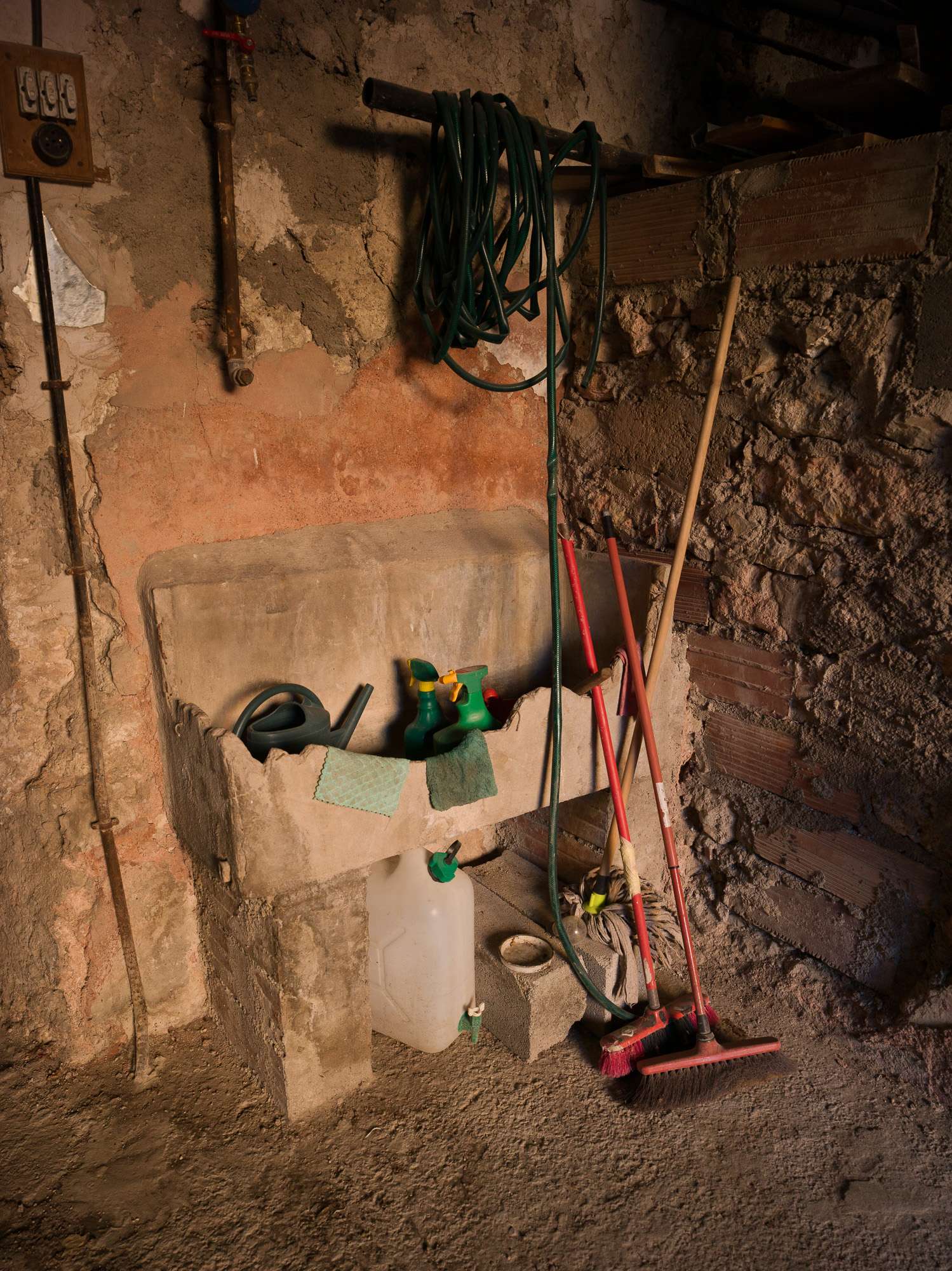
The scene above was cool but rather dull. Pushing saturation made the walls go wild. This is typically the sort of image that would have gone straight to b&w for me.
But using calibration and color grading allowed me to make the brooms and sprays pop a lot more. It pushed the contrast between red and green. This increased the saturation of the hues on the walls, but the photograph remains balanced and credible. The light was warm, the edit just made this more visible.
And, in smaller doses, these tools made the image below look far more interesting than the out of camera version above, and far less garish than the saturated version.
In this final image, I pushed colour contrast further, to create the sort of popping colour that amazes me in the work of someone like Steve McCurry. But white balance is preserved, all is pure natural hue ;)
Some of the pics on this page are overcooked (deliberately, as in the "postcard" series, or not). I'll get better at this with experience. But it's opening a whole other way of seeing scenes, not just focusing on light for composition, but including hues.
In stead of using colour because that's what the camera gives me, or feeling to monochrome when colours are weak, I now have the means to push and tug hues around to replicate what my eyes 'felt' on the spot. 'm starting to see in colour :)
How about you? ;)