#812. How to infuse your images with meaning
Thank you to all of you who responded to the challenge set two weeks ago in "Photograph it like you mean it". It's only when trying to produce images for this article myself that I realised how hard it actually is to step beyond an intuitive process and become deliberate about what a photograph means to you and what you hope it can mean to others. Why didn't I keep my blabber hole shut, I ask you?

I'm a big fan of nature. How do I make a photograph that "says that in just a few words" ? How do I make it obvious that it's not pretty landscapes that interest me but the inner workings of nature, those that regulate the growth of a leaf, a cloud or a galaxy ?
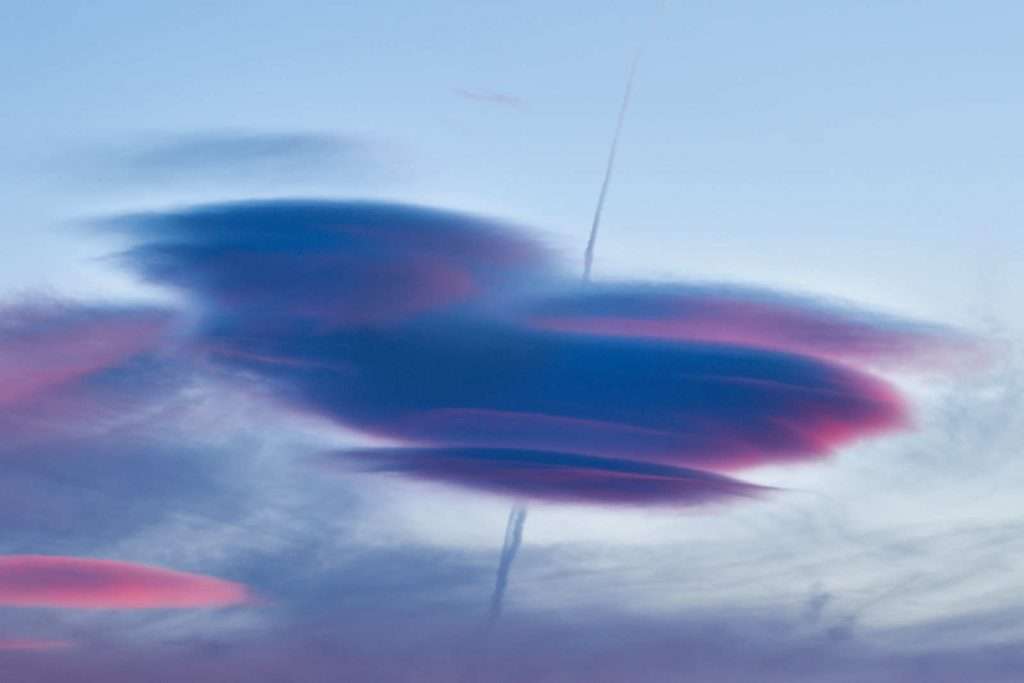
This, above, is one of my candidate photographs. It's good but, to me, only partly successful. Because, without the previous paragraph, you may have thought "what nice colours" rather than "what fascinating natural mechanism can create a cloud like that?"
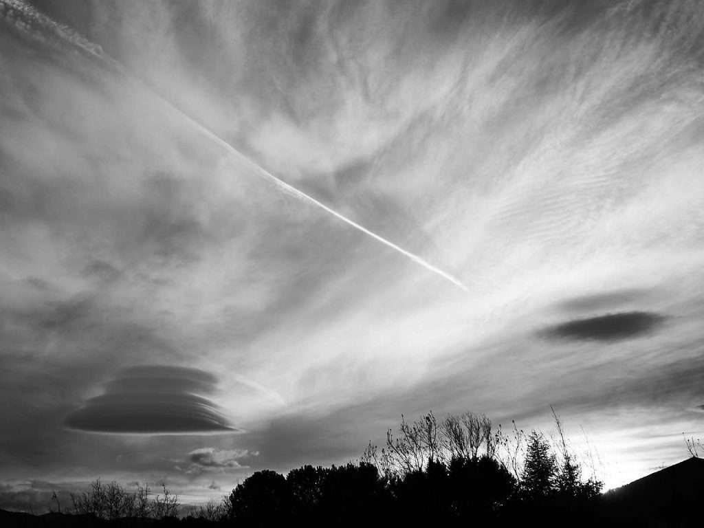
Maybe I can offer a photograph like these (above and below) instead? Less immediately pretty and more visibly troubled. The human plane cutting through the natural cloud formations, the sort that most photographers in search of a pretty picture will do their very best to avoid, sends a more clear message of a jarring coexistence.
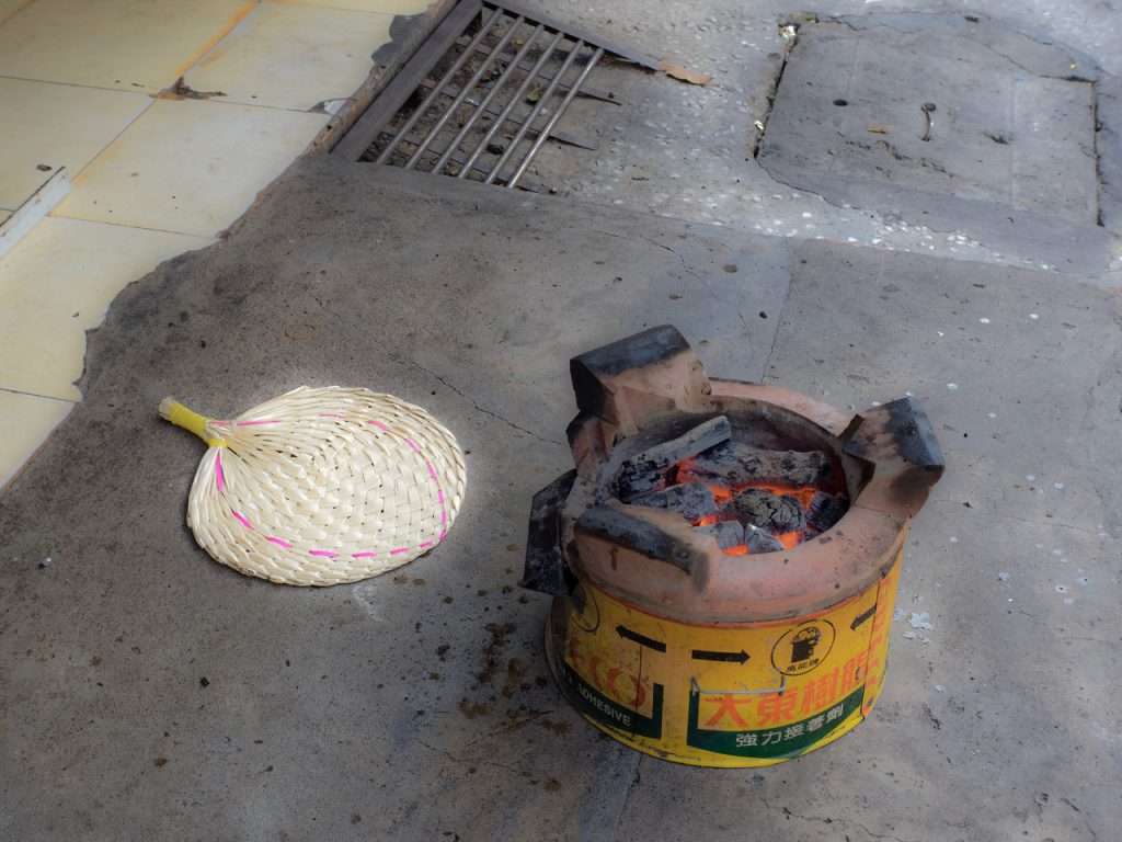
But that only takes into account one aspect of nature, its suffering at the hand of one of its creations. And that's only part of the message. A part that I can just as easily produce a counterpoint to by illustrating how nature is able to digest man's intrusion and make it its own. It would look something like this.
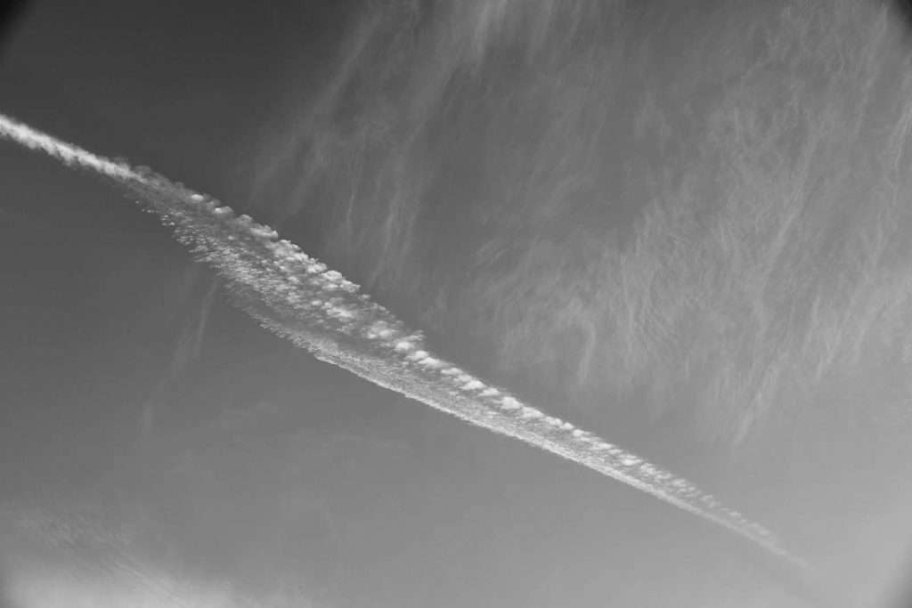
Of the 4 photographs presented above, this, I feel gives the most complete vision of what I find fascinating in nature : it's capacity to adapt, to create complex mechanisms that (eventually) look drop dead gorgeous visually, whatever happens to it. If I could only pick one of the 3, that would be it. Because it looks nice but also because it shows the contrail being absorbed in swirly currents, it shows a broken transition between two more stable periods (the straight parts at left and bottom right), illustrating 2 of the most fascinating concepts in science : entropy and self-organisation.
But if I showed it to you, out of context, without the previous paragraphs, would you think "man, nature is incredibly powerful" or "hey this looks like an eel" or "what the heck is wrong with him" ? It holds intellectual meaning to me, but might not be powerful at all as a purveyor of sense to most others. It might leave quite a few viewers cold and only appeal to those with the same scientific biases and preferences as mine.
So, once again, how the heck do I inject visible meaning into my photographs ? I have no definite answer. And, judging by your submissions, my attempts at prescription would have been way out of whack ;) But there are potential avenues to explore and ideas to submit to you. The following are illustrated with the photographs you sent me and a few more I dug out of my archives.
Before we move on, though, and while we're talking about clouds, here's an interesting note by Kristian Wannebo, who sends us this photo explaining it looks very different depending on how you turn it. So, at the risk of a major spoiler alert, this sets the tone for the rest. Photography is about conveying meaning about a 3D world, on a 2D medium. And it's up to the photographer to decide what (s)he wants to say, why and how.
Predefined meaning - the way of the artist
Robert Mapplethorpe is remembered for his vividly sexual imagery. And also for his orchids and other still life photographs. He wrote : "I'm looking for perfections in form. I do that with portraits. I do it with cocks. I do it with flowers. It's not different from one subject to the next. I am trying to capture what could be sculpture." And that pretty much sums up all of his subsequent work. Whatever the subject, even verging on pornography, he took a very formal approach to portraying it and the combination of great technical mastery and provocative subjects help put photography in museums.
-
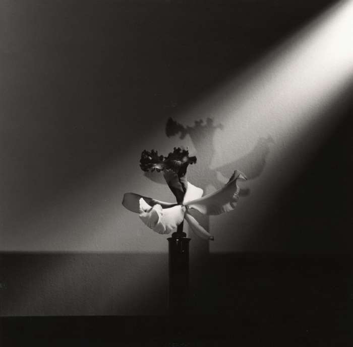
Orchid (c) Robert Mapplethorpe / International center for photography
Let's keep that studio work in a separate compartment. But only because of technique. I think what many of us do at home or in the field follows a very similar thought process.
Enhance your awareness
To a certain extent, we all photograph with a preconceived worldview. However, few of us choose to or manage to formalise this worldview and deliberately let it direct the way we photograph. Some do more than others, others refuse to or don't know how.
Now, I don't know the readers who sent me their photographs, so I may be reading too much or too little into them. But here are 3 great photographs by Pavel Bochman which, to my mind, follow this line of thought. Whether deliberate or not, such consistency often comes from an internal vision.
In a similar vein, I think Pascal Berend's two lovely photographs below also communicate meaning very consistently.
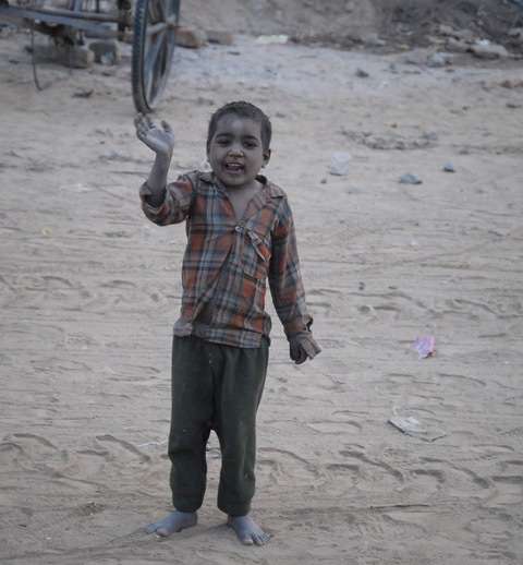
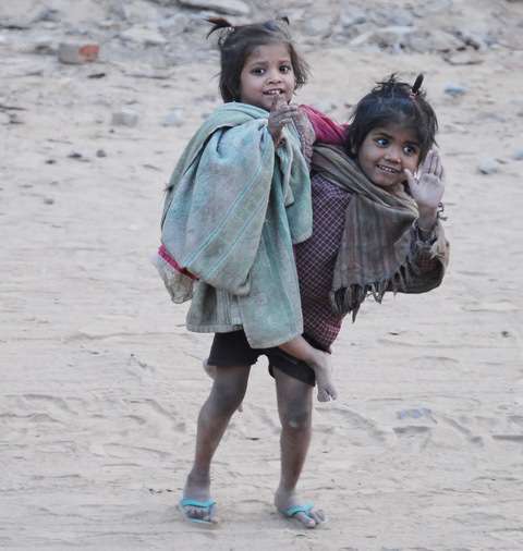
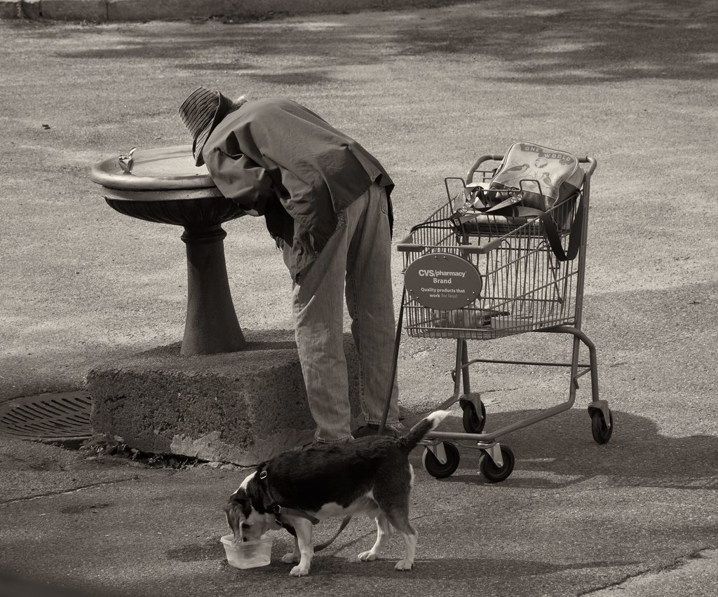
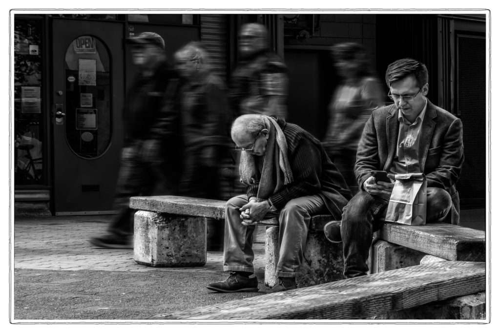
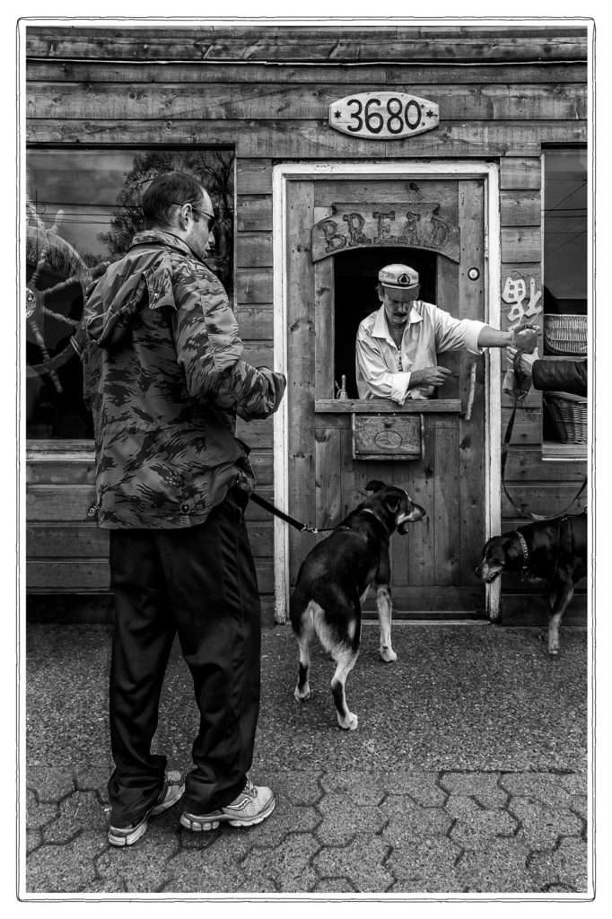
Even in single photographs, themes that have a meaning undertood by all are very possible. See this photograph by Cliff Whittaker:
And mine, of a similar subject.
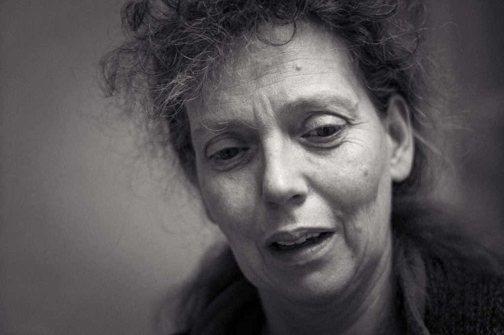
In both cases, the photographs could be said to tell a story (see section below), and the dirty floor and "accessories" (for lack of a more empathic word, apologies) contribute to that. But the main subject remains poverty and isolation, something that scares all of us, to the point of making these photographs somewhat taboo, or voyeuristic, to some people. Cliff's inclusion of himself, in the first photo, adds to that feeling and to the impact it has on us, whether we like it or not.
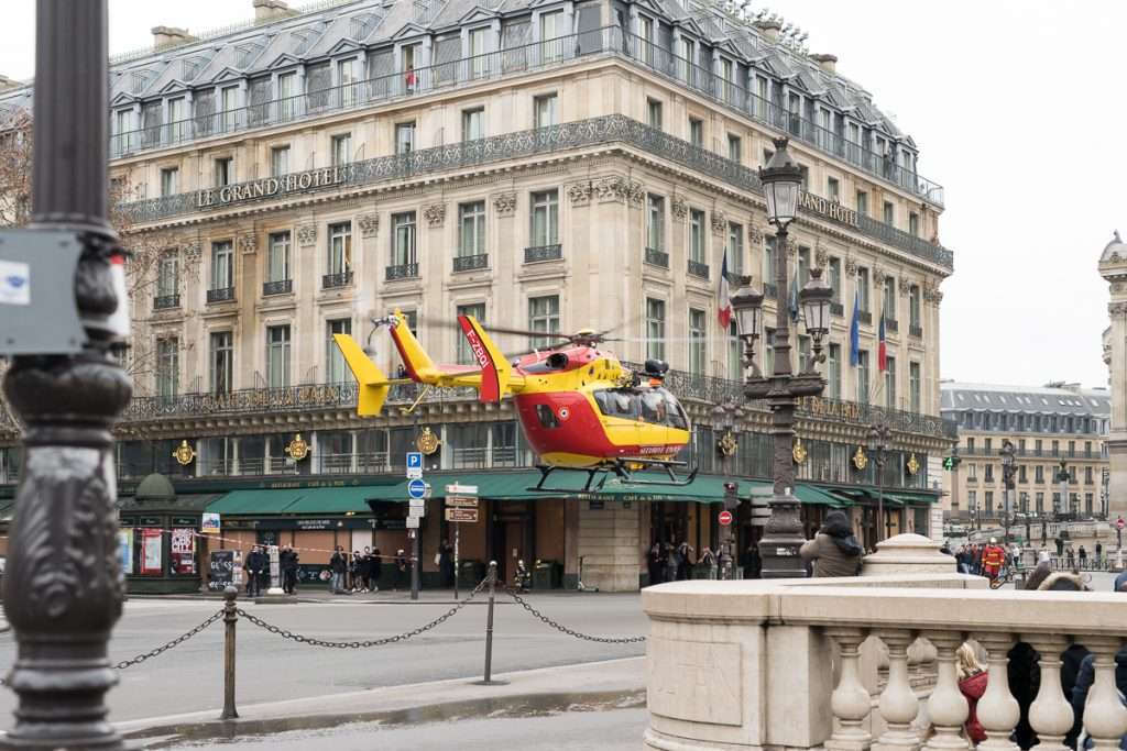
And how about this, from Dallas Thomas? We all relate to seeing an emergency service helicopter. Seeing it in the center of Paris, just next to tourists, really adds to the impact.
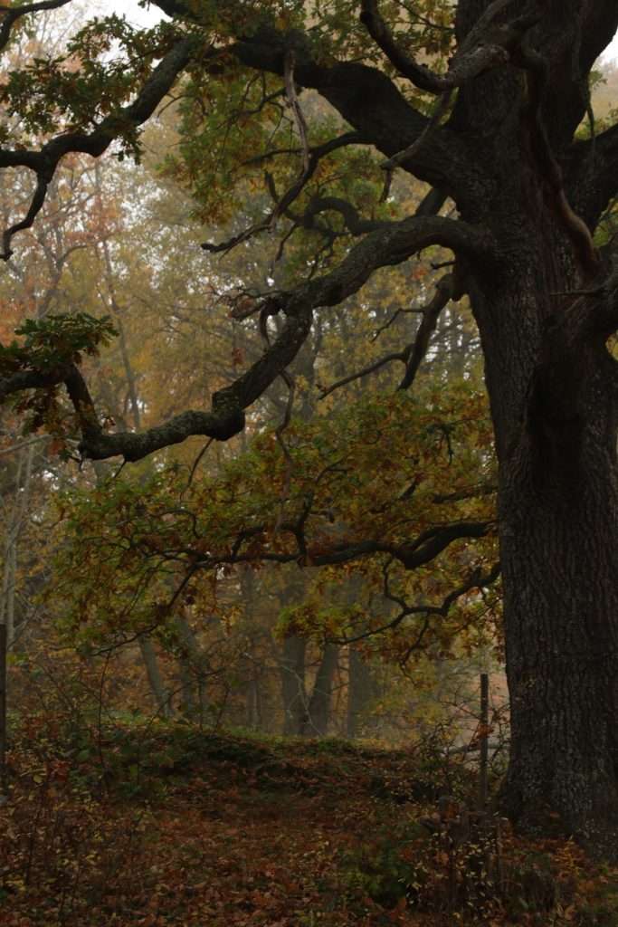
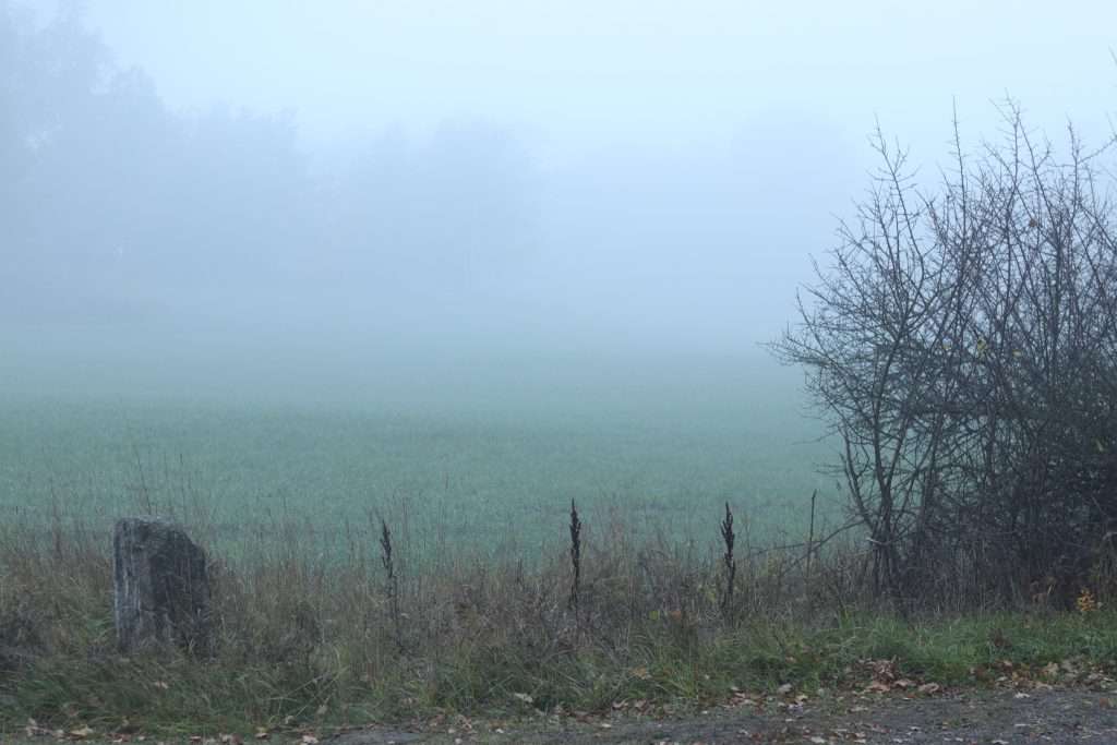
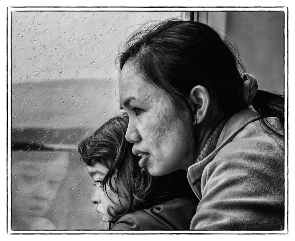
There are many topics most of us relate to and which we can try to attune to if we want to have strong impact on others. Nature is probably the most obvious, as evidenced by the sheer number of landscape photographers out there, and Kristian Wannebo's photographs below. And who can blame them? There are others, of course. But what I find great in photographs of nature is how they can evoke the whole range of human sentiments. See the second below, for example.
Enhance meaning in PP
This specific challenge was more about the raw power of the subject than about the abilities of the photographer. But that doesn't mean a powerful subject can't be made even more gripping through post processing.
I can think of two ways of doing that, there may be more. One would be to create an atmosphere that complements the subject. This is what Brian Nicol has done below, with a dreamy vibe to his photographs.
This is also true of some these photographs by Pascal Ravach, where a dreamy glow brings you back to a past you've never lived but can understand.
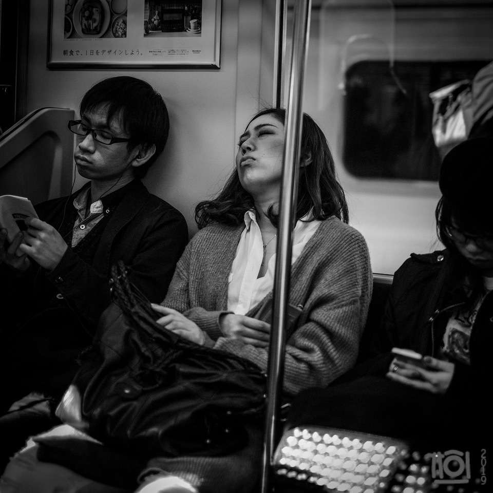
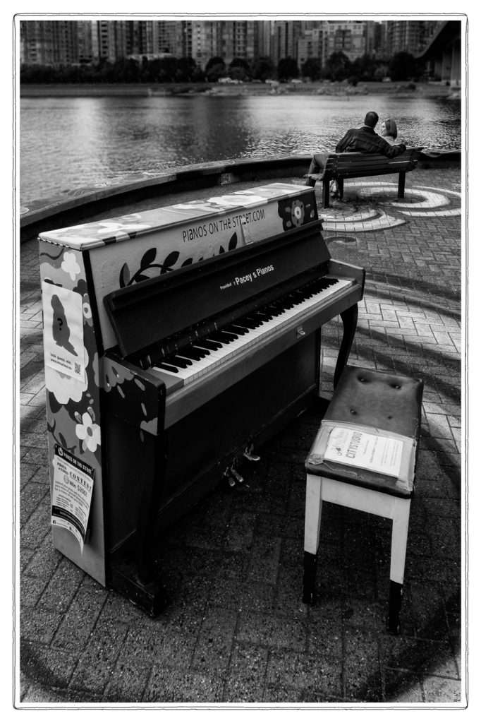
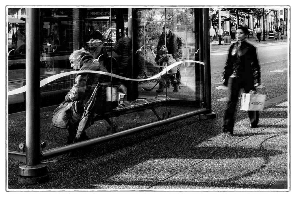
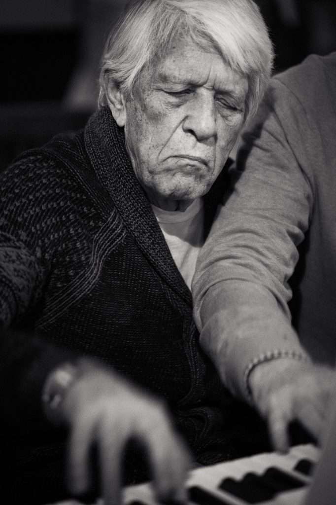
The second is to use PP to enhance clarity, to make it perfectly obvious what the photograph is about. Paul Perton's train scene, below, shines a spotlight on the various expressions of these passengers. Anyone else feeling sleepy, now?
John Wilson's storytelling photos, in a section further down are also a prime example of this role of PP.
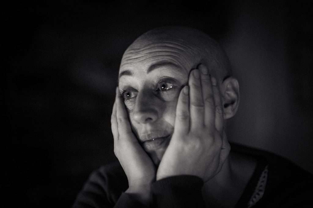
Make it personal
Loving something or someone is a sure way of paying attention and letting the thing/person shape your world and direct your photographic hand. This is beautifully illustrated by Bob Kruger's "Embrace", below. Wow, right?
And how about this family scene, made by Tom Wilson, when he was just a boy? What strikes me with both these photographs is that they are completely about the subject. There is no special technique involved. Something not even Mapplethore dared to in, in his day.
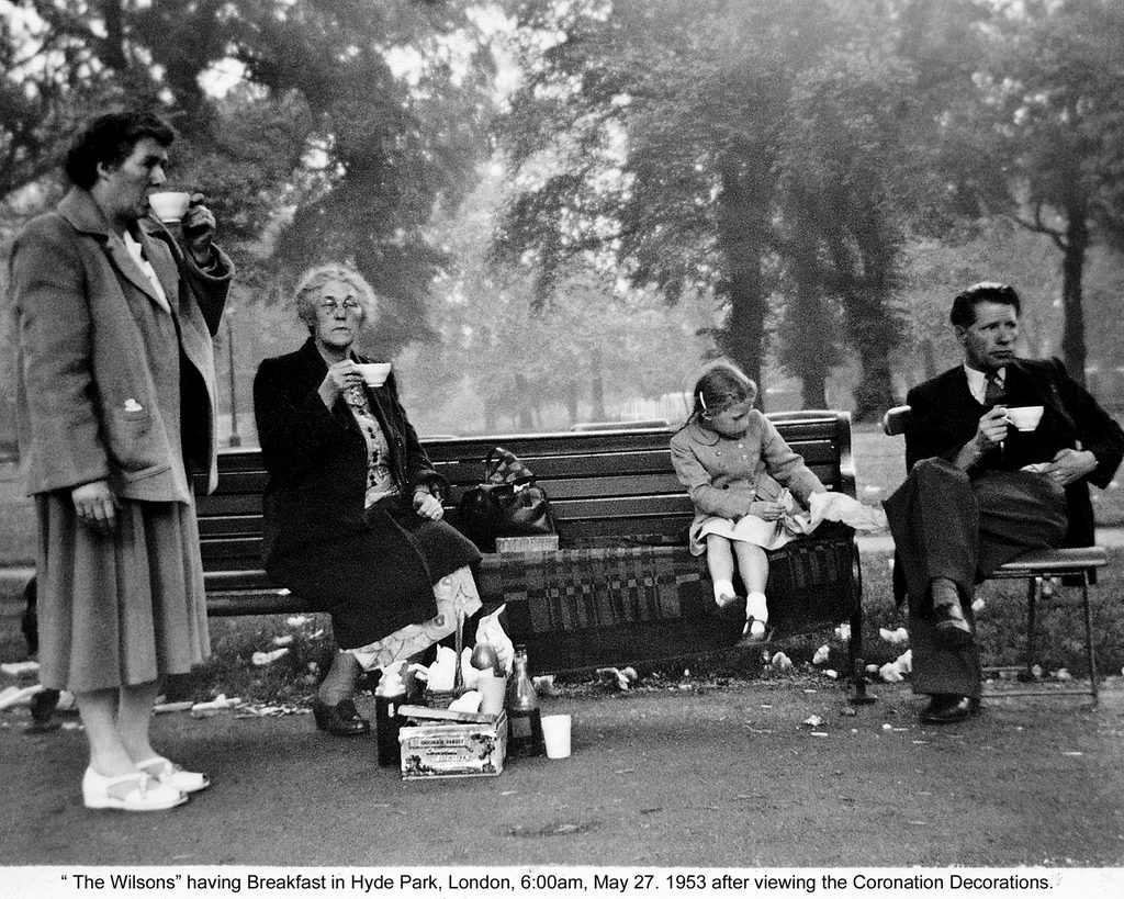
Making it personal doesn't mean the rest of the world can't relate, as these two above photographs prove. But there's definitely a gradation of relateability in whatever is personal. Everyone likes a cat picture, in an "awww" superficial sort of way. But this was my cat and she died at the age of 6 months, which gives the photographs far more meaning to me than to other people. Whereas family photographs (above) elicit stronger feelings from anyone. Related or not, they are hard wired into us.
-

Biskit 1 -
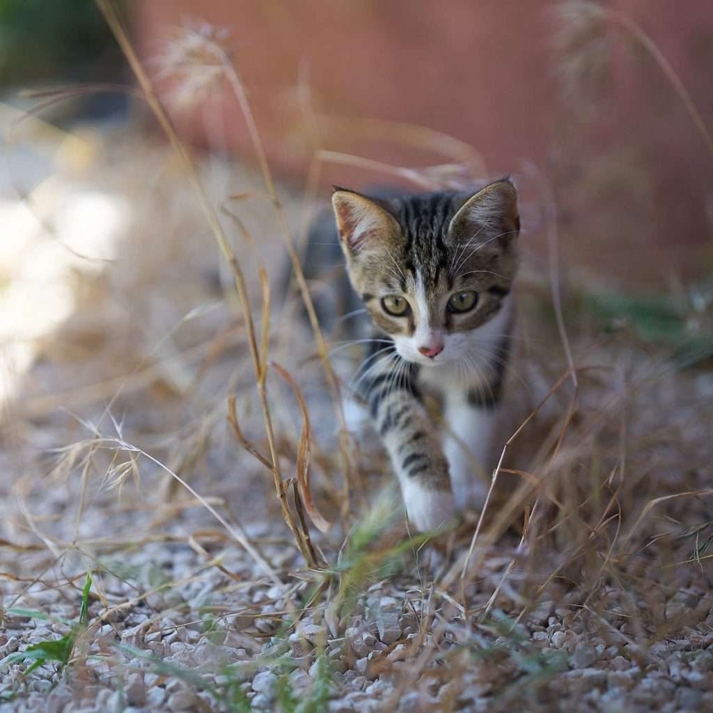
Biskit 2
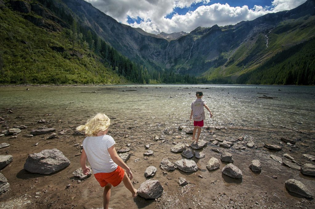
Another example of a personal story is this one by Lad Sessions. Without the children, it could be a nice photograph of a great scenery. With the children, it becomes a recollection of a family adventure.
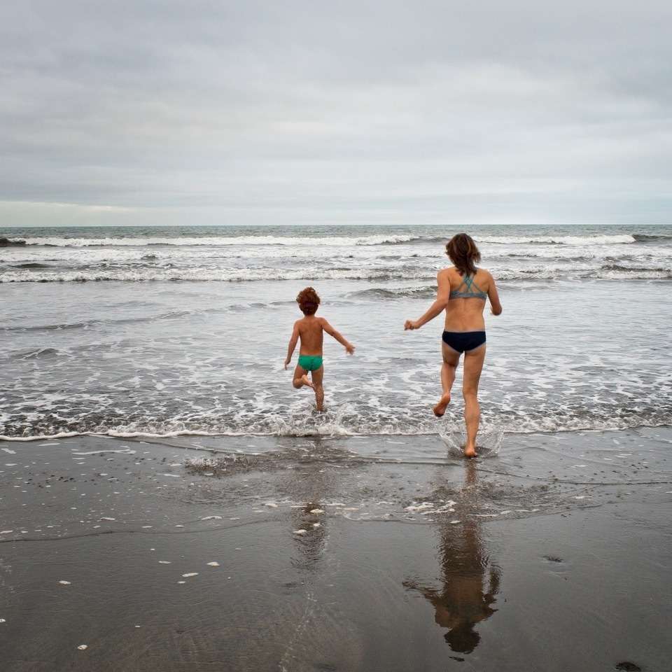
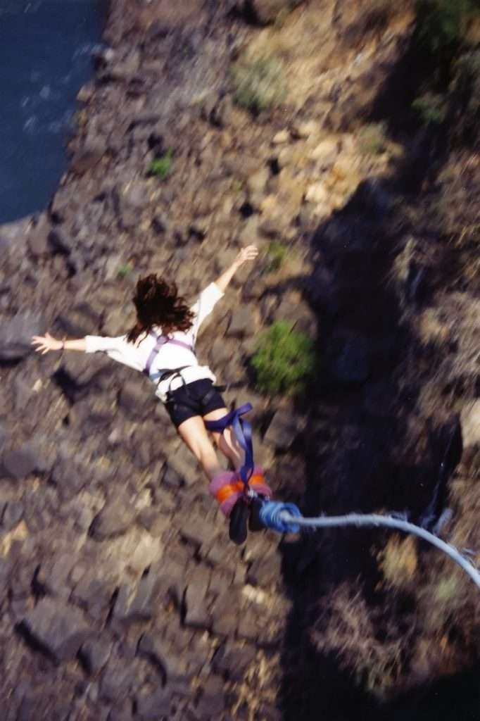
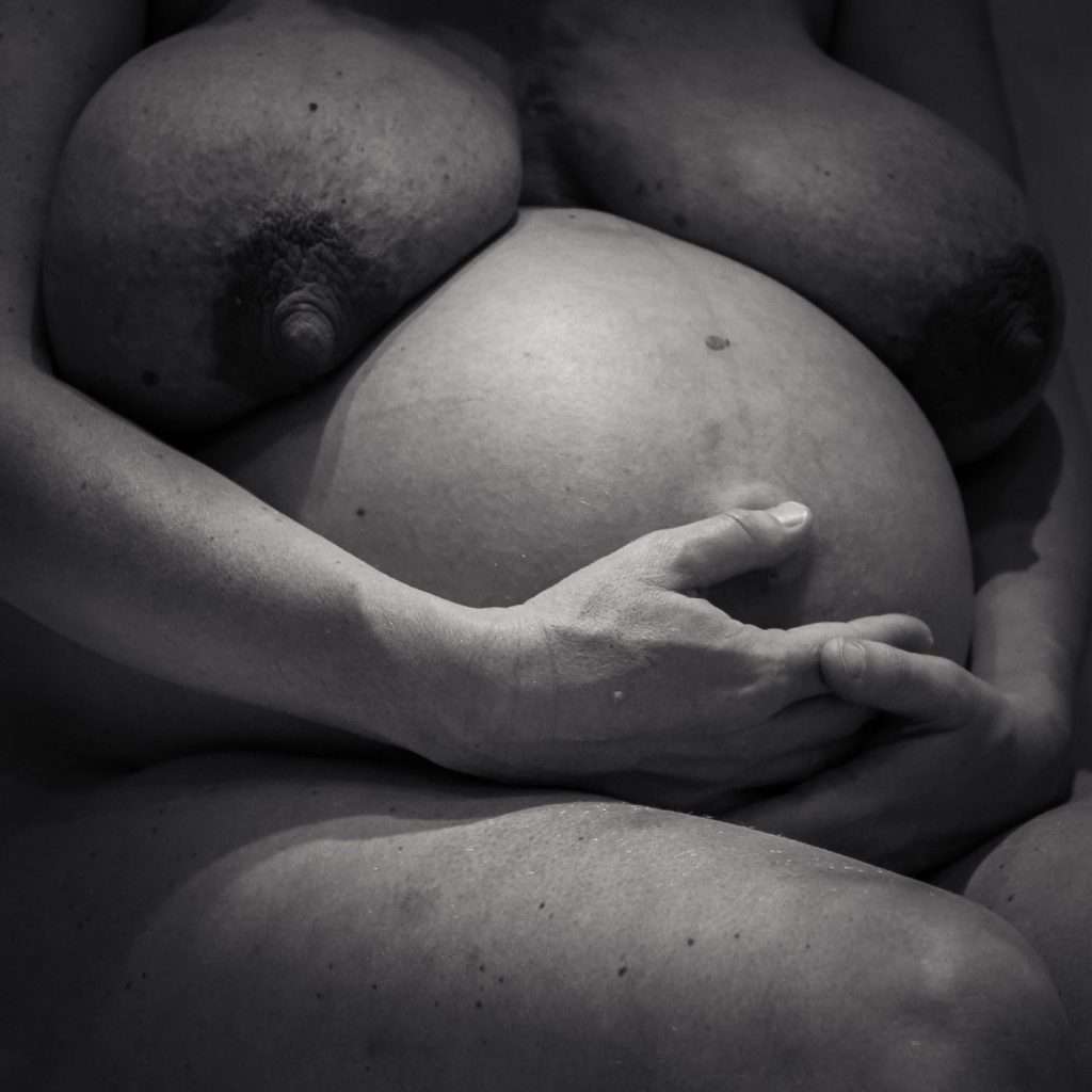
Steve Mallet's family shots display that complete range of private to common emotional bond. First, a moment. Meaningful mostly to those who were there, but which we all understand. Then, something stronger, faces, emotional connection, smiles. We don't know them but react to the common human link that is a smile. And, finally, who else's scrotum shrivels at the thought of their daughter jumping from a bridge into a precipice? That blue umbilical cord is the only thing that keeps this mildly terrifying, and not full-blown horror.
And at the extreme opposite is anything we deliberately make for ourselves, almost as a form of meditation. Those are the photographs co-author Philippe calls Wilsons (nothing to do with the two Wilson contributors to this post ;) but everything to do with Tom Hanks' basket ball companion in "Cast Away"). Philippe's Wilsons are personal discoveries, unexpected scenes that elicit a very personal reaction, such as the one below, shot a few minutes after reading the challenge post. (Just to prove he can work on many levels, Philippe also sent in the great shot of that cute puppy in the banner photograph :) )
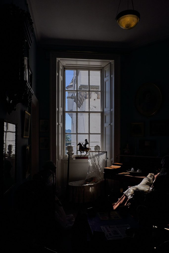
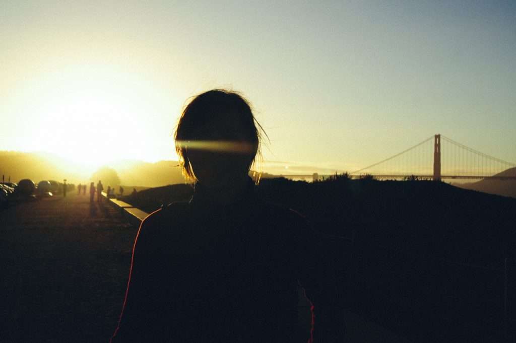
And here's a very intriguing conclusion to this section. This interesting photograph by Steffen Kamprath could have been a common-garden tourist shot without that strong backlighting, which throws the person in the shadow. This is the conceptual opposite of a selfie. A fill flash would have made this a nice souvenir photograph. As such, the person is easily recogniseable to Steffen but remains unknown to us. The situation is familiar, but we remain locked out of the intimacy. Of course, you don't want your family albums full of these. But as a concept, I love it.
Work in series
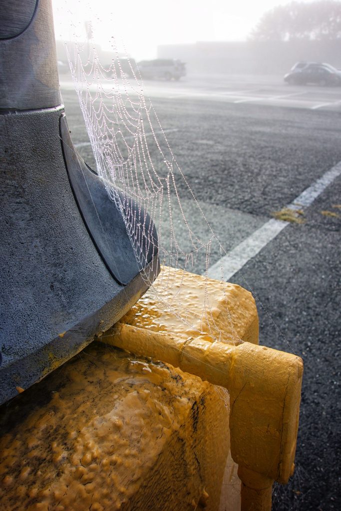
This series is by Lad Sessions. We had a long email exchange about this first photograph, because the transition from bright colour to monochrome is so perfect it seems like post processing wizardry. But it isn't. I think that's a killer shot! It stands on its own and that mysterious dialogue between the cobweb and the cars in the background leaves you with more questions than answers.
Include it in this series, however, and a message about deriliction and abandonment becomes clear. There's no sadness, because the colours are so bright and cheerful. But the common ground is decay. Happy decay. Positive decay. Not really Wabi Sabi, but similar in some ways. In that context, I read all this as nature always finding a way to conquer and make everything beautiful. Very similar, then, to my opening photographs of clouds.

You can read something different into it. It all depends on our personal worldviews and biases. Ultimately, though, it's what the photographer wants it all to mean that matters. What's really important here is that a consistent series really reinforces meaning because it lets you discover and reassemble its various facets for yourself.
Semiotics, baby !
You'd think that, my father being a preeminent scholar on semiotics and having given me many of his books on the topic, I'd have something clever to say about the topic. Alas not. It must be a sign of something, but what ? (I can figuratively hear you questioning my intellectual abilities, you know ;) ) Instead of shaming myself, I'll direct you to the 2 guest posts dad did on the subject for DS in the past.
What I will say is that meaning is implied, in all other sections of this post. What you make of the photographs might be different from what another reader will. And a great artist is one who is able to direct many viewers to very consistent interpretations.
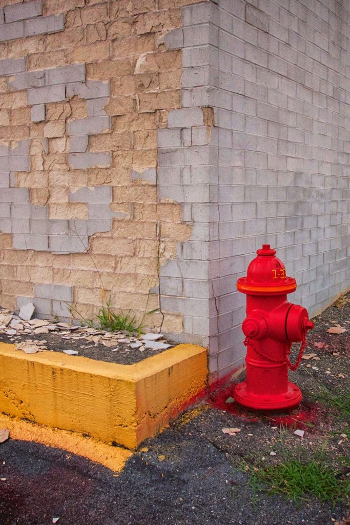
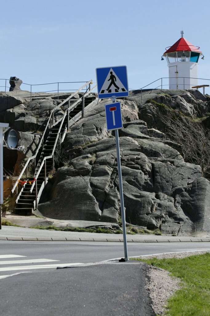
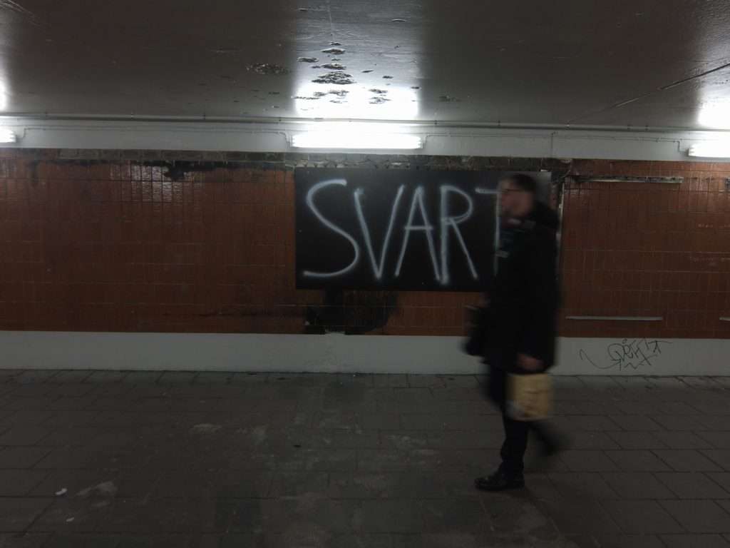
But including visual signs in your photography removes some of the implicitness of interpretation and adds some more universally understood cues to your photographs, as illustrated in the two photographs below, sent by Kristian Wannebo. Imagine them without the graffito or the road sign.
Tell a story
And, we're back to the studio. Only we're not. Many famous artists who specialise in photographic storytelling usually build there images from scratch, using controled lighting, actors, props ... But we dont have to. Street photographers, for example, strive on availability : available sight, available light, available time.
There's a very real difference. Compare Saul Leiter or Vivan Maier to Jeff Wall and the storytelling is equally powerful but much more directed in the latter's work.
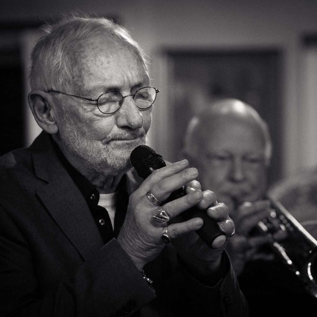
John Wilson has sent us a set of his storytelling jewels, cherry picked off the street and processed very consistently to provide continuity in very different settings and stories.
How do you tell a compelling story in a photograph? John might have his own experience and rules. To me, storytelling is tightly connected to composition. No composition, no story. A single element tells a story about itself. Multiple elements tell a story that's entirely based on their respective visual strength and placement in the frame. There's no space here to get into such a huge body of study, but have written quite a few posts about composition in the past.
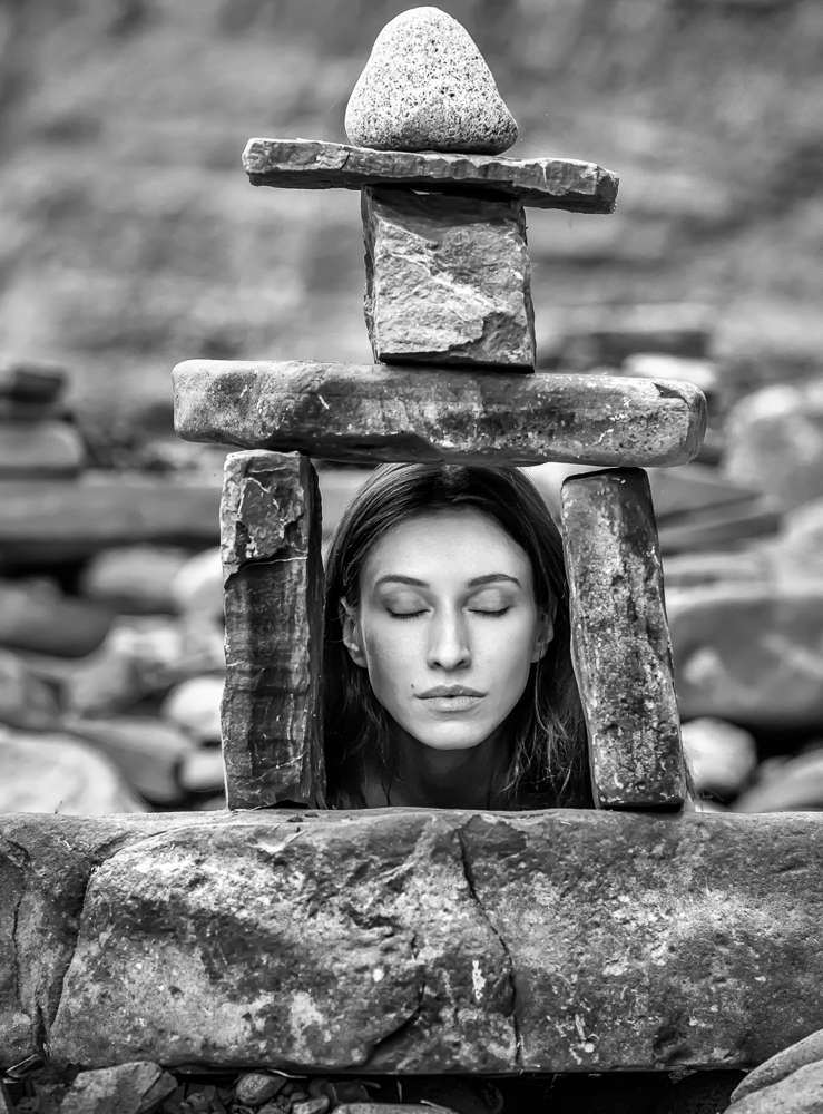
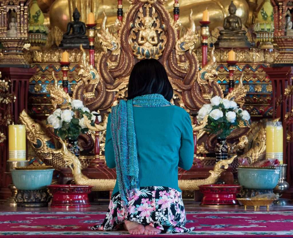
This lovely photograph by Pascal Ravach also tells a powerful story, one that is more open to interpretation, possibly. There's no escaping from the situatoin and the composition is spot on: perfectly symmetrical, the divinity at top center balancing the darker mass just below it. This is serenity made photograph. But who is she? Why is she here? Daily ritual? A prayer for a particular reason? Trouble? Thanks for a wonderful event?
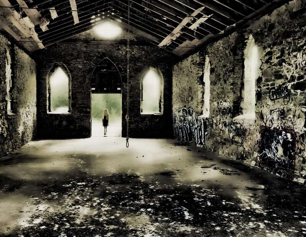
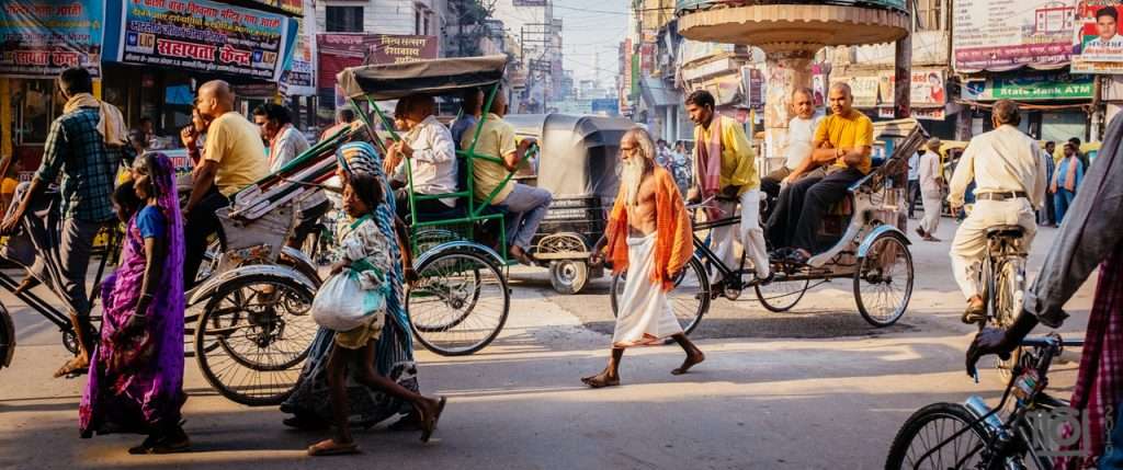
And how about this corker by Paul Perton ? Straight out of a movie: subject, long frame, composition, lighting, PP, the general movement, it's all there. Does it get better than that?
Shoot RAW
Not the file format (although, you should), but the raw, visceral character of the photograph. At the end of the day, the more a photograph connects us to our primal instincts, the stronger it's impact.
If you do this, I find it's difficult to perform elaborate post processing as well. In fact, the two compete for attention, mindshare. Either your photograph is about the subject or it's about your ability to create a mood. The balance is hard to find, when it comes to impact. Nick Brandt and Robert Mapplethorpe, among others, combine the two. It's the only way to sell, and their talent allows them to understand the limits of PP in their work very precisely. But, more generally, the stronger the subject, the more you should aim for clarity in your PP. And I'll close with this absolutely wonderful series by Julian Warde that does just that. Very finely judged.

Well that's it. Thank you again for the fantastic photographs. I now live in terror that I've forgotten someone or mixed up submissions. If that's the case please drop me a line, I do apologise and will update the post asap.
And what do you think? What style makes more sense to you? What style has the most impact on you?