
#691. In the style of (imitation is the sincerest form of flattery)
Welcome to another DS collective blog post. This time, we are each paying homage to a master of the craft we admire by sending in pictures in which we imitate that person's style, in one way or another.Copying has long been a method of learning certain techniques and, while it doesn't necessarily strengthen your creativity, it will help your eye, your technique and your post-processing tremendously.As you'll see, we have some masters in common but have each taken something different from him/her. There's no right or wrong answer, the only thing that matters is to identify a specific aspect of that master's work and use that as a target for practise. 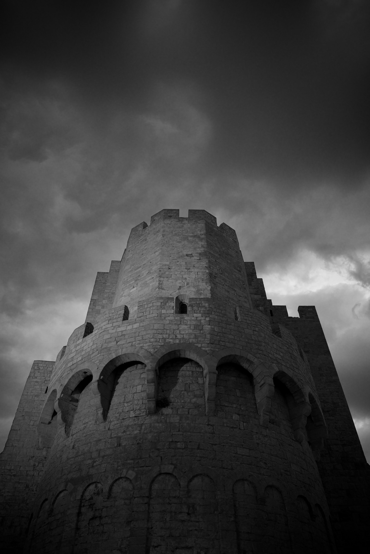 With that said, enough from me, on with the copying.
Adam Bonn
When task master Pascal suggested that we all pick some photographers to imitate, we all seemed to relish the project with glee……I can’t speak for my fellow DS’ers, but when it came to actually digging out my own humble images it occurred to me just how mediocre I was about to look. Hey don’t get me wrong, I can manage mediocracy all by myself, but to wheel out the greats &/or the contemporary, then stick my own efforts next these names can only mean that I’m about to look like a dick.Damn. I’m pretty sure that not looking like a dick on the internet was one of my 2018 resolutions.So let’s get the most cringe worthy one out-of-the-way first.Henri Cartier-BressonCan you believe that three of us (out of nine) immediately said; I’ll do HCBOf course you can. Why? He’s a legend.HBC is generally regarded as the father of Modern Street, and if you don’t buy into that (shame on you) then being the one of the fathers of Magnum should say it all.In much the same way (and this going to be an analogy so woolly you could pin a large set of tusks on it and eat it for your Paleolithic dinner) as Doors singer Jim Morrison came to father the modern era of leather clad, snarling rock screamers, the street style of Henri Cartier-Bresson came to be what street is defined as today.The visual lexicon of Henri Cartier-Bresson is well-known, the decisive moment, the baroque compositions.So for my HCB tribute, I’m going to have a small and unfunny joke! HCB visited the city where I live, and took a shot of Mercado do Bolhão (amongst others); do I know where he stood to take that? You bet. Have I taken any shots from that spot myself? Too many to count.The shot in question features pigeons flying away from a figure.So from a completely different spot in Porto, I embarrassingly present: 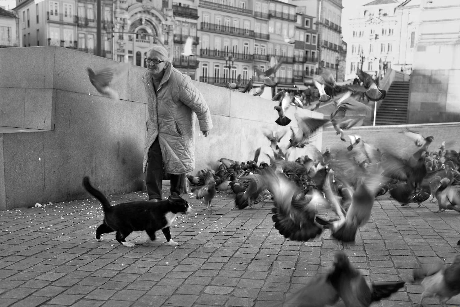 My tribute works (well it doesn’t work at all tbh), not through a faithful reproduction of style, framing, tones, skill, ability, purpose. No sir. It’s a tribute to making a scene from the everyday. Because that to me is the very essence that Henri Cartier-Bresson gave to modern photography.Of course, HCB wasn’t the only founding father gig in town. Another highly respected, supremely skilled photographer was André Kertész (truth be told, I owned an André Kertész book before I owned a HCB one)I love André Kertész’s work for the strong tones and seemingly subtle, yet intricate and brilliantly executed compositions. In fact HCB was influenced by AK.Again, I won’t pretend to do this any justice at all. But for my Kertész homage I’ve selected the following everyday scene.
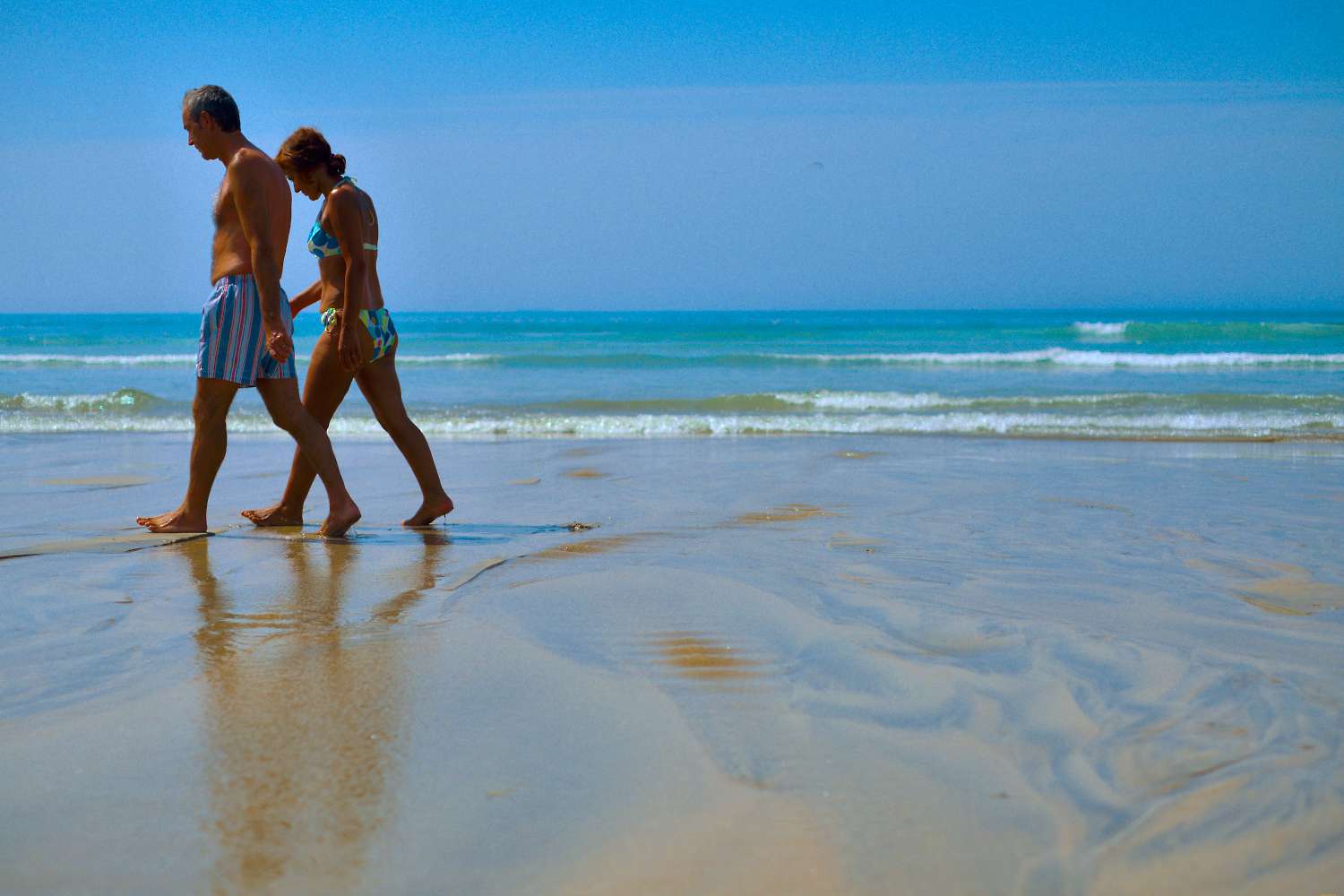
 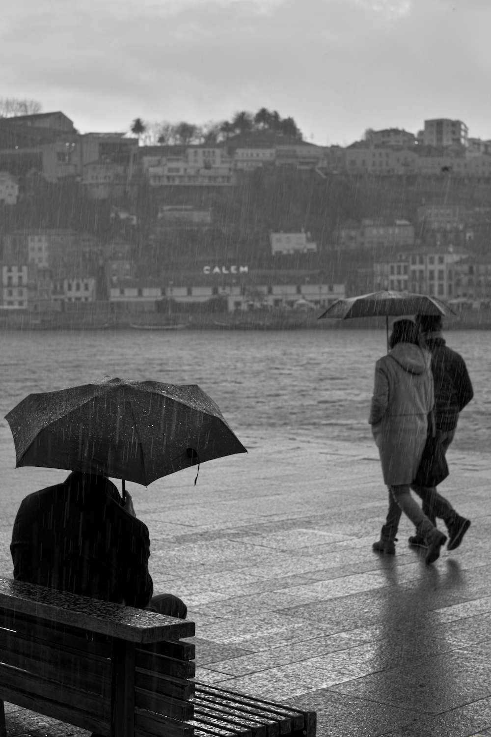 There’s a cliché from a perfume ad They say romance is back in fashion, but I say it never went out I feel the same way about black and white photography.So for my final two style imitations, I’ll go with colour.There’s a lot written about colour photography in the digital age. This raw software is bad, this camera has a colour cast, this picture doesn’t have good colour.It’s all valid, but sometimes – so what?This brings me to John Hinde’s postcards series.Does the colour look real to you? No. Do Hinde’s pictures look good? Yes.Enough said.John Hinde is known for shooting beach (and holiday) scenes. I’m really not, but I do spend a lot of time shooting on the beach.So for this shot, I’m trying to ape that warm, sweet colour that you might find in candy floss or a stick of rock, or a toffee apple basically the colour that Hinde can do and make work and I really can’t.
  The legendary names and genre definers should be of interest to us all, but what about someone contemporary?Keeping with colour, I’ve drawn inspiration from Rodrigue Zahr’s Cuba series for this next shot.Of course this wasn’t taken in Cuba (which actually makes the car a bit more of a rarity) as I’ve never had the pleasure of a visit. But Rodrigue Zahr’s Cuba series shows (amongst other things) these wonderful old, immaculate cars against the backdrop of the faded Cuban buildings.I’d like to think my shot does something similar, but then again we’d all like to think a lot of things!
 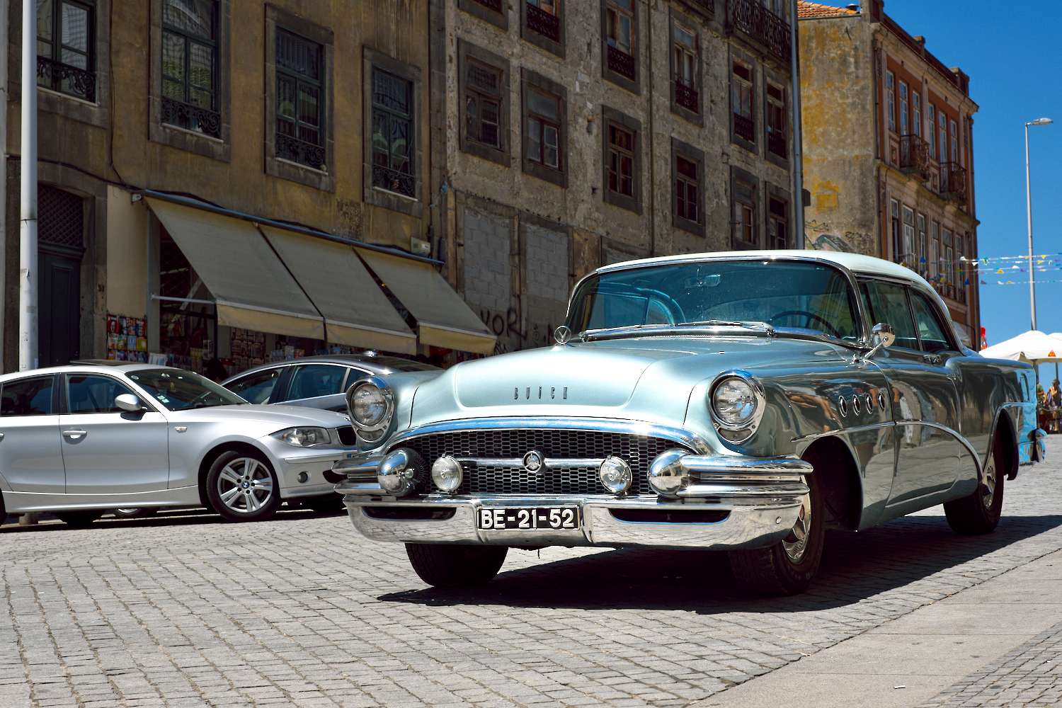 There we are: four photographers, four different styles, and me the pound shop imitator.
Bob Hamilton
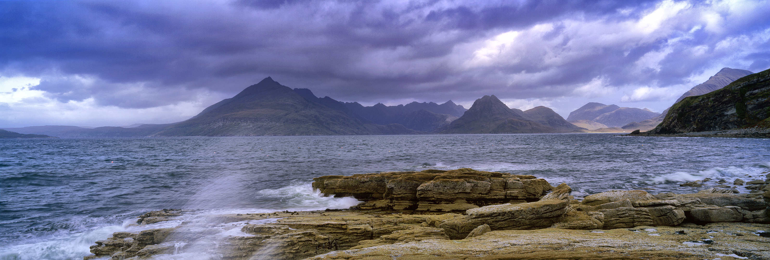
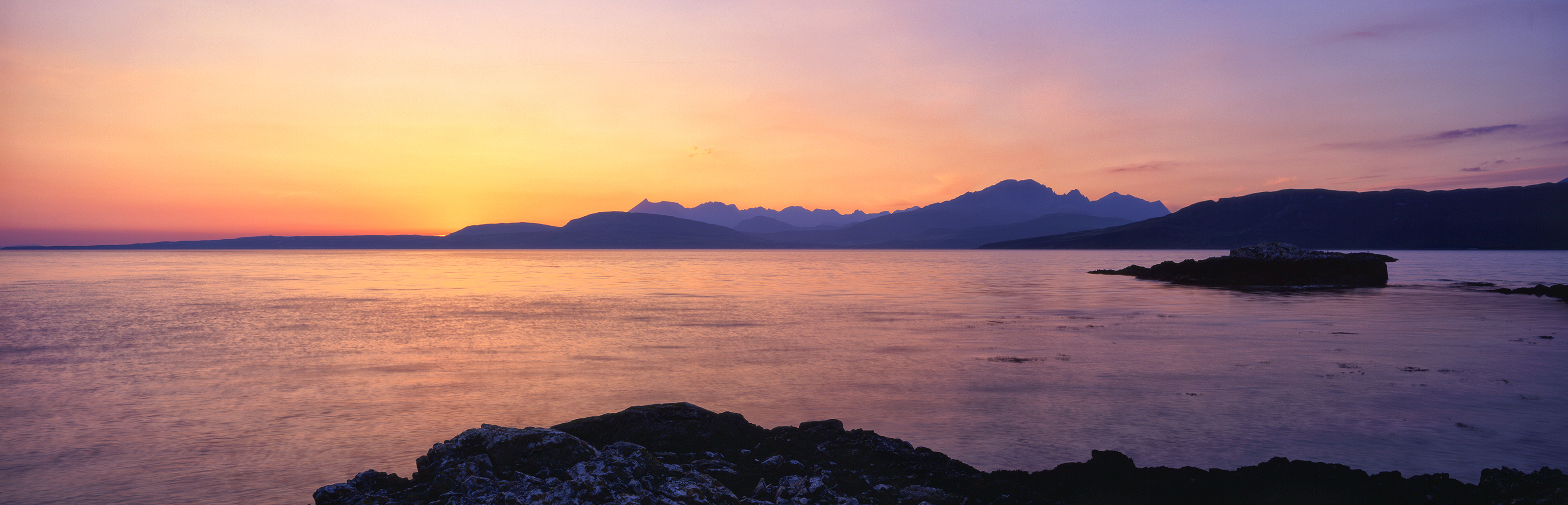
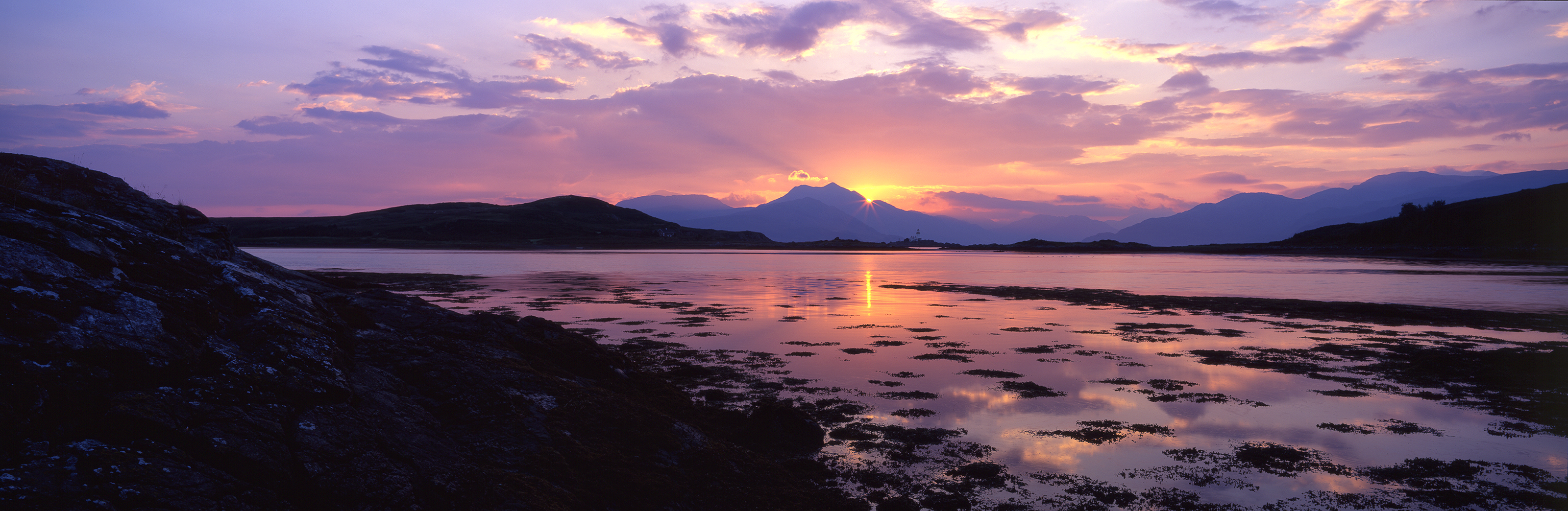
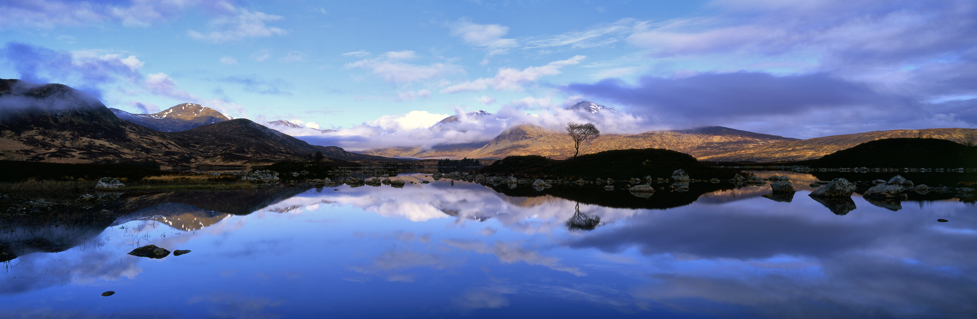
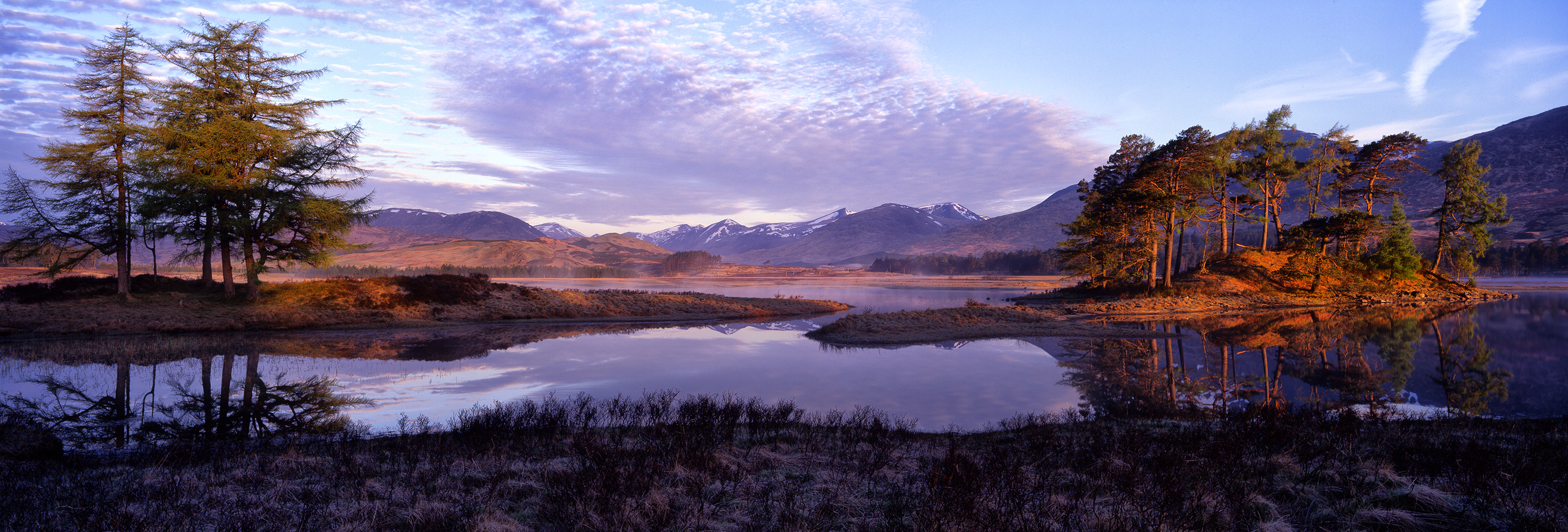
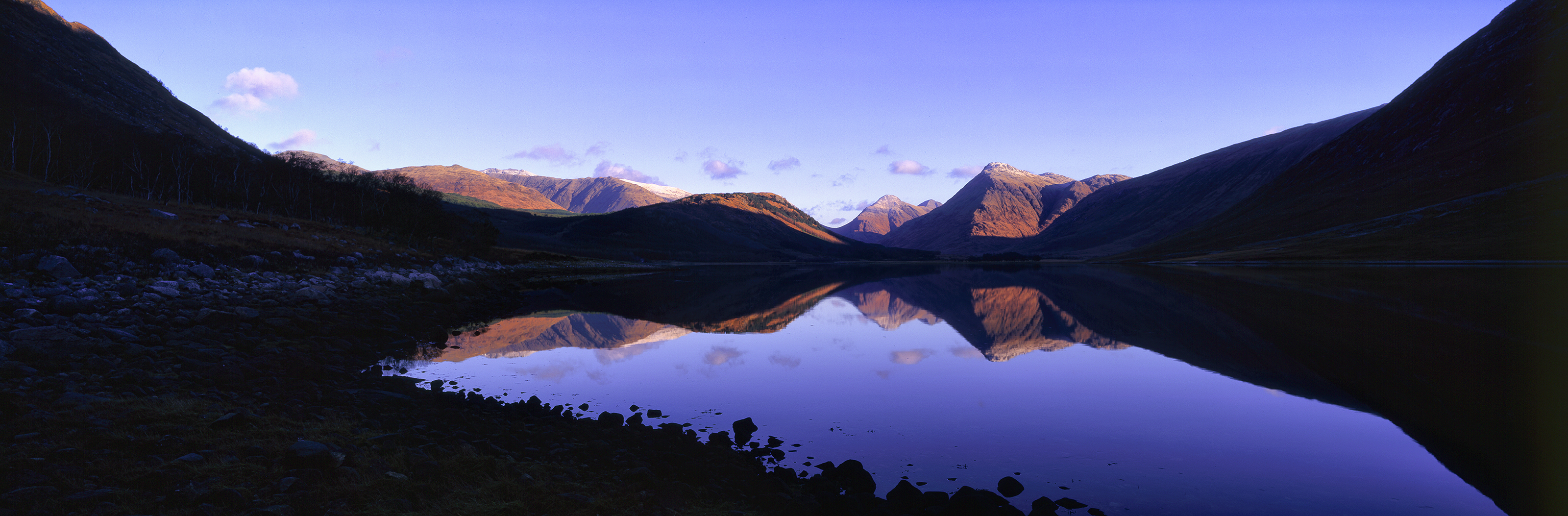
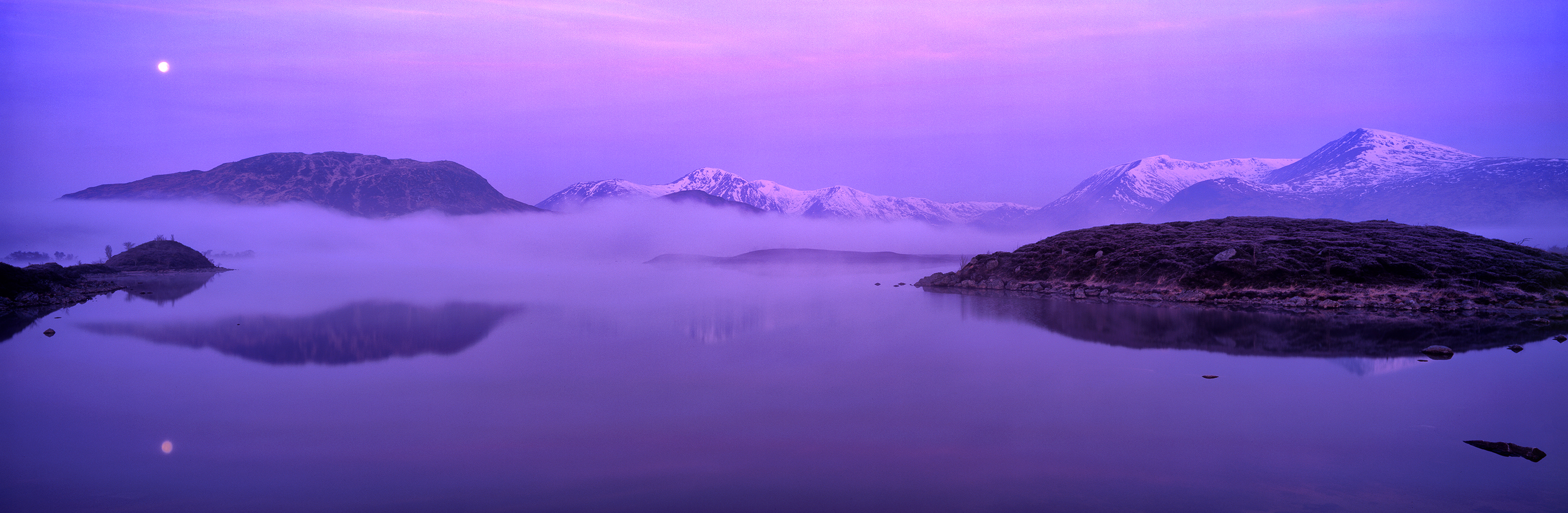
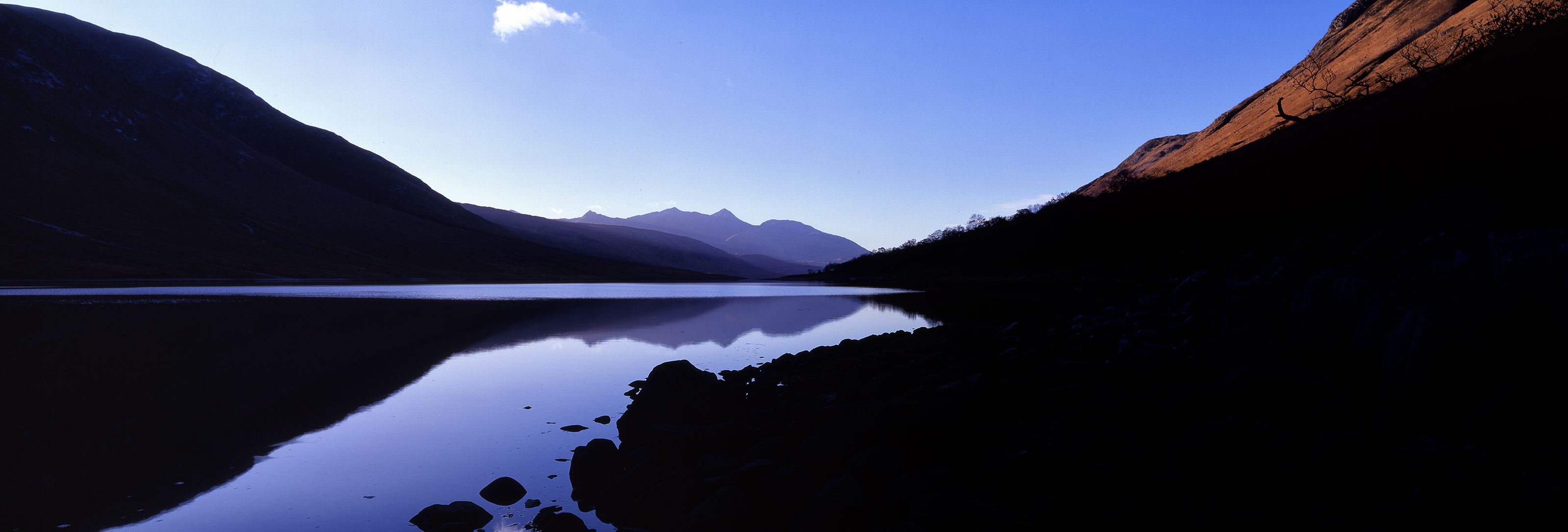
Here are few from me for the article. Images in the style of my good friend, Colin Prior (www.colinprior.co.uk ). A poor imitation of his but, hopefully, in his style and with the cameras which made him well-known - in the UK at least.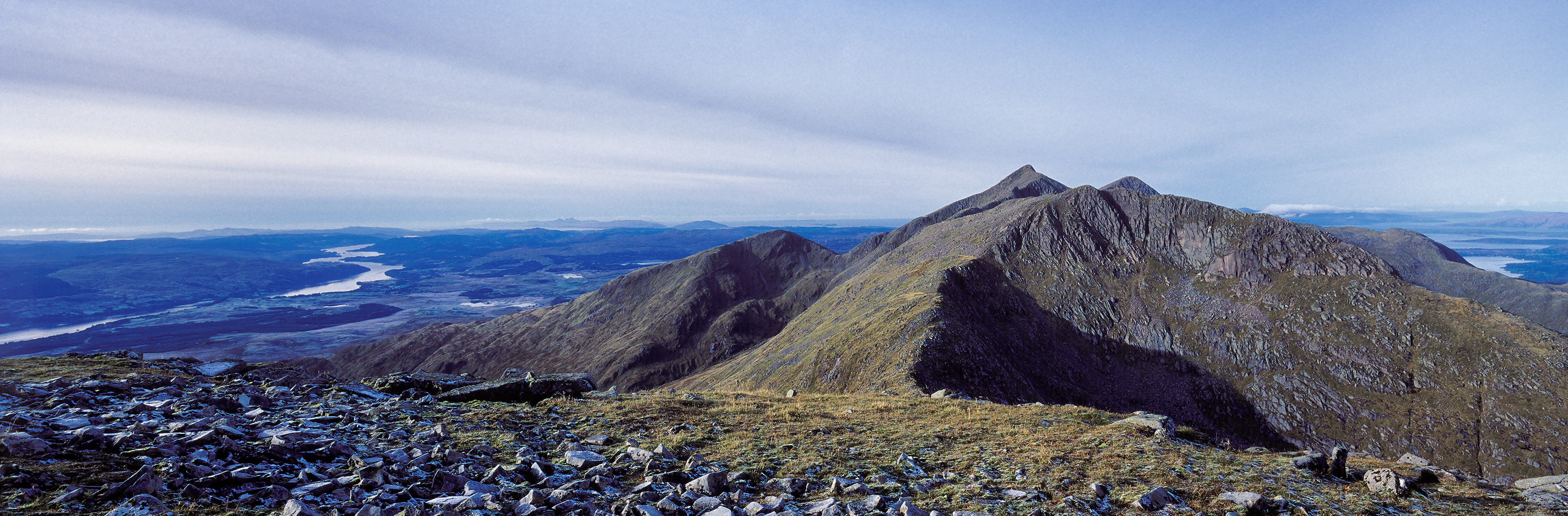
Dallas Thomas
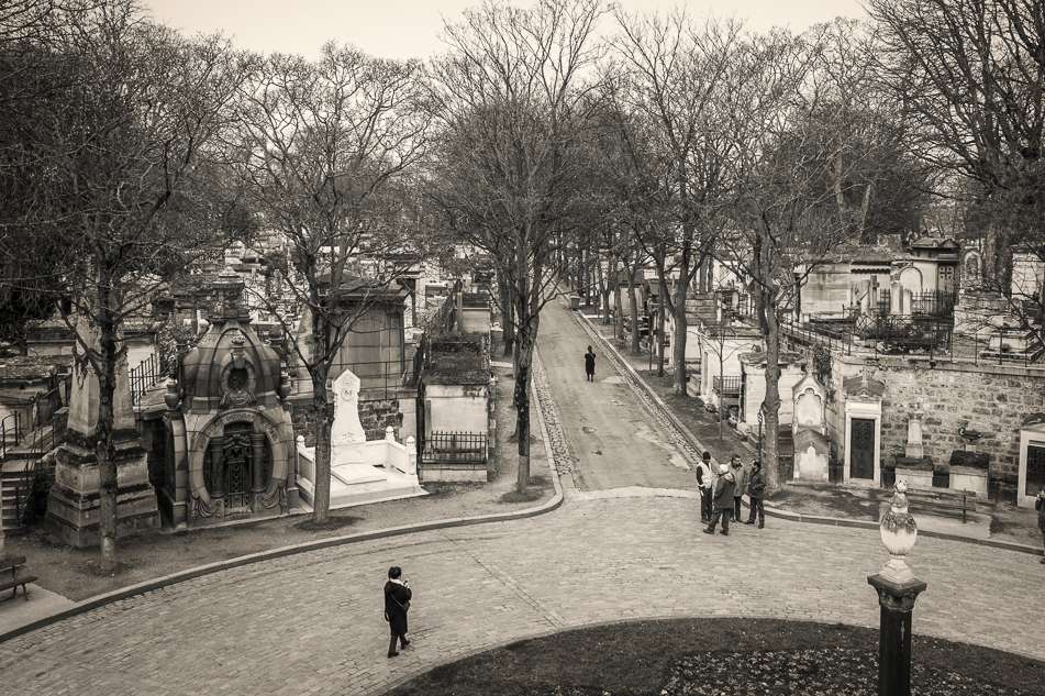
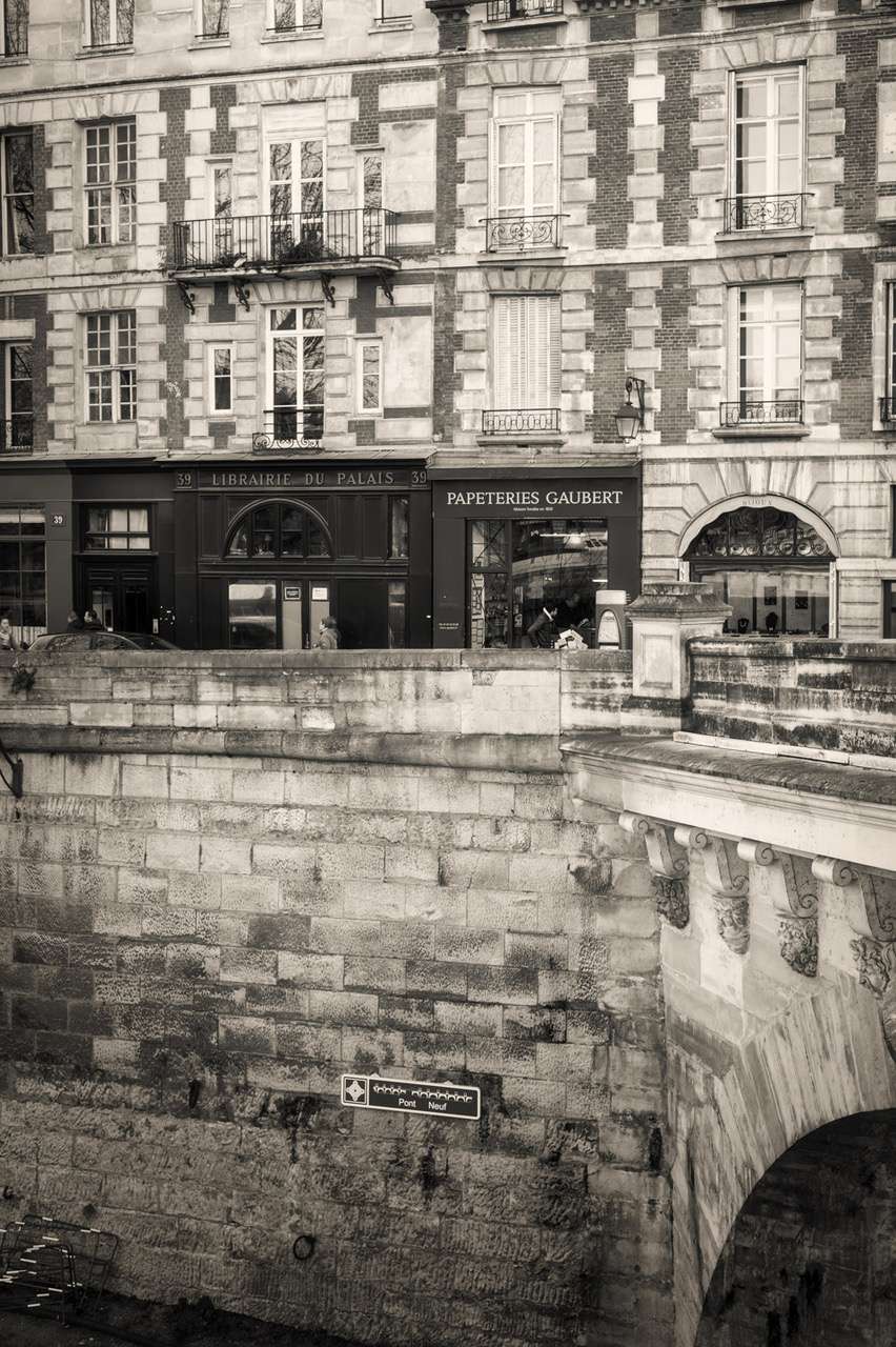
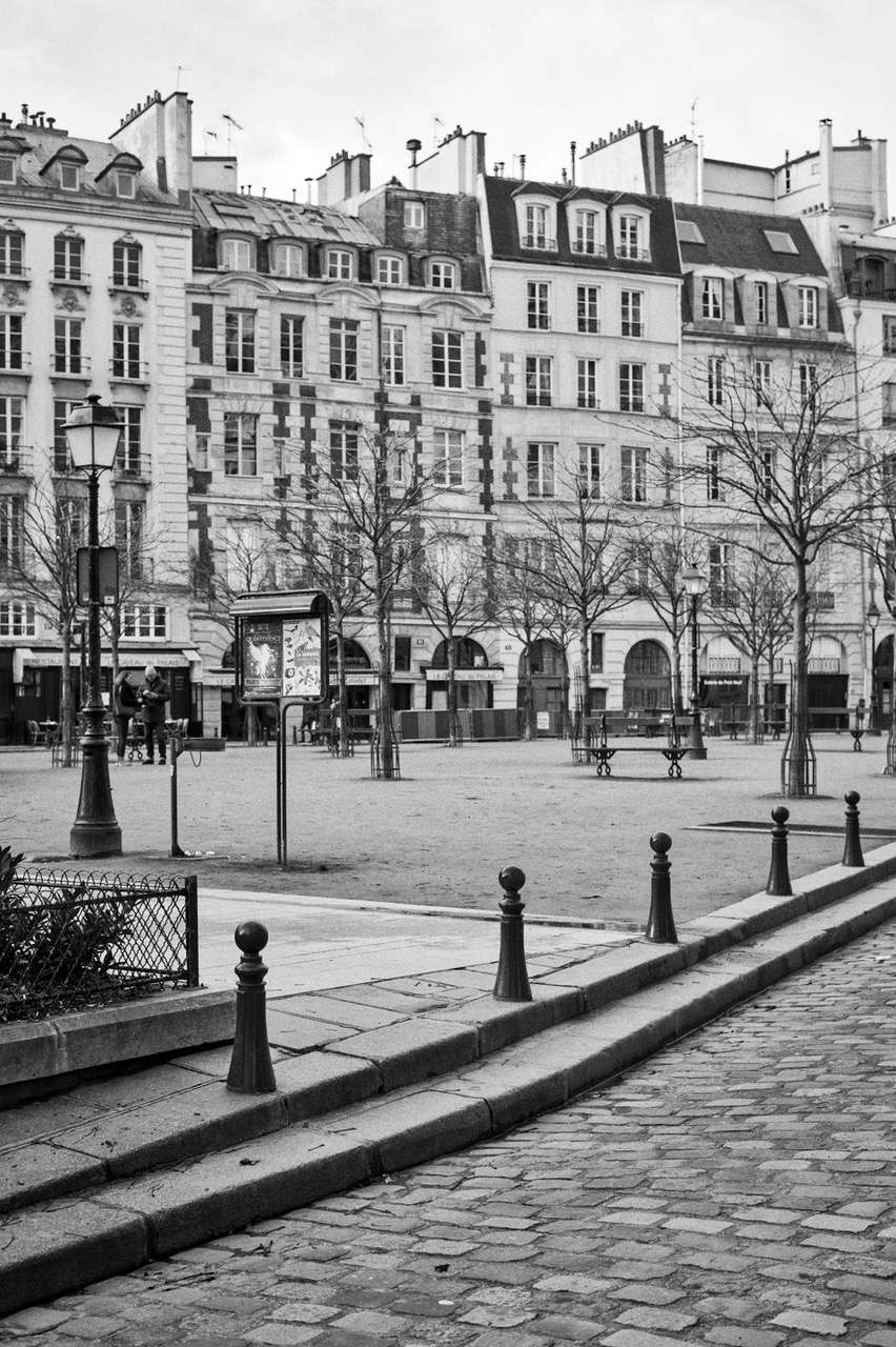
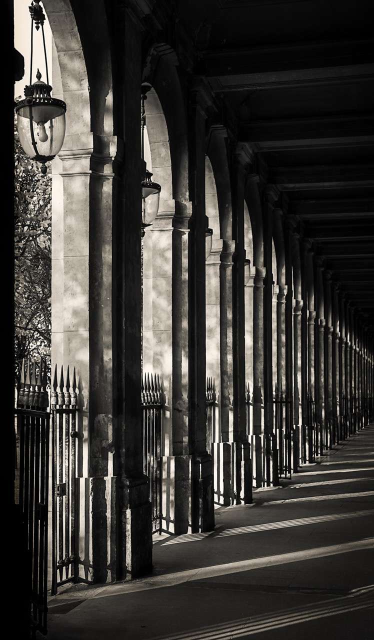

Pascal JappyWell, having volunteered Philippe's idea, I found it a little hard to follow-up with photographs. With the exception of the homage to Warhol and the Micheal Kenna imitations immediately below, it was often more the case of finding who had inspired some of my photographs than actually doing the conscious work of deliberately copying in the first place. "My" Man Rays are half way there because the post processing was a distinct attempt at capturing his style, even though it wasn't systematically the case at the moment of taking the photograph.So here we go with my copying. First up is Michael Kenna, for which the weather was kind enough to throw lovely compositions just as we were discussing the topic with Philippe. 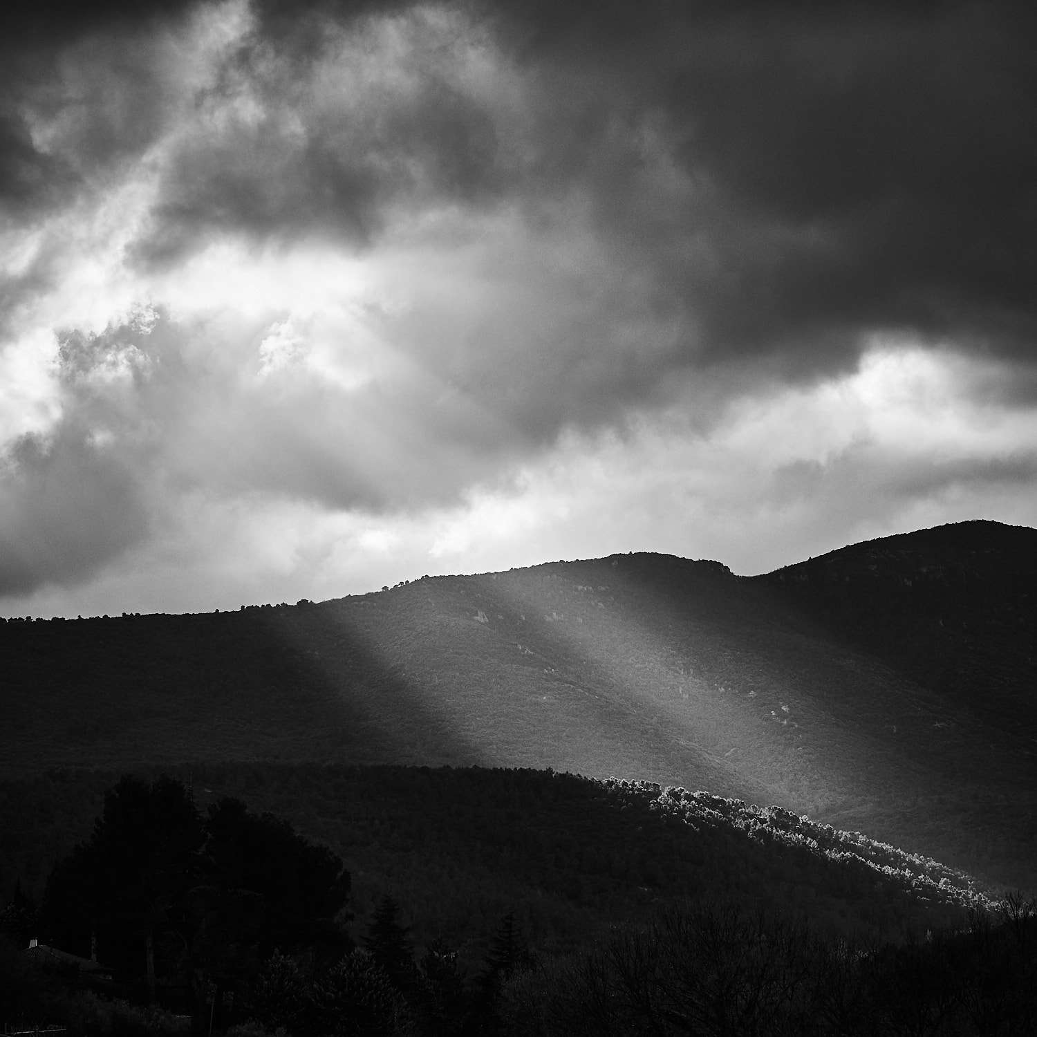
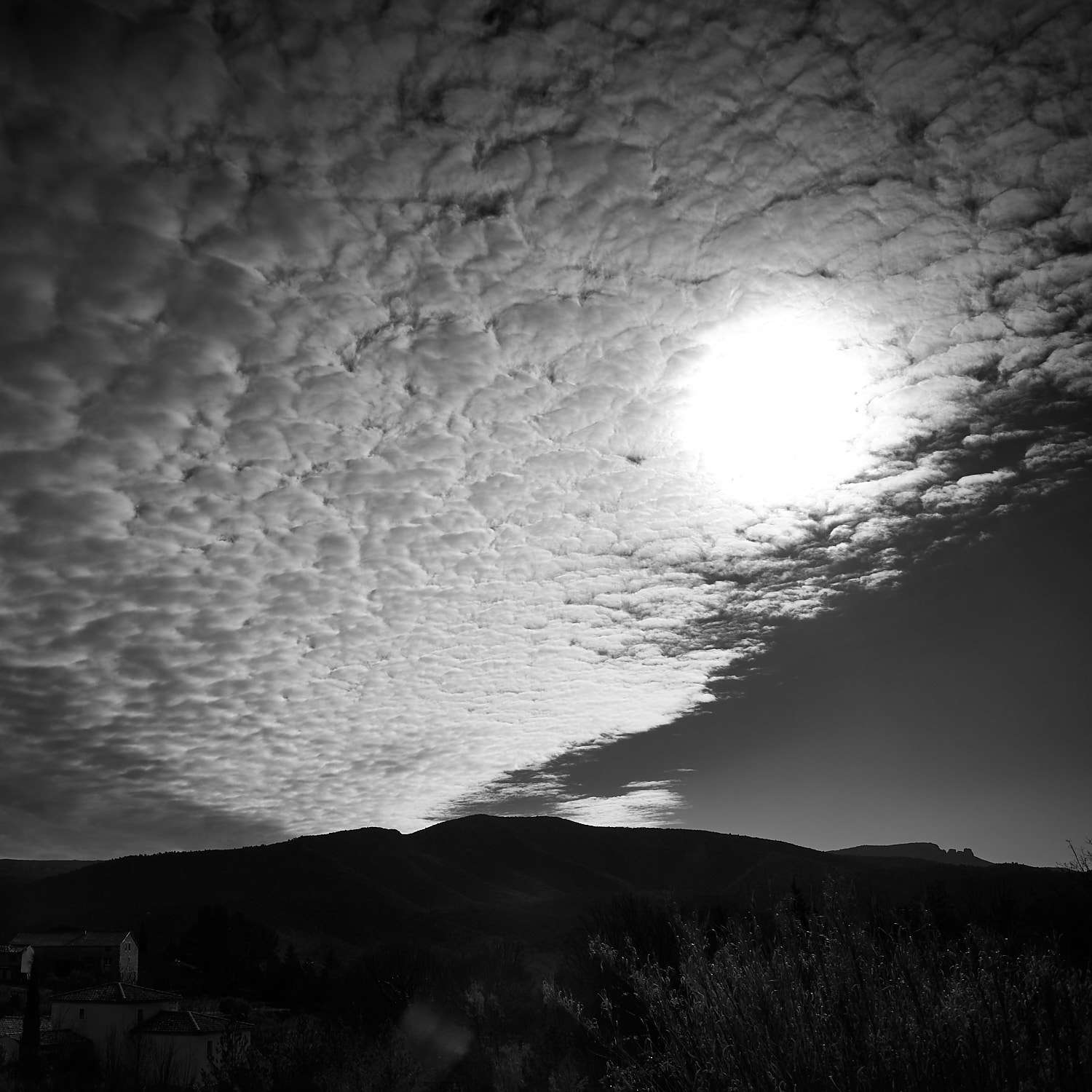
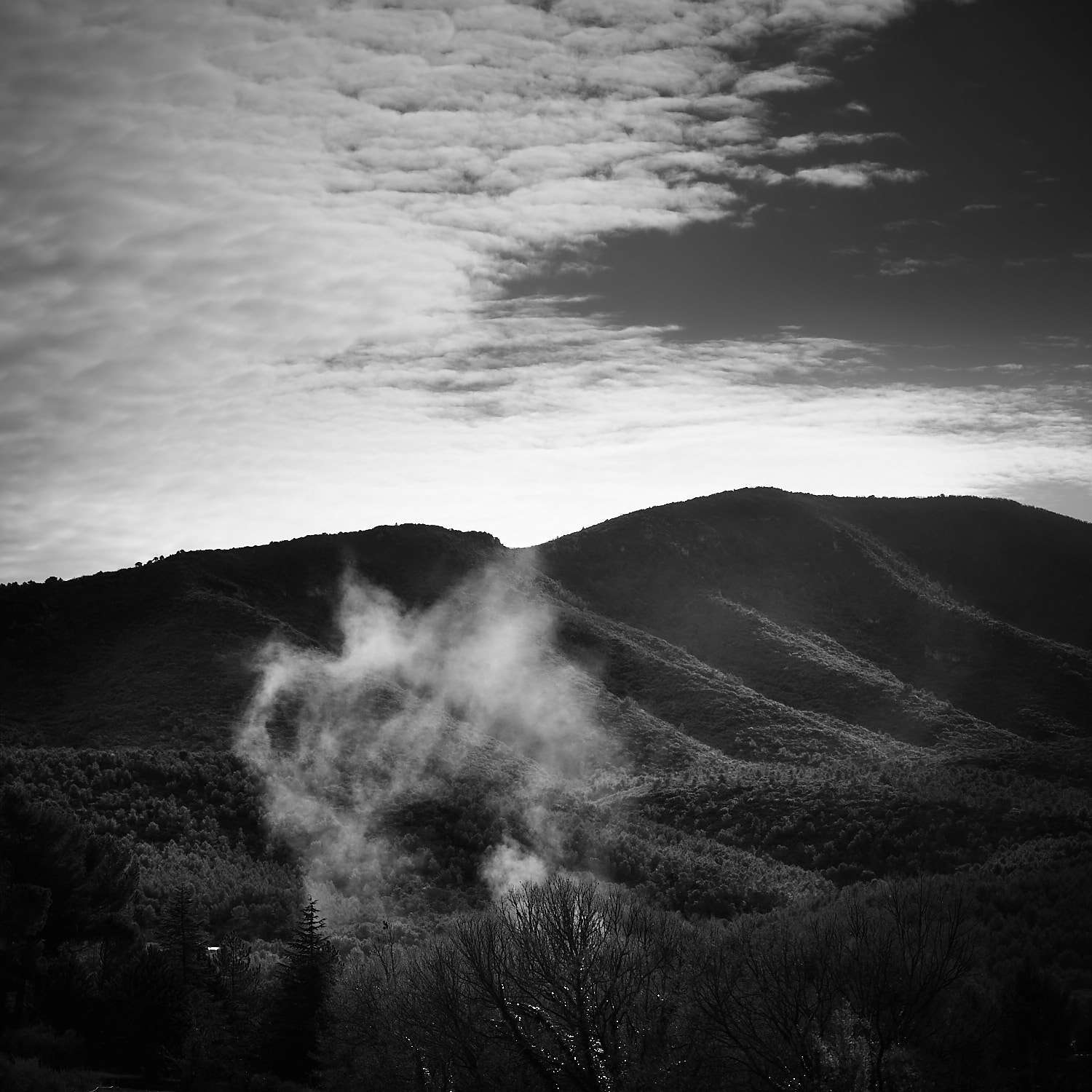
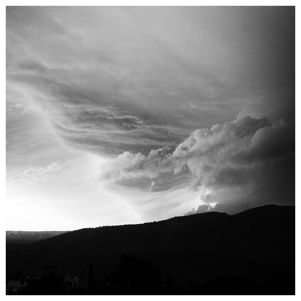 HCBOK. So I had no entry for HCB but all the cool kids were doing it so I tried to find a photograph that might evoke the Master's spirit and here it is, for me.
 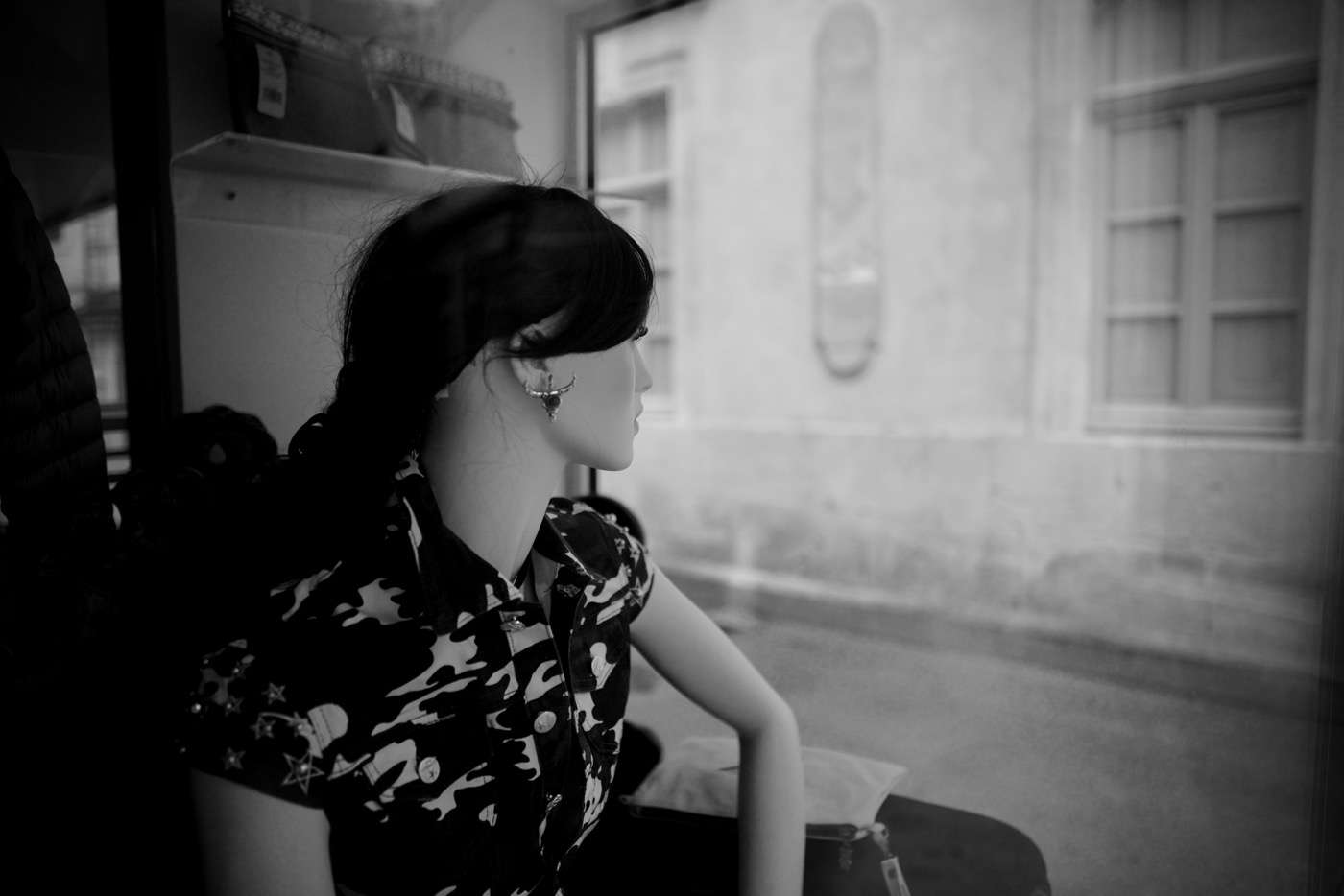 Man RayThere's a French saying that goes "knowledge is like jam, the less you have, the more you spread it out". This applies to my knowledge of Man Ray's work. So what you see here is my reduction of a man's legacy to "cool solarizations, bro!" The effect is cool and really goes well with the rendering of a certain 85/1.4 lens taken way the heck out of its design zone by huge extension rings :) Sue me, Zeiss !
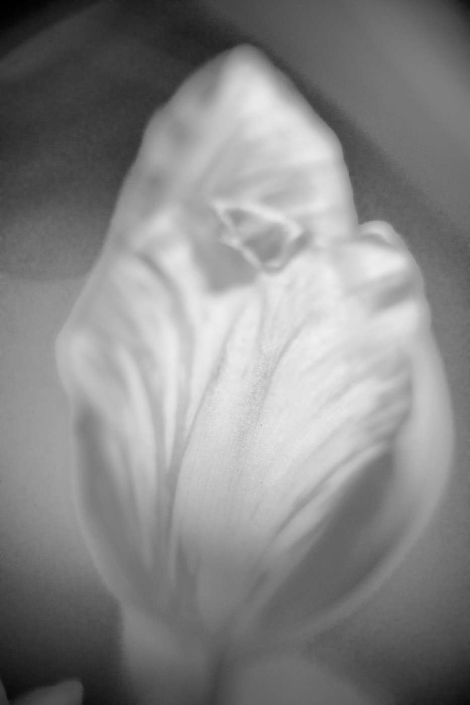
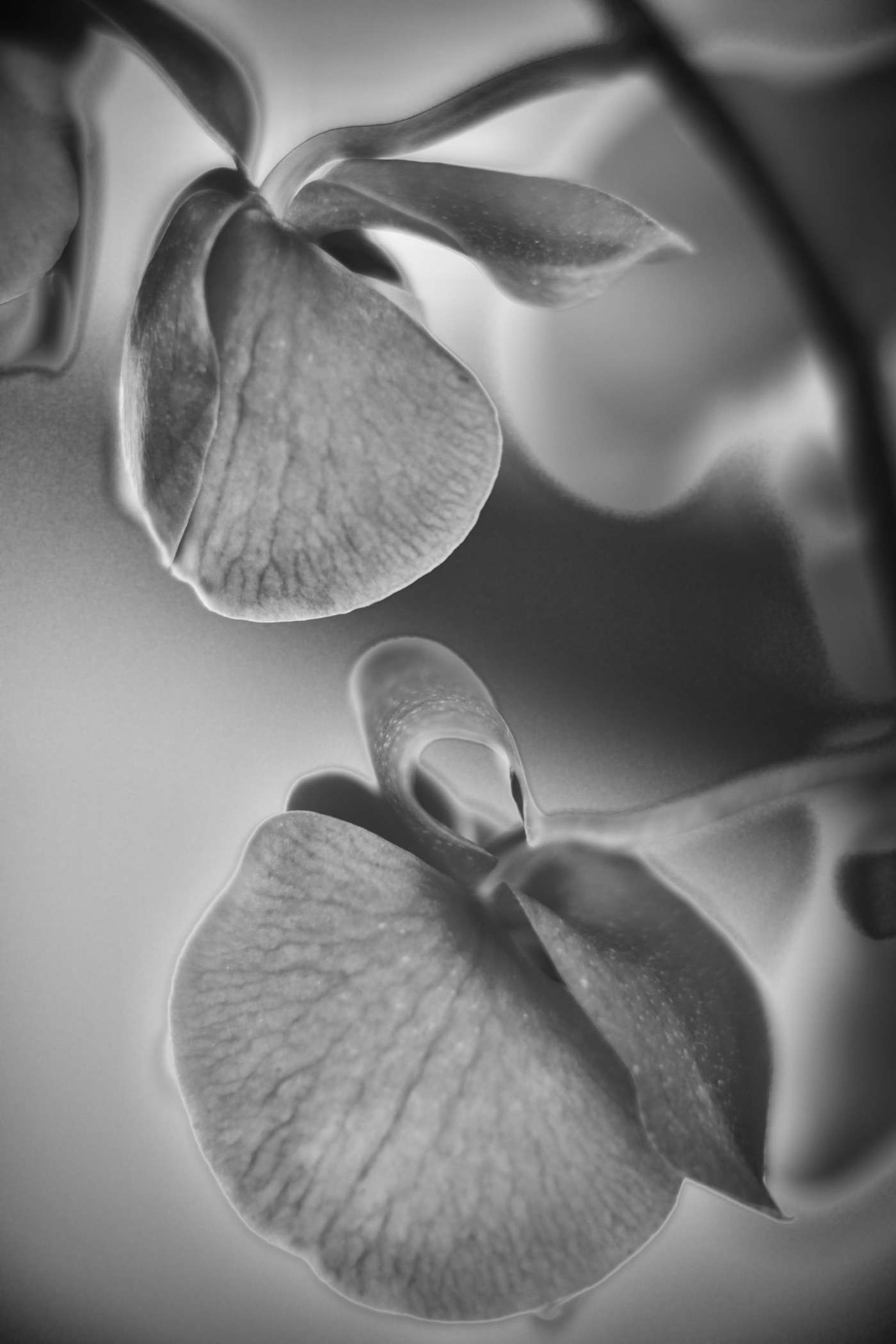
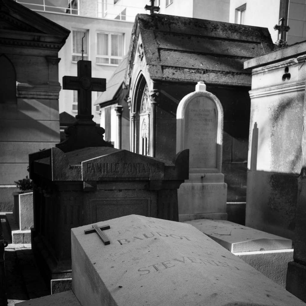
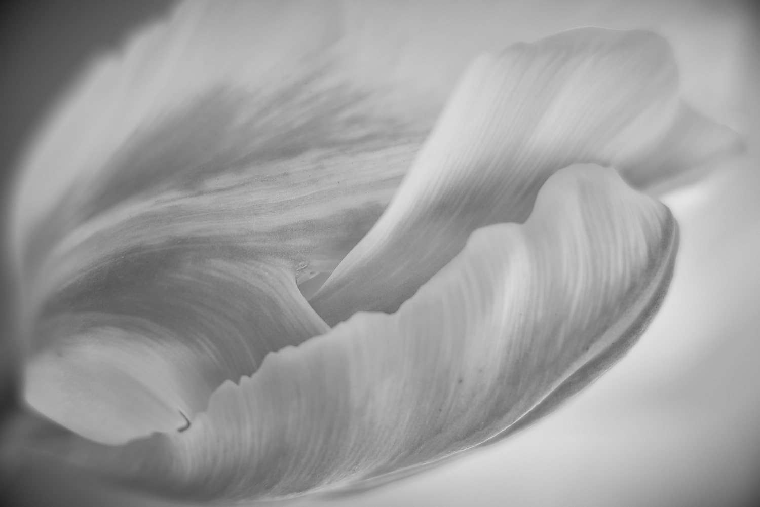 André KestészConsidered to be one of the fathers of photojournalism, a section of photography that leaves me stone cold, Kestész impresses me by his compositions and tones. A free-thinker who turned down awards and told prestigious magazines to go suck eggs, he spent his life resenting his lack of recognition and understanding. Well, here's a minor homage from a major fan!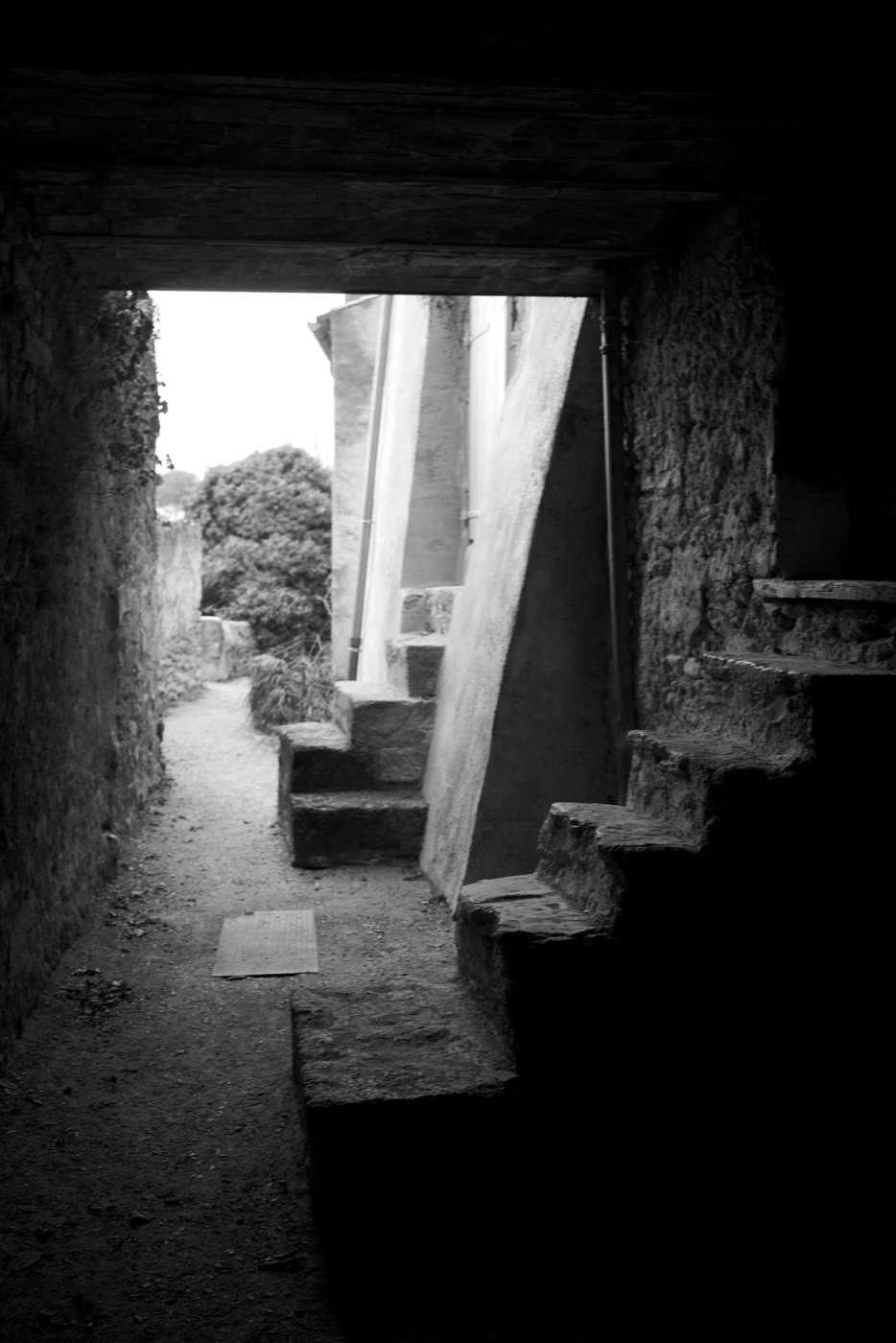
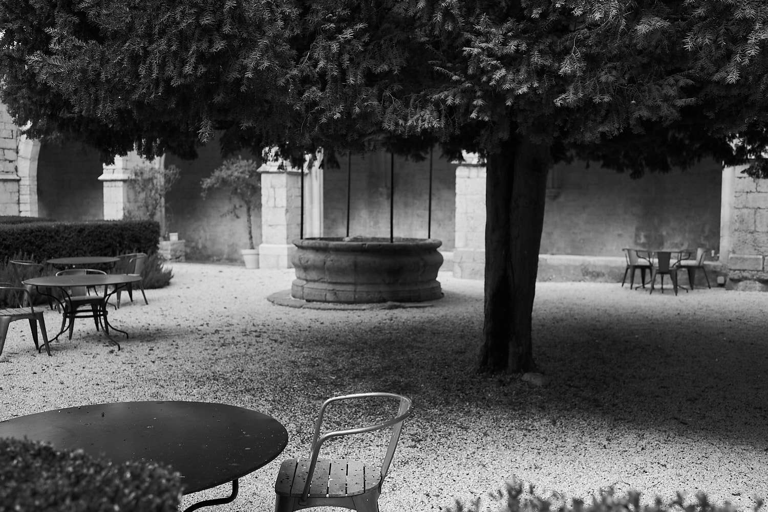
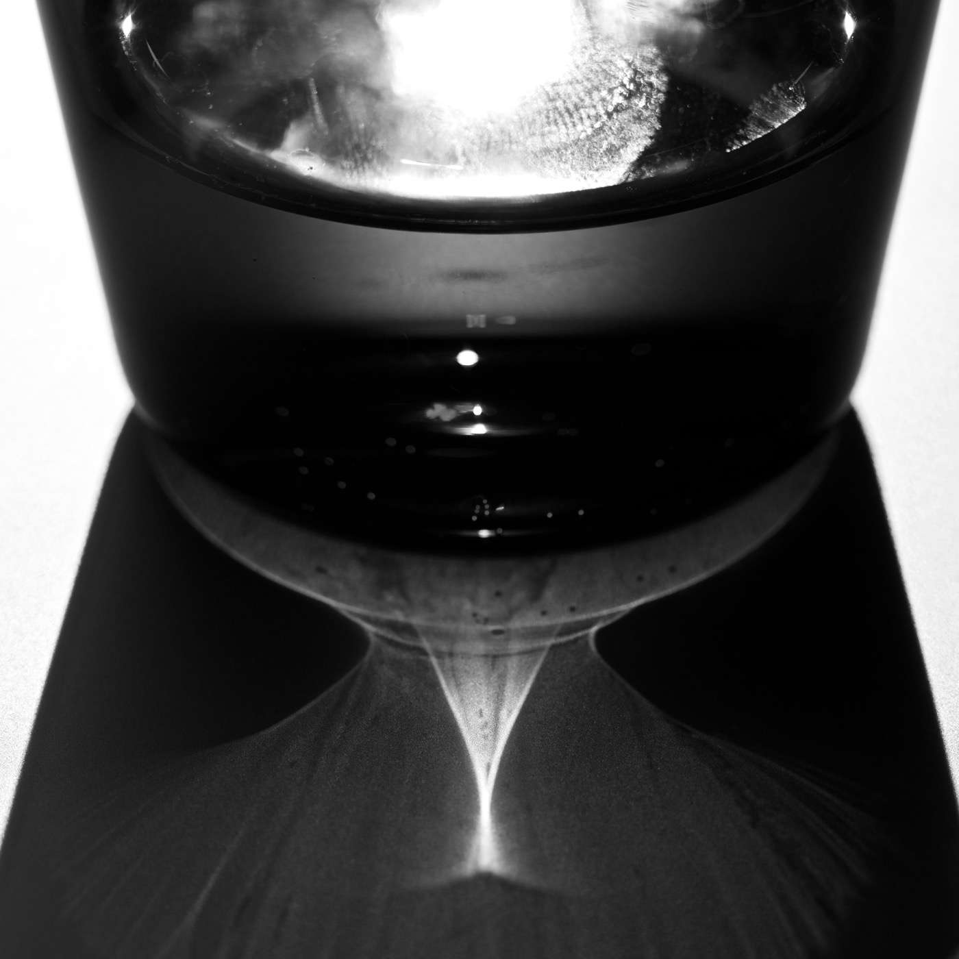
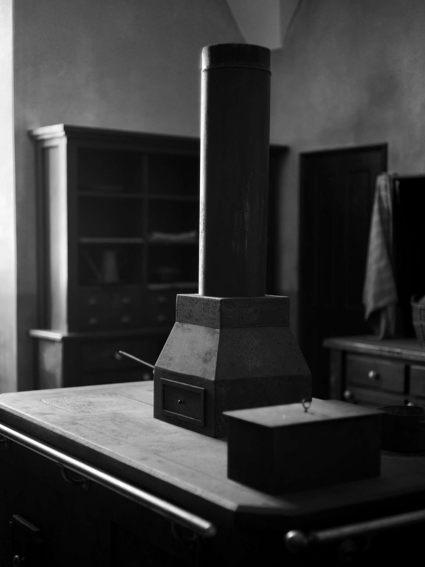
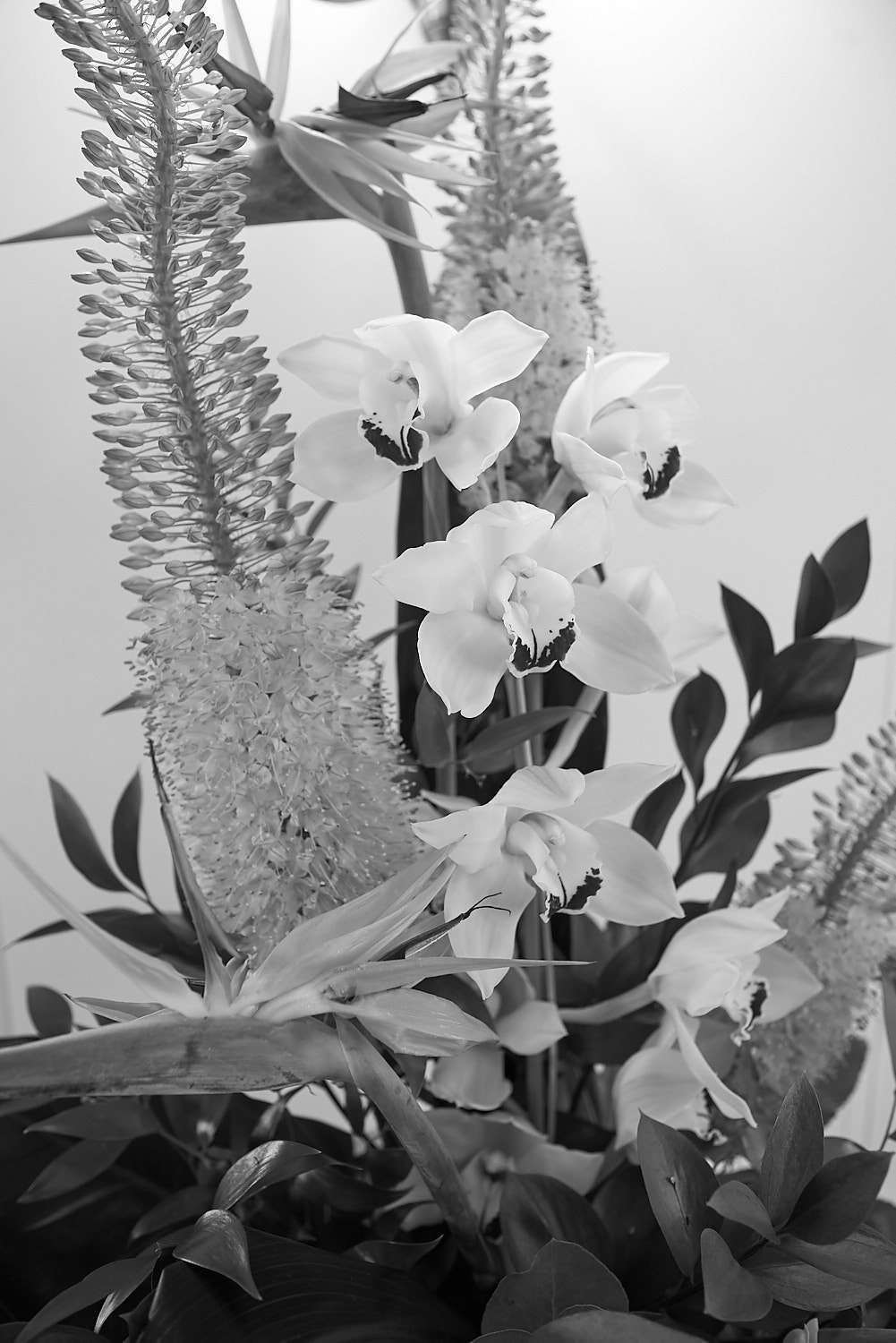
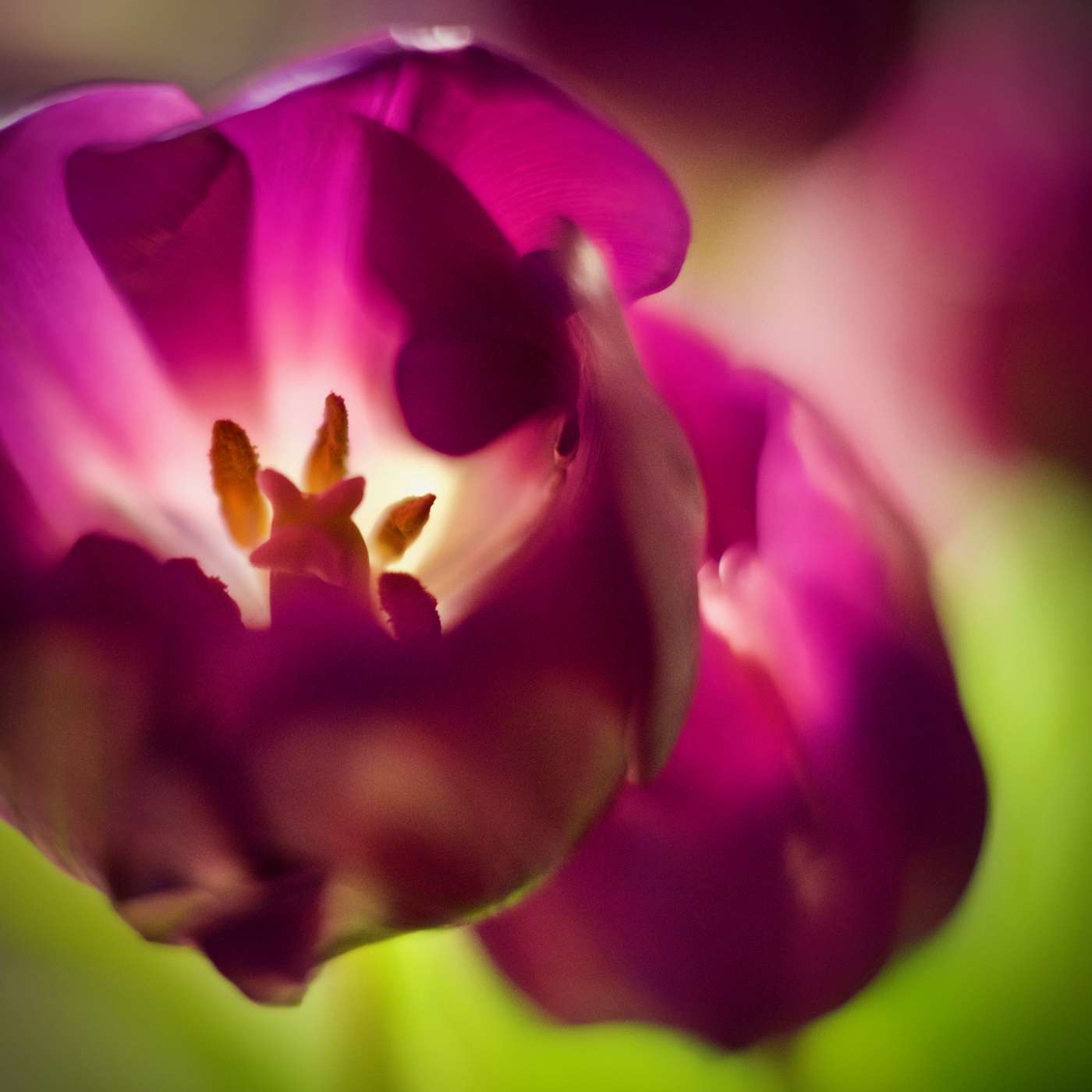
 Irvin PennYou say Penn, I see the crazy fashion shoots with feathers, windblown drapes and checkered fabrics. This flower arrangement on a royal yacht in Edinburgh reminded me of those.
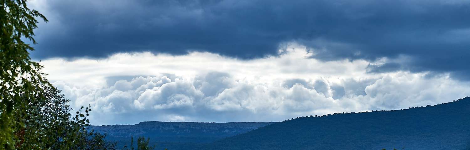
  Ernst HaasI absolutely adore Ernst Haas but really know very little about the photographer. What strikes me in his photographs are the dark, intense colours. The strong contrasts and bold compositions that, by some miracle are always meaningful and balanced rather than over the top gimmicky. After reviewing my own photographs, I realise how timid they are compared to Haas'. If this exercise has taught me something, it's to avoid dilution, be ever more essential and direct.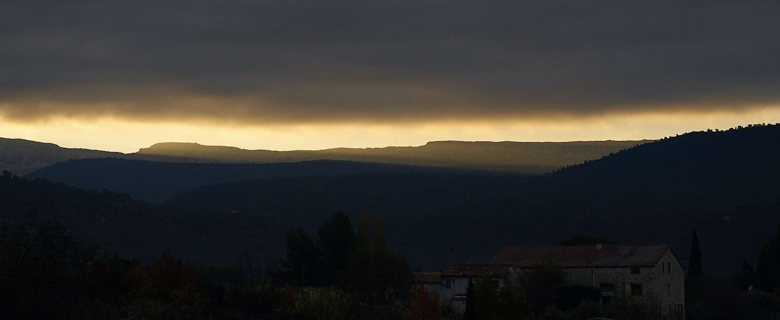
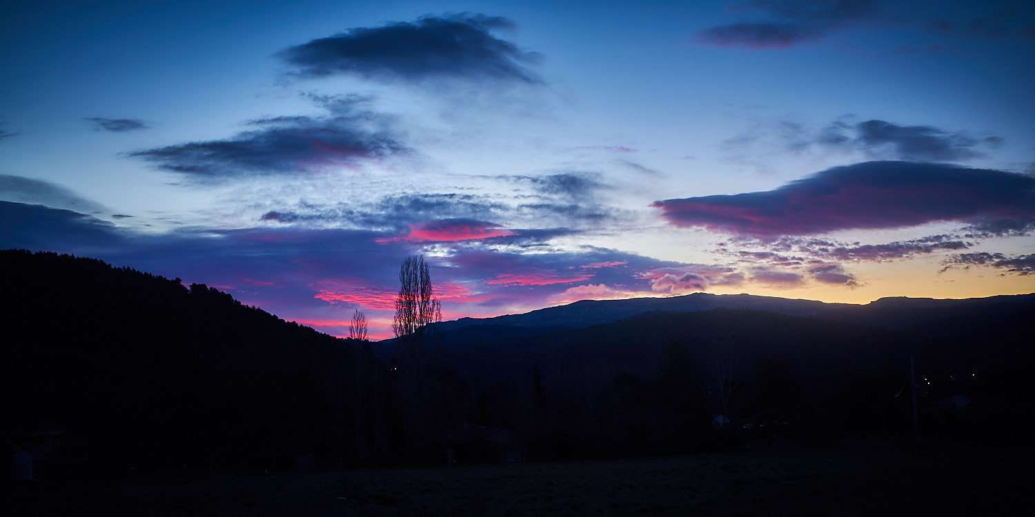
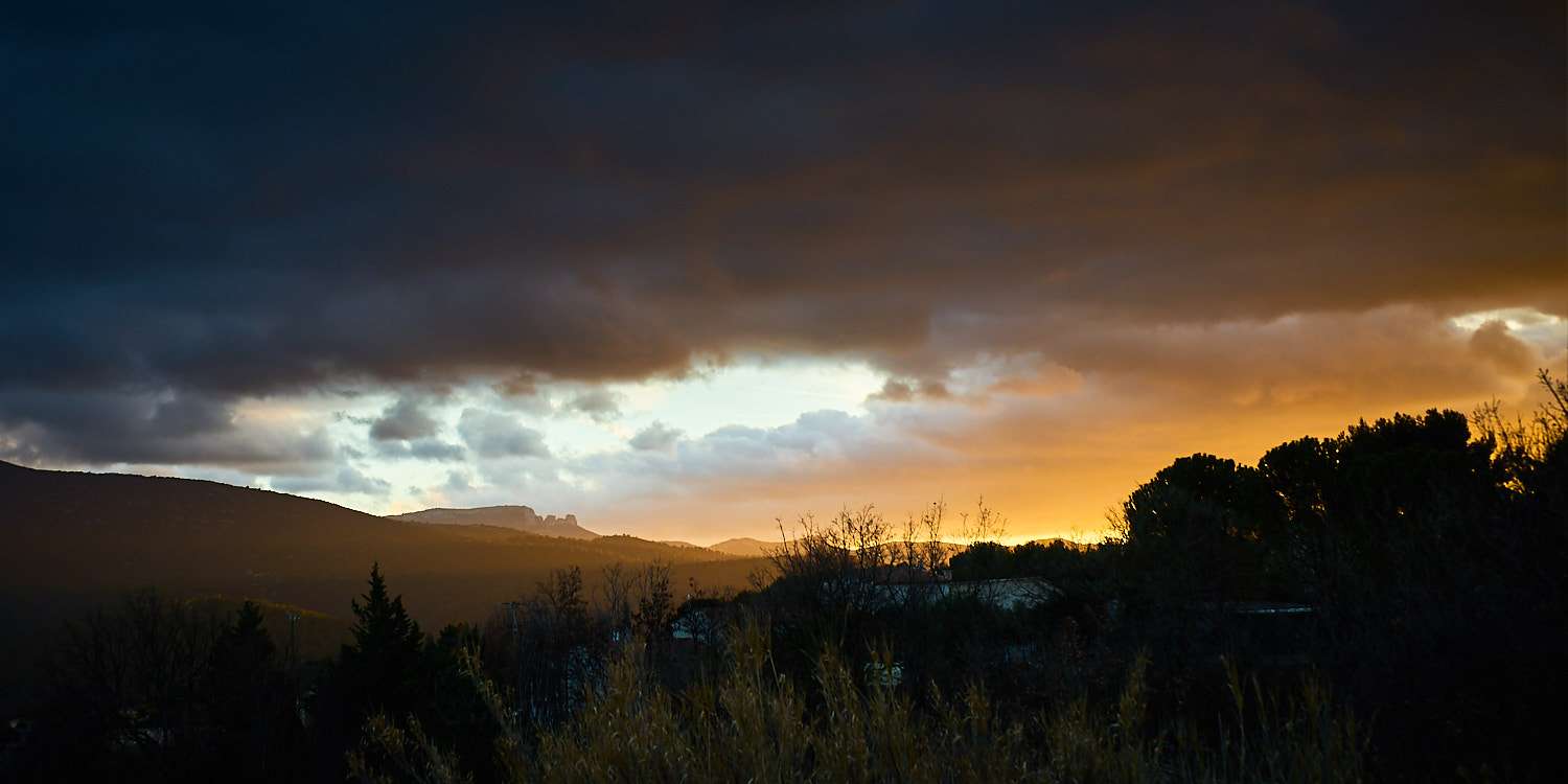
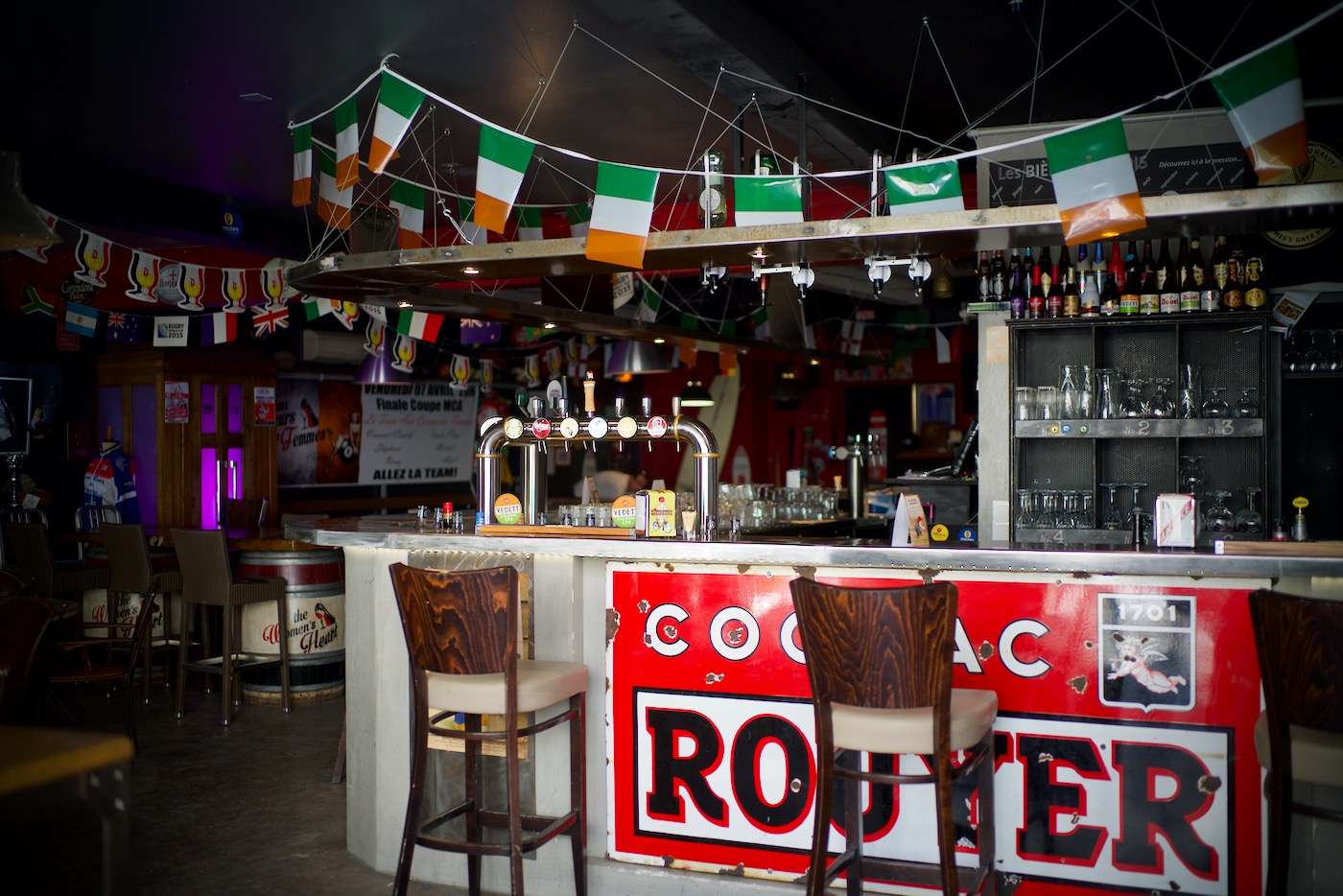
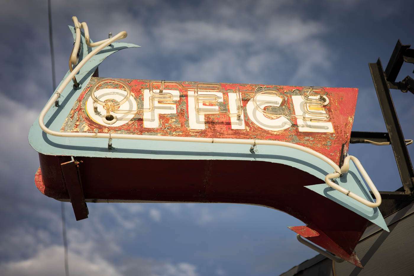
 William EgglestonRemember that red ceiling photograph ? Others in lonely motels with faded shades of blue and pale neon lights ? Well, the composition is far off, but the play on colours is what remind's me most of Eggleston here.
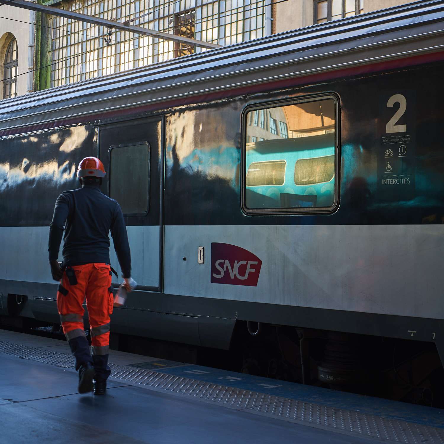
  Saul LeiterTo me, Saul Leiter is one of the unsung heroes in photography. Although not as influential for my personal dabbling as Haas, for instance, Leiter is someone who's ability to see what would pass totally unnoticed to anyone else is astonishing. I love his use of glass as imperfectly transparent or reflective medium, his choice of colours - usually pretty pale with a dab of red or orange - and his compositions which always feel so alive. Mine, below are far too formal to do justice to Leiter but I tried to get some of that bold colour in hiding and the hints of parallel worlds colliding.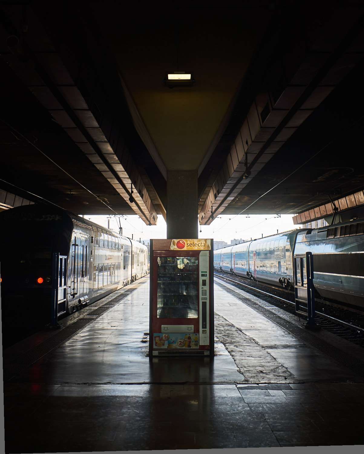
 Hiroshi SugimotoWell, barely. Sugimoto's seascapes figure elemental air and water from all over the world, usually abstracted via long exposures and a mid-frame horizon. Not being a great fan of long exposure photography, I chose the represent the air as the ripples on the water and no horizon but a bar of light in between slices of shadow. It's not the same and probably wouldn't fetch the 2-300 large of a Sugimoto seascape, but the intention is there :) Less of an elemental masterpiece, more of a focus on the surface of interaction.
 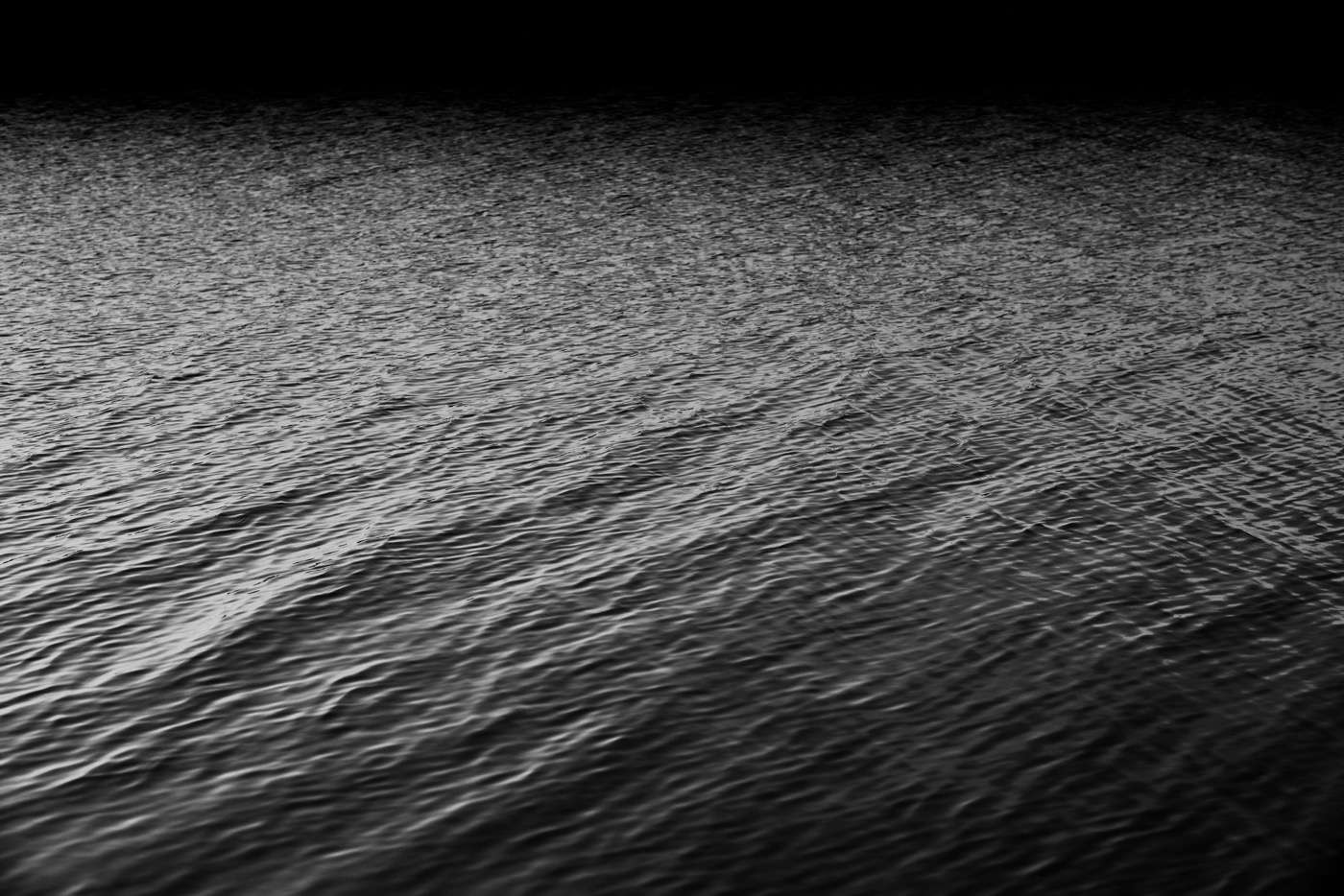 Gregory CrewdsonYeah, I wish ...
Steffen Kamprath
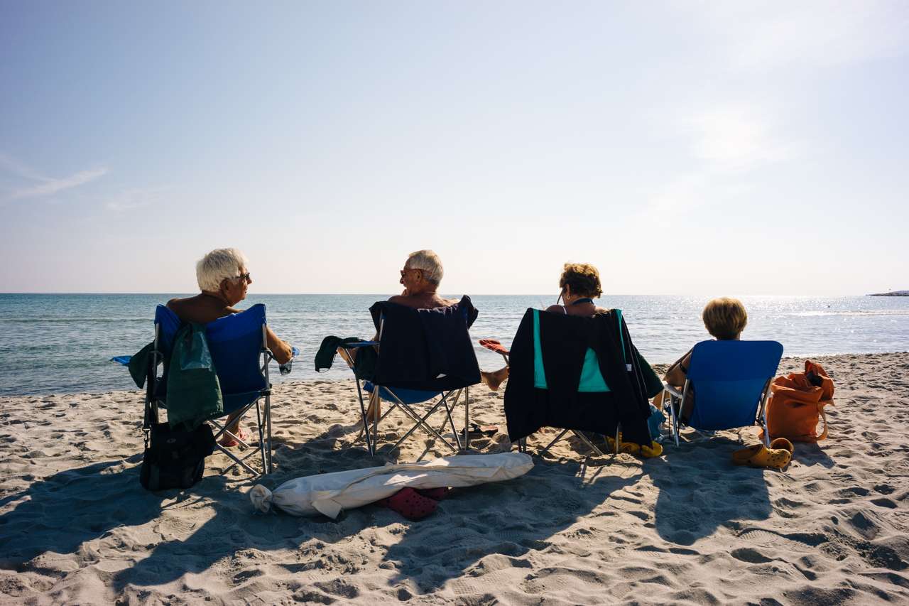
Disclaimer upfront: During photo shooting, I never try to imitate famous master photographers. But when Pascal pitched his idea, I couldn't resist to scour my back-catalog and relate some more or less to the many photo books in my shelf.Let's start with one of my favorite travel photographers, Steve McCurry. We both share the same passion for the Asian continent, travel photography in general, the variety of people and their places, and color photography. I choose this photo from inside a colorful Cao Dai temple in Tay Ninh, Vietnam. In true McCurry style, this photo contains Asia, people, bold colors, pattern, and shows us unusual parts of the world. 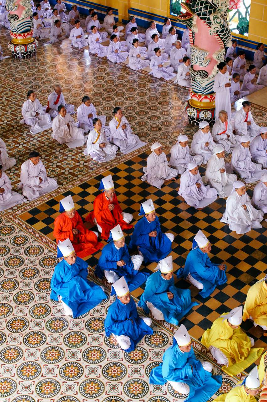 The second slot is also dedicated to a all-time favorite of mine: Martin Parr. He's arguable best known for documenting modern life in all his ordinary and quirky ways, and always with his distinctive British humor. My Parr-contribution in best Life's a beach style is of course set on a beach in Sardinia, and celebrates life and joy, with an easy composition – and a hidden message.
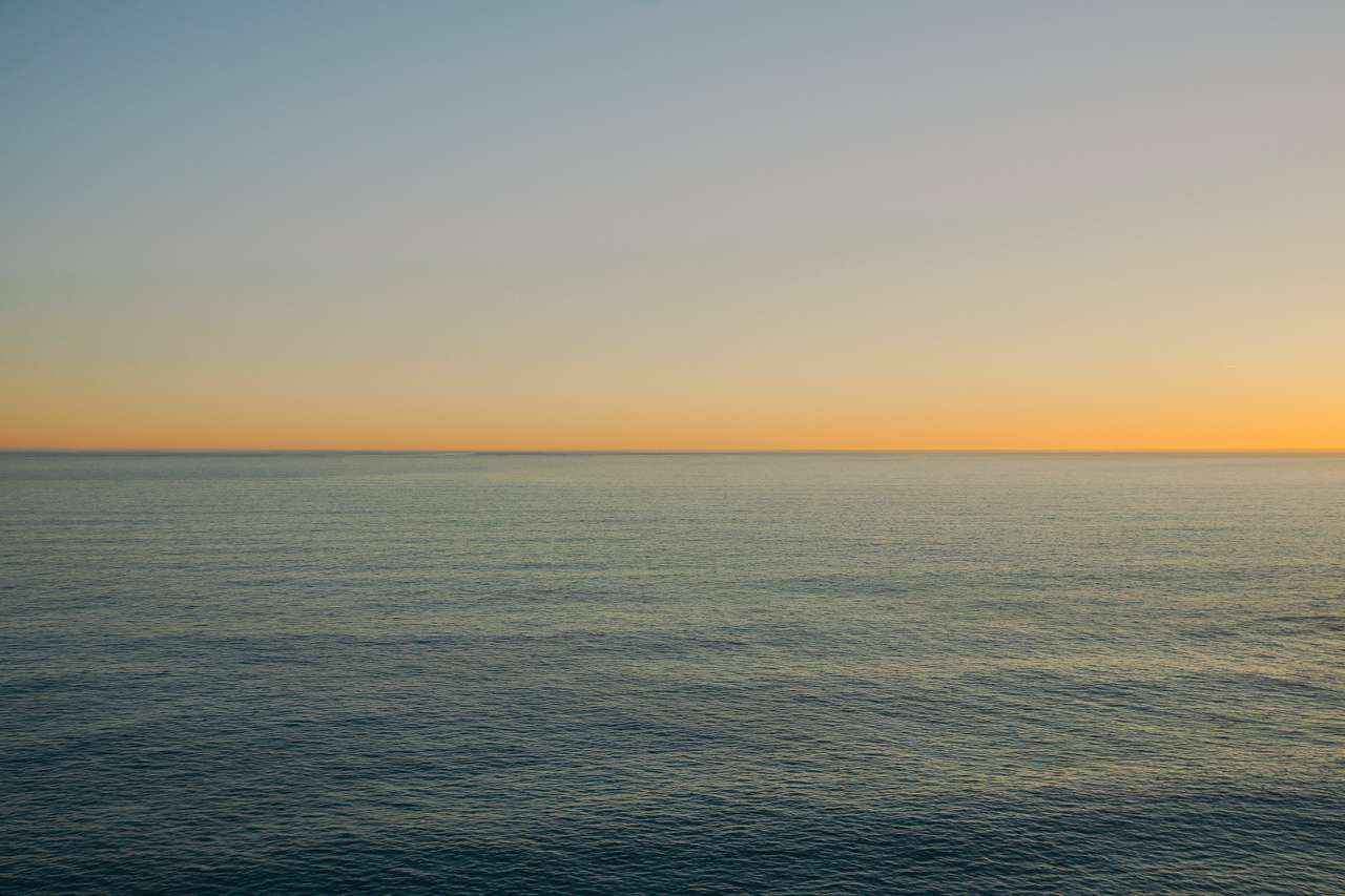
  My third contribution is dedicated to one famous photo series I feel very strong connected: Hiroshi Sugimoto's Seascapes. I love water, I love the sea. I love swimming, snorkeling, scuba diving, and even boating. And I also love to be at the shore and just look out into the endlessness of the sea, into infinity, where water and horizon meet. It's a graphically thing, shades of colors, structure, light … and it's constantly moving and morphing. I'm actually collecting my own set of seascapes, less abstract, dreamy, and surreal but more documentary, in color, and more about variety of the same subject. Here's a seascape from the Algarve coastline in Carvoeiro, Portugal:
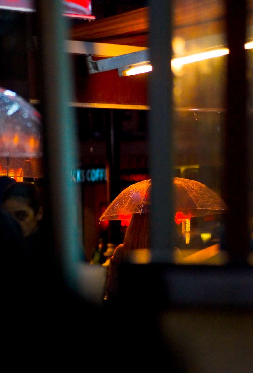
  Next up, me as Alex Webb in "Istanbul: City of a hundred names". This red umbrella is not only also taken in one of my favorite cities Istanbul (though recently not so much), but arguably shares a similar work with color, light, shadows, and a more complex layering of elements (as compared to e.g. McCurry).
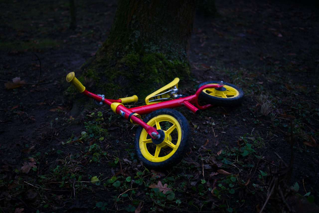
  … no, Pascal, I'm not finished. What about my take on William Eggleston's tricycle? Sad, isn't it? So much untold story, I can't hold myself …
  … and what about William Klein's Boy With A Gun? I got two!
  … stop pushing me, Pascal …
Steve Mallett
OK, in the spirit of co-operation and experimentation here’s an HCB offering. Hadn’t thought of a b&w rendering of this image but it works quite well I think. This is one of my fave images. I love the way the guy is completely stationary in the pouring rain whilst everyone else is scurrying. 
Paul Perton
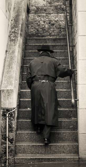
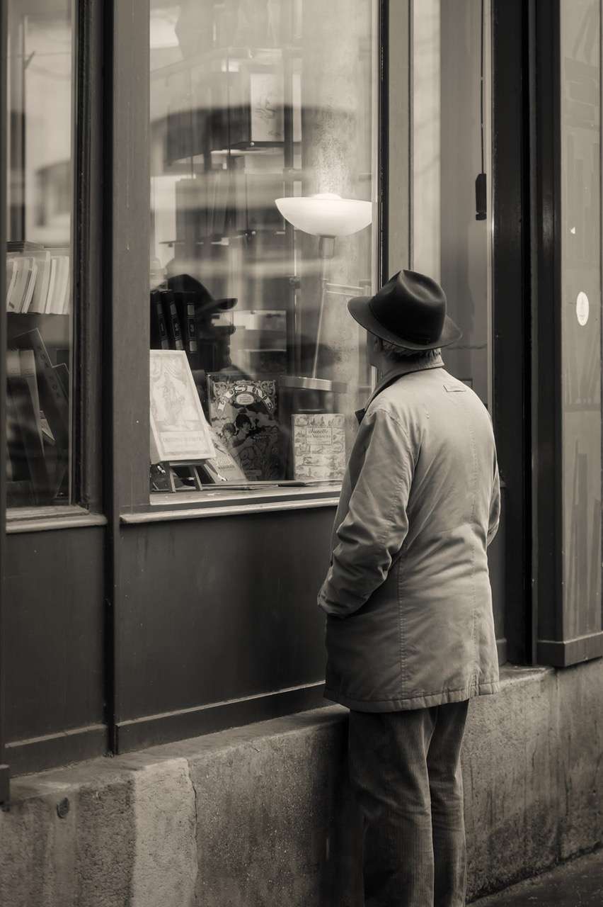
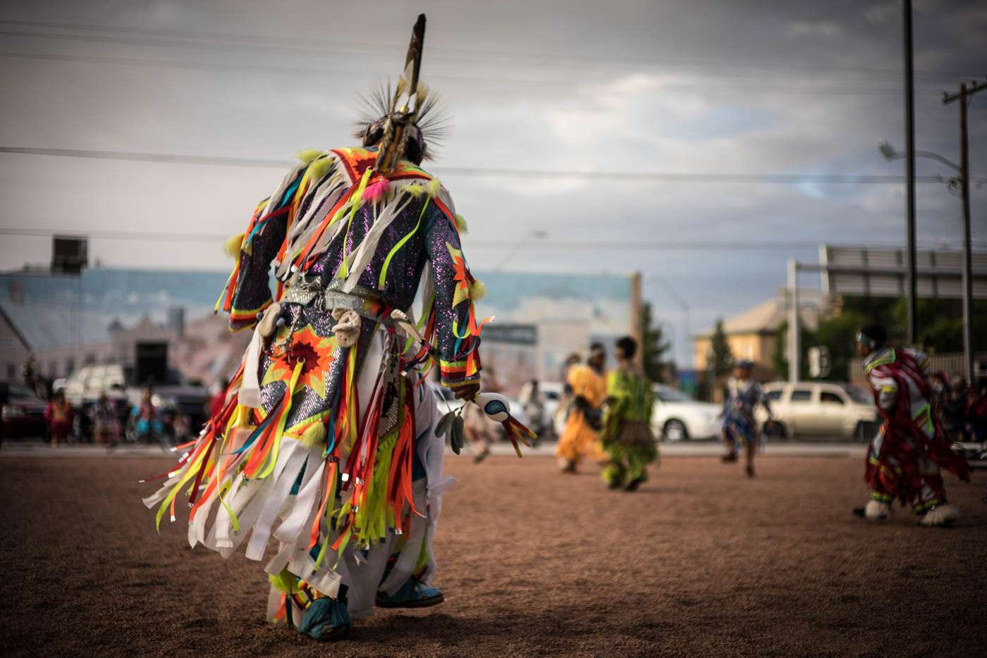
(narrated by Pascal) Paul's preparing a long trip and suggested something interesting. He sent these photographs along with no attribution to a specific seed master, leaving it to us to discover the influences in his work. What say you? 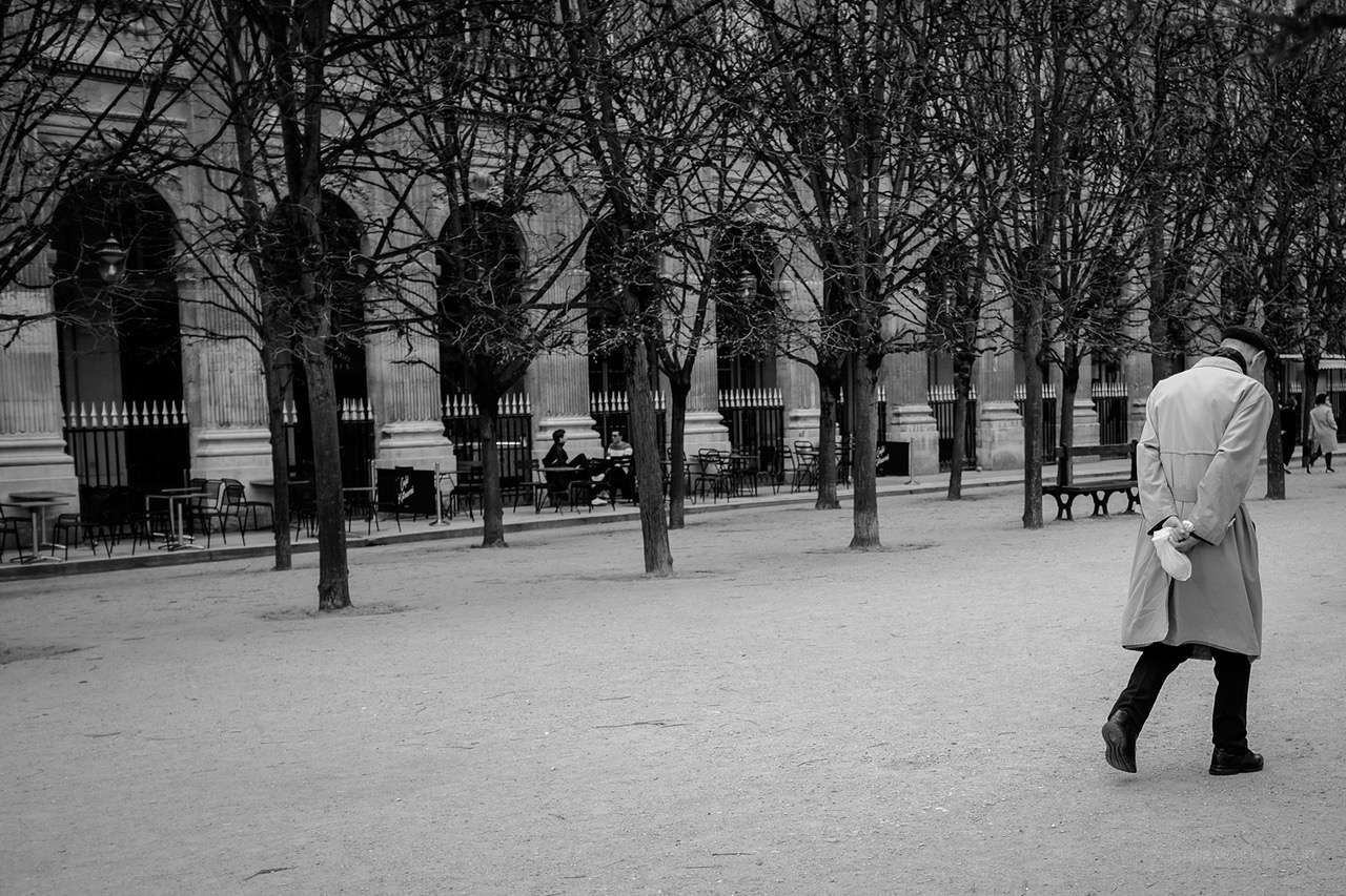
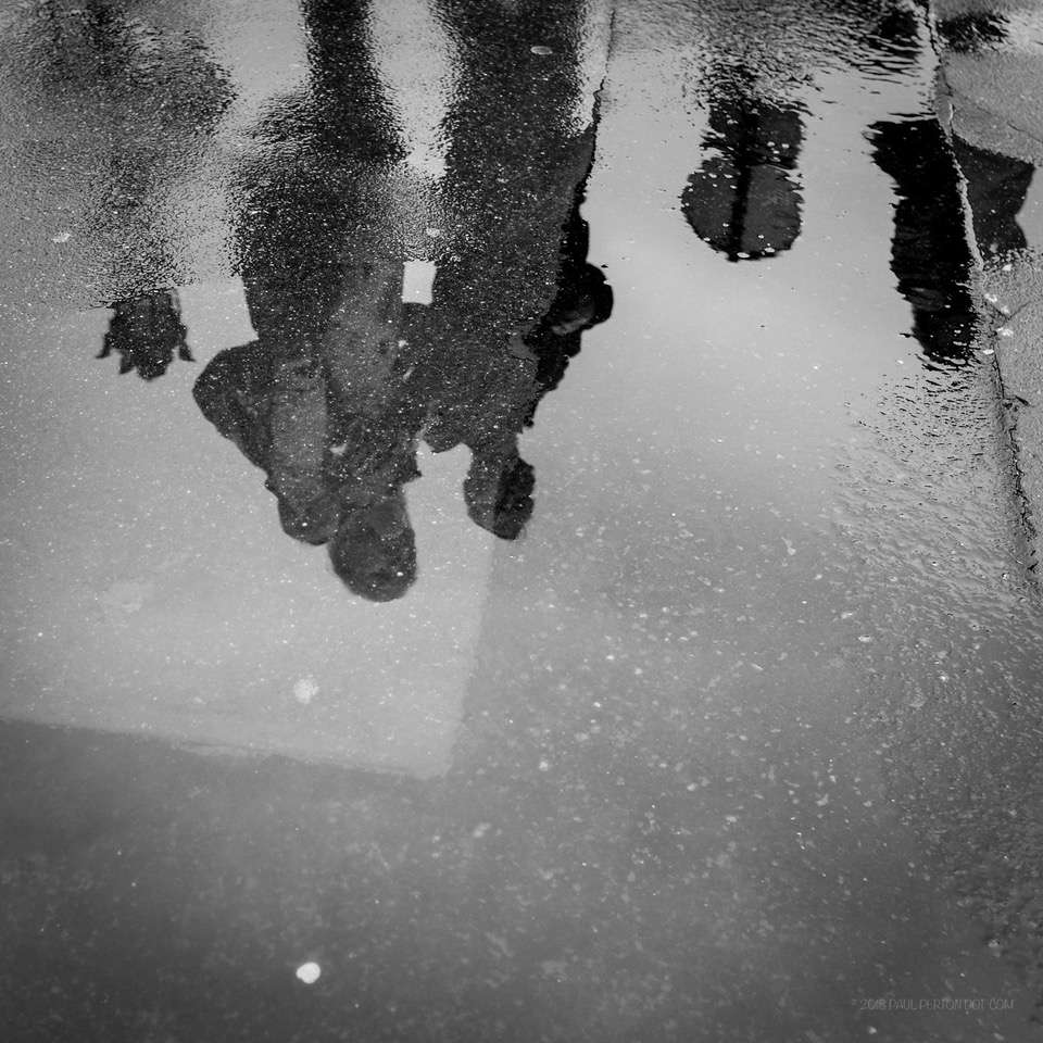
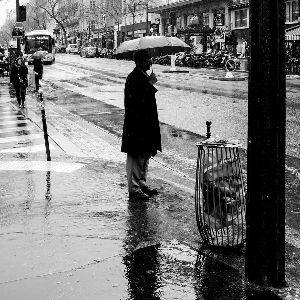
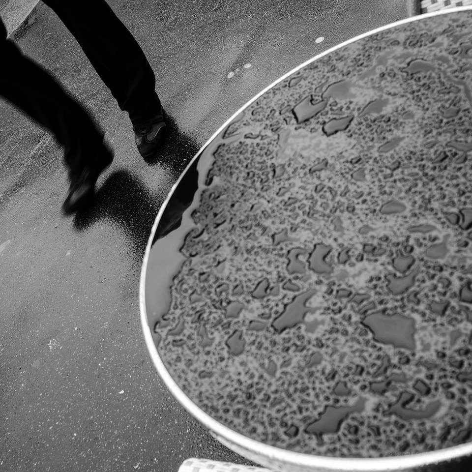
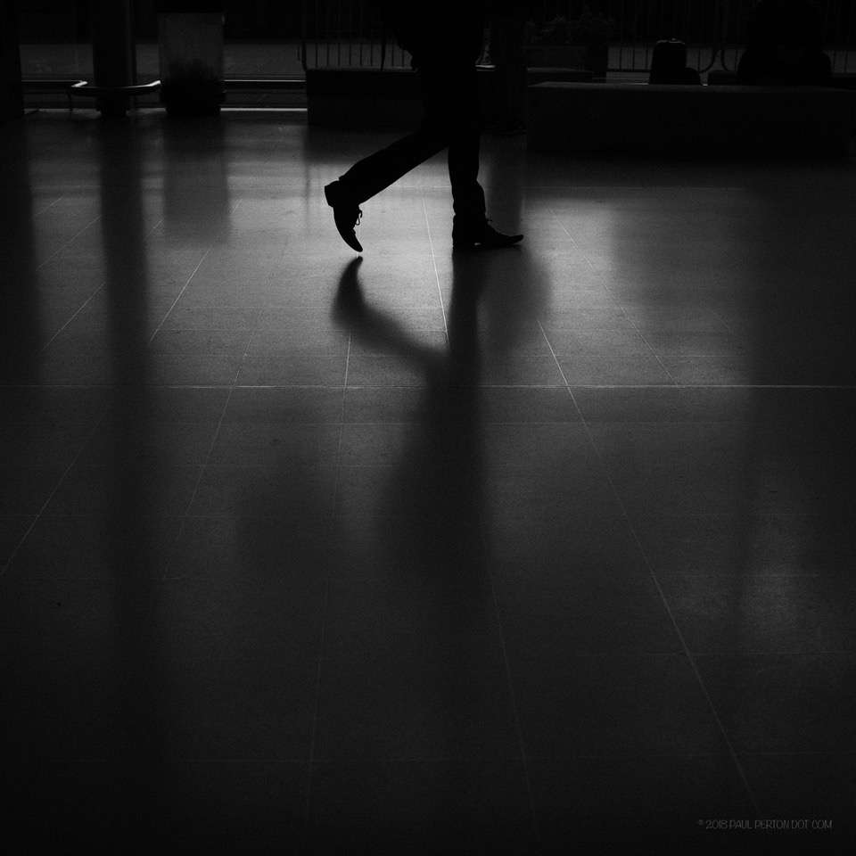 Riboux, Erwitt, Leiter and HCB come to (my) mind but you'll probably see others in Paul's work.More importantly, what influences do you see in yours ?
[hcshort id="7"]