#1337. United Colours of X1D
Since my recent love letter to Hasselblad consisted mainly of b&w photographs, a few readers rightly contested my praise of the X1D's colour science ;) This post is here to explain what it is I like about those colours, and contains (almost) only colour photographs to back up my words. The concept ...
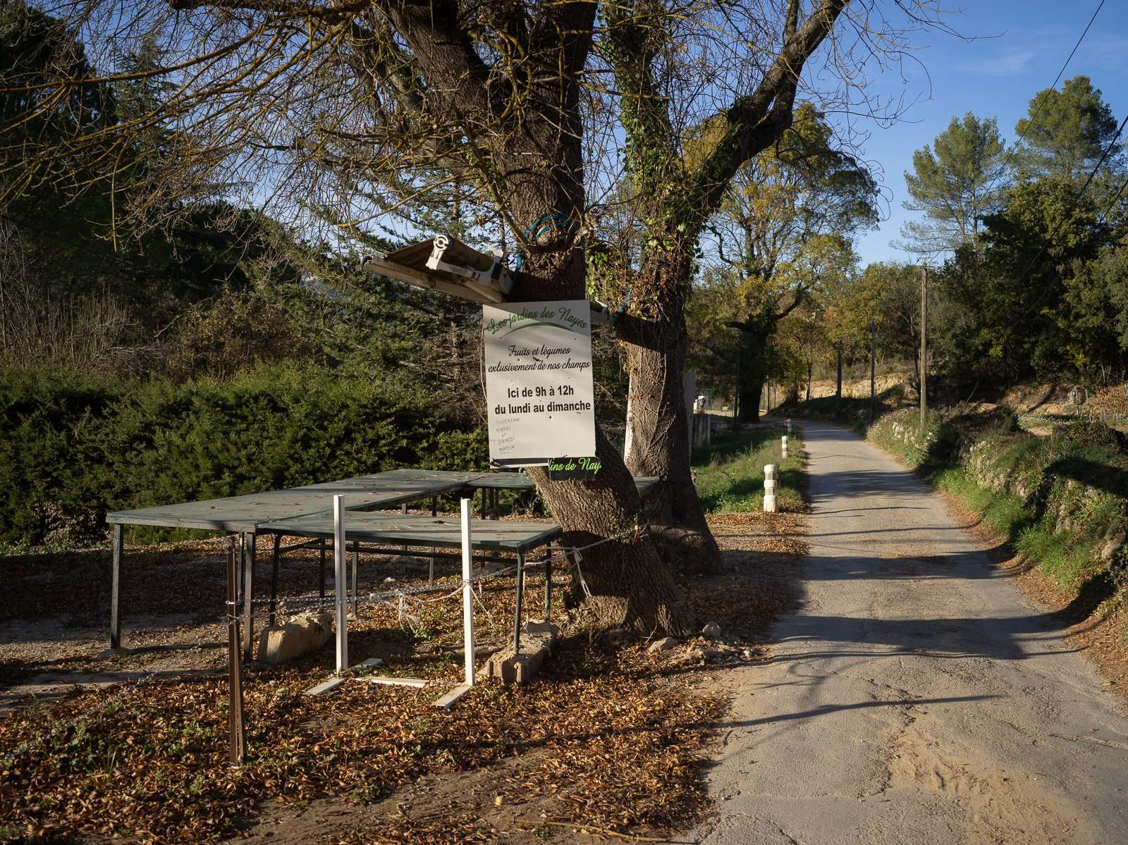
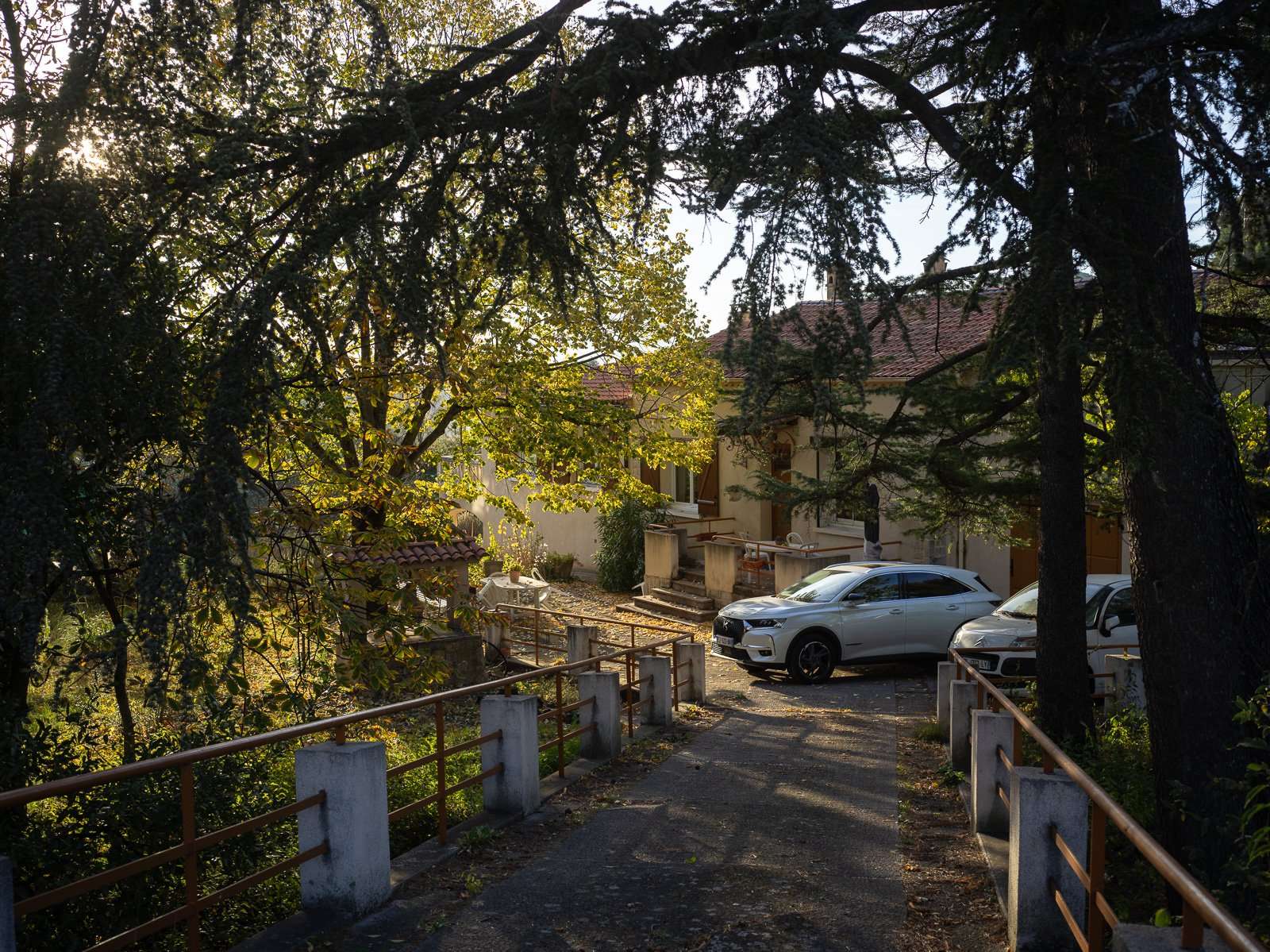
Please excuse the lack of thematic unity of the photos on this page. The reality is that, to make my matters worse, I actually don't shoot in colour all that much :lol:
But here's what appeals to me when I do.
It's all very subjective, and if you'll allow the analogy, let's talk about wine a little.
Wine can be bold, dense, light, strong, subtle, acidic, sweet, tannic, soft ... It can be several of those things at the same time, though some are polar opposites. On wine forums, very often you'll see wine praised for its taste when all it has to offer is strong alcohol content. A wine can be excellent with strong alcohol content, if it is balanced by something else, but alcohol level alone never makes for a good wine.
Likewise, colours in a photograph can be bold, intense, subtle, subdued, cold, warm, bright or dull, and more. And what you or I like is completely down to personal preference. But, as in wine forums, photographers tend to clamour for intense colours that "pop". And good colours can pop, but pop alone never makes for good colour science.
For wine and photo colours alike, my personal preference goes to subtlety, restraint, and the ability to transcribe very small nuances. That's entirely personal, and that type of photo is neither inherently better nor preferable to one that pops like crazy. It just suits my style and preferences more. It's also easily lost to bad screens, or viewing in bad conditions, so ... mileages will vary.
If you work as a product photographer, absolute neutrality will be very very high on your list of priorities. If you focus predominantly on sunrises in the tropics, more zest might suit you better.
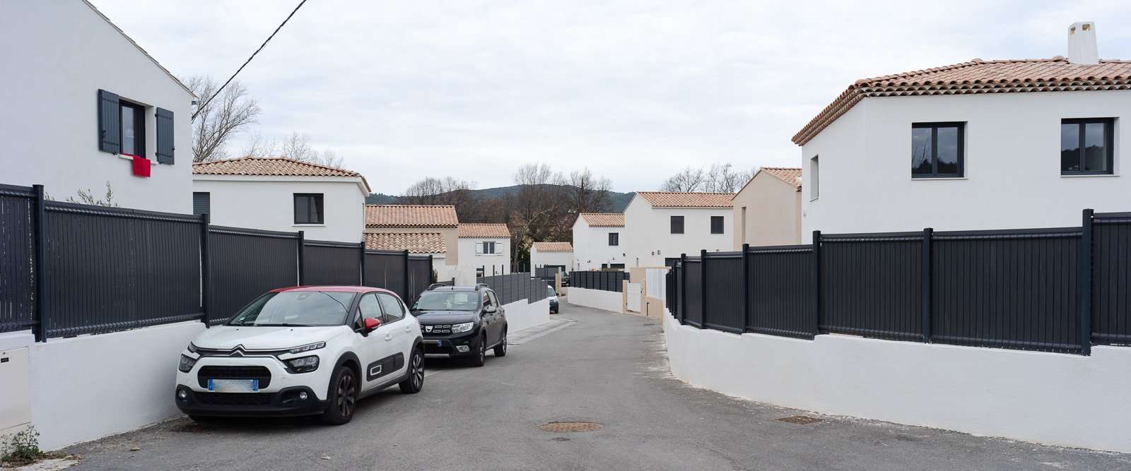
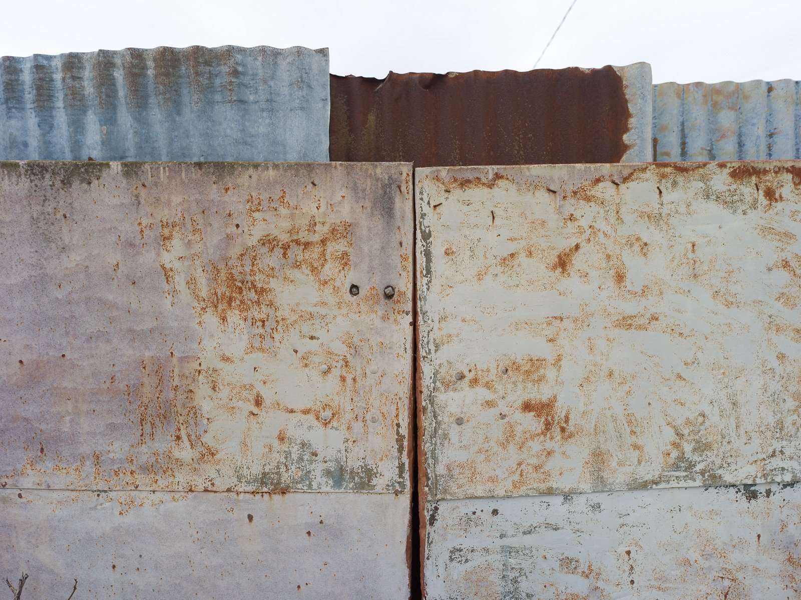
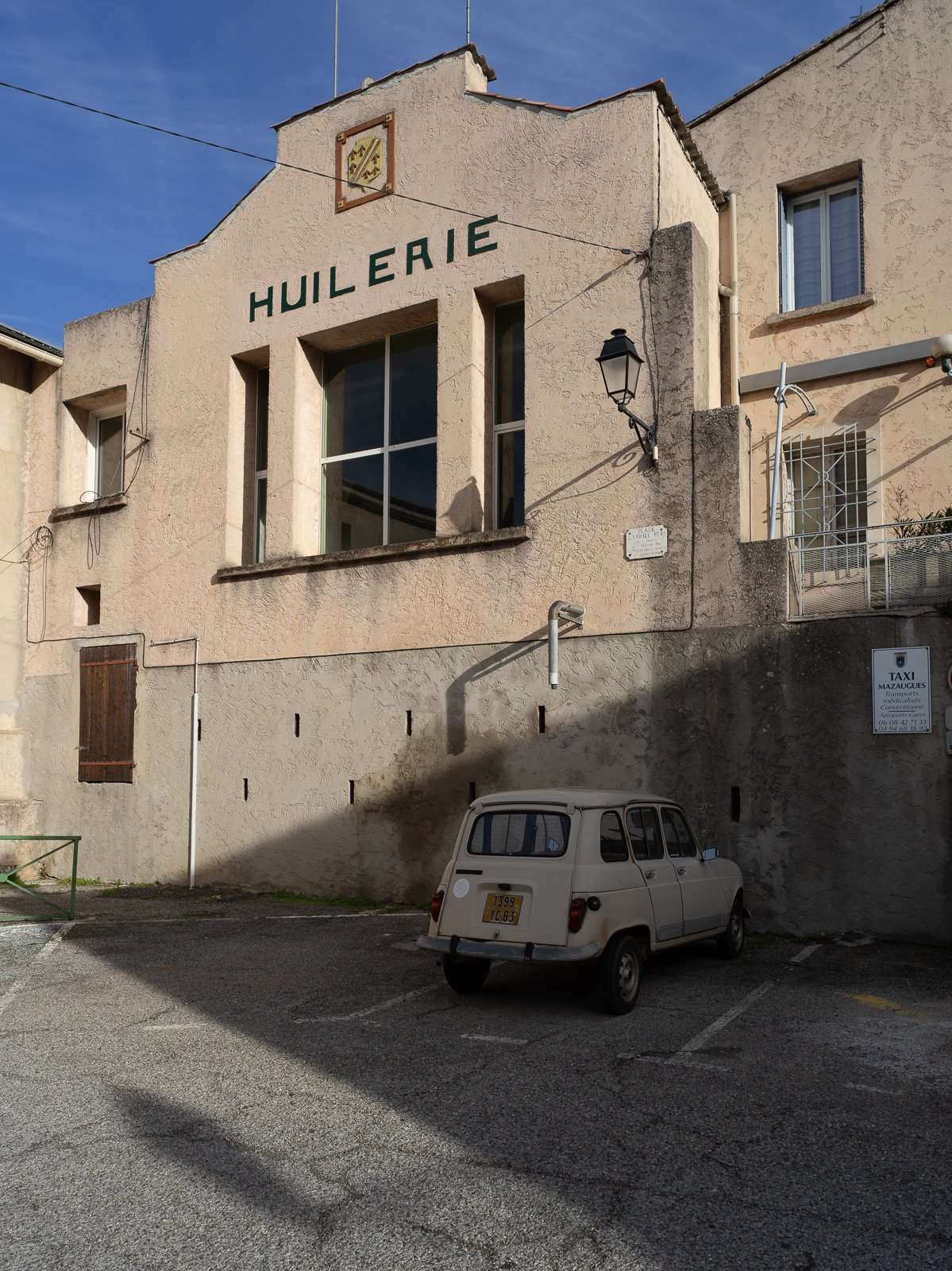
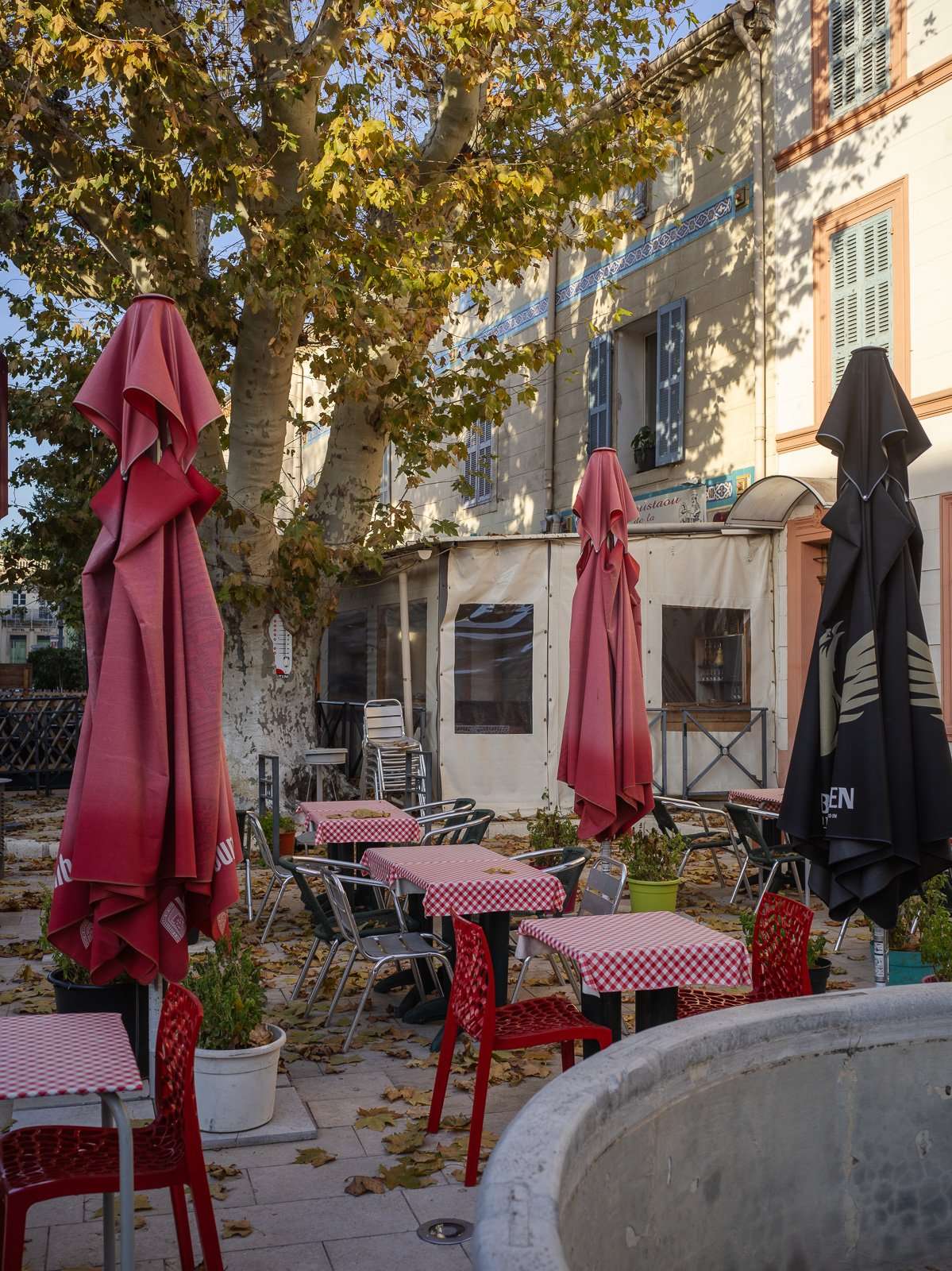
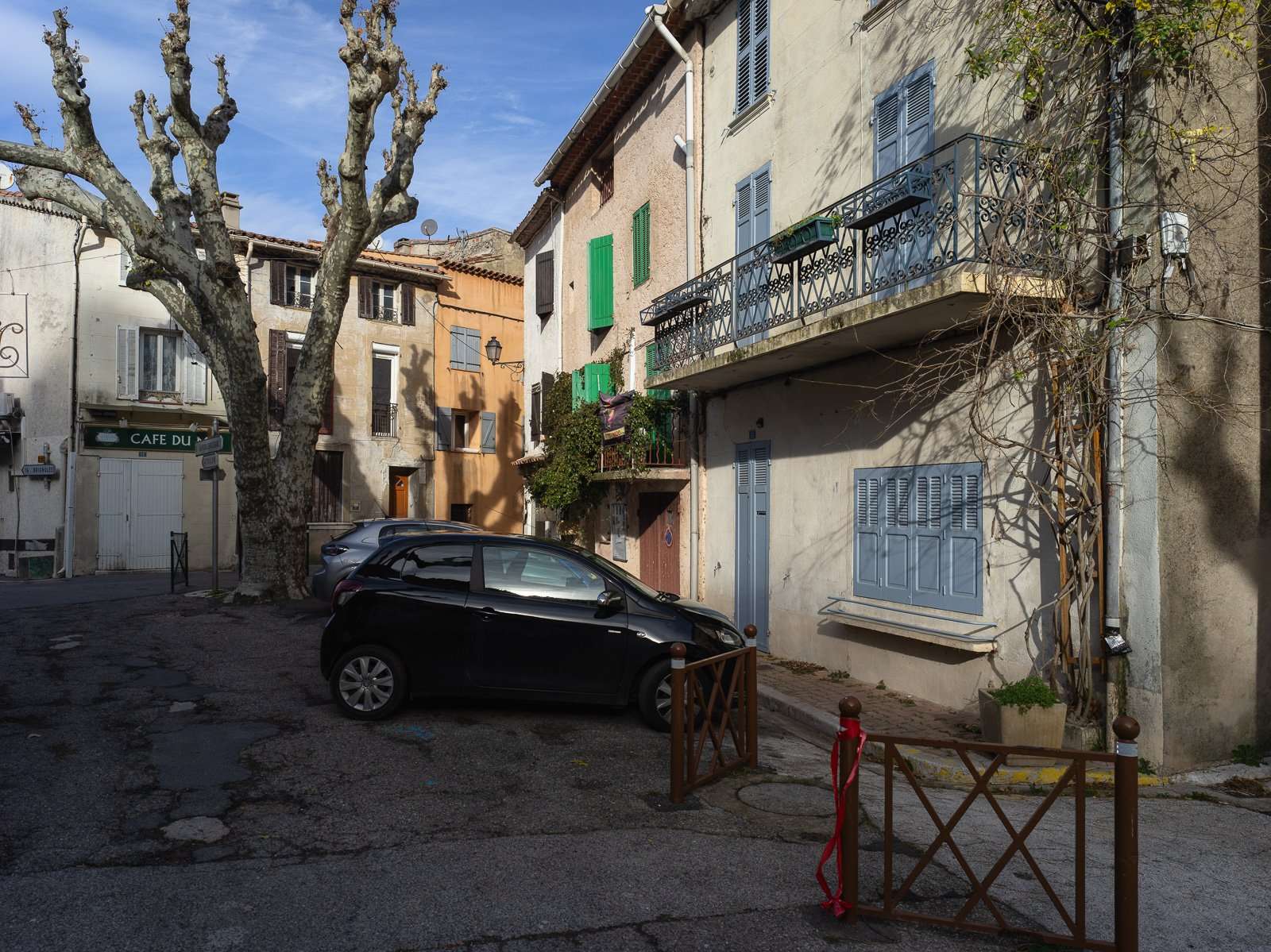
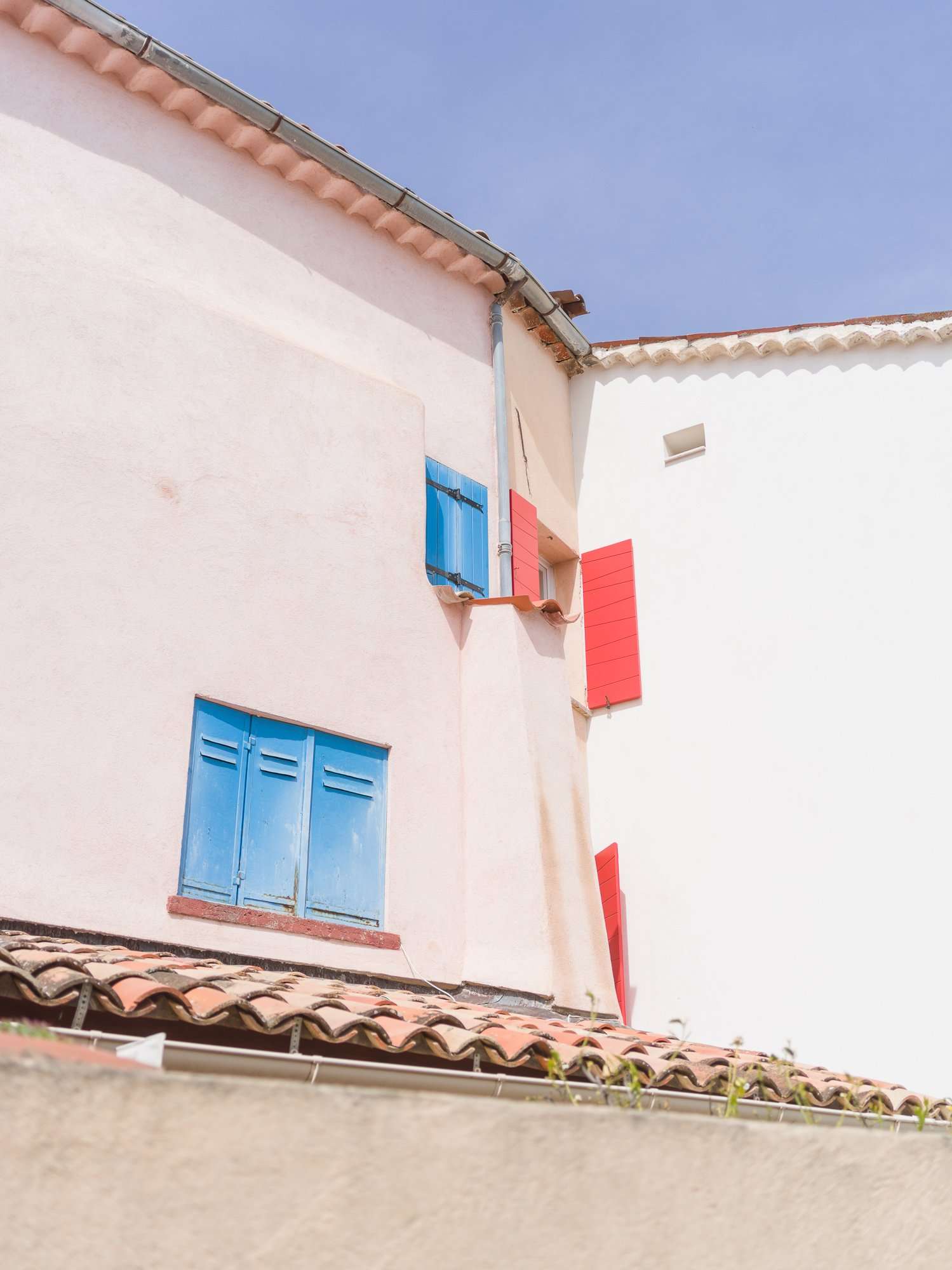
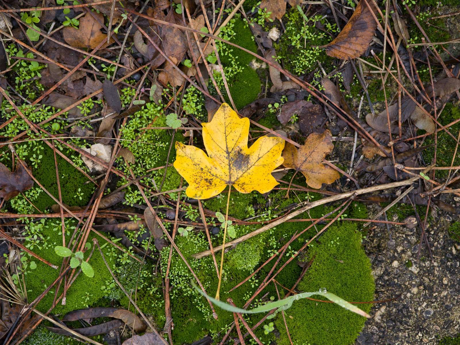
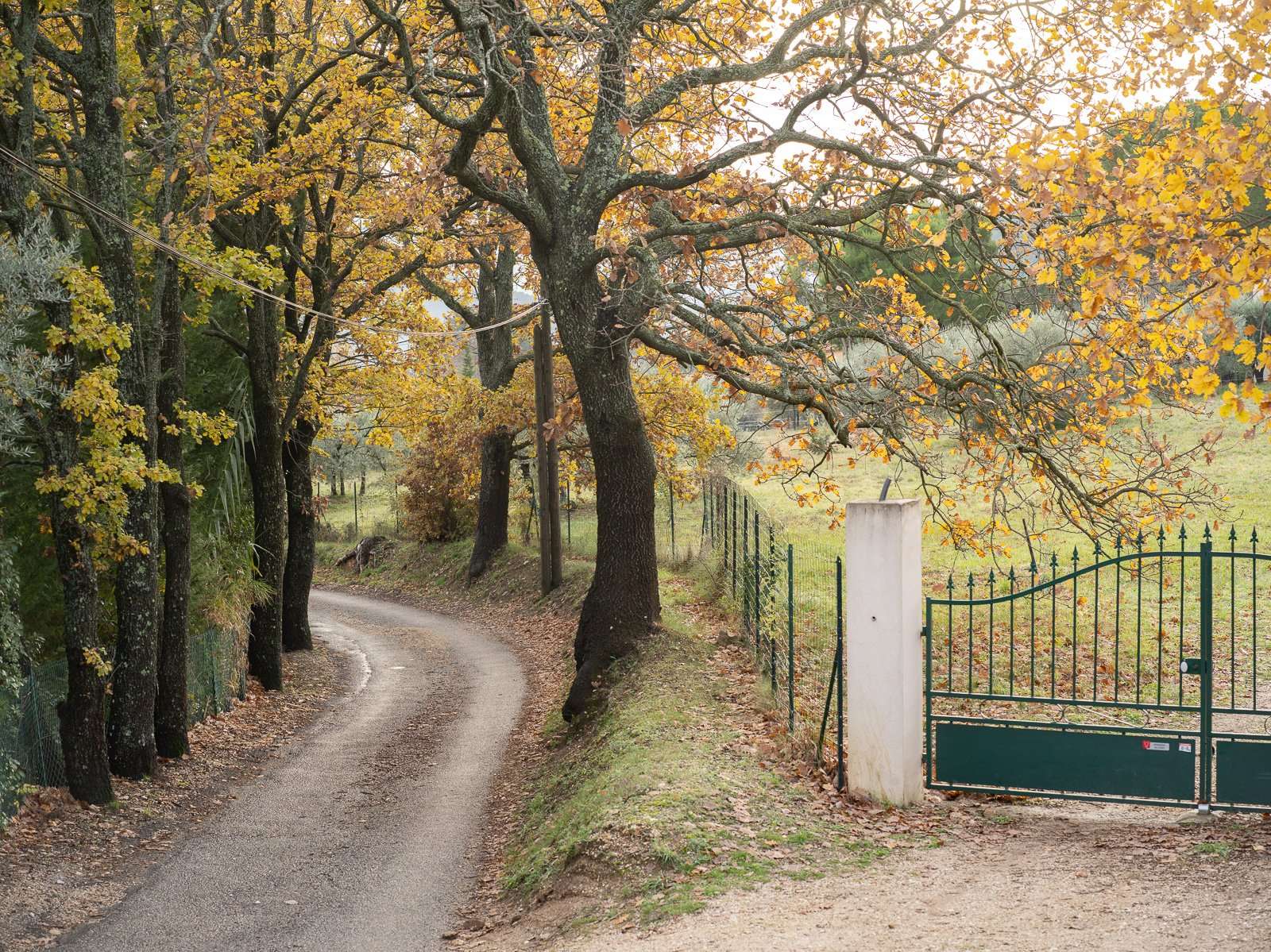
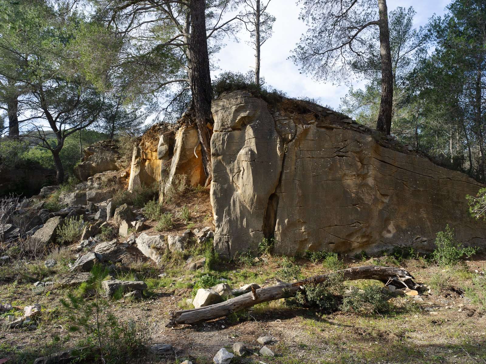
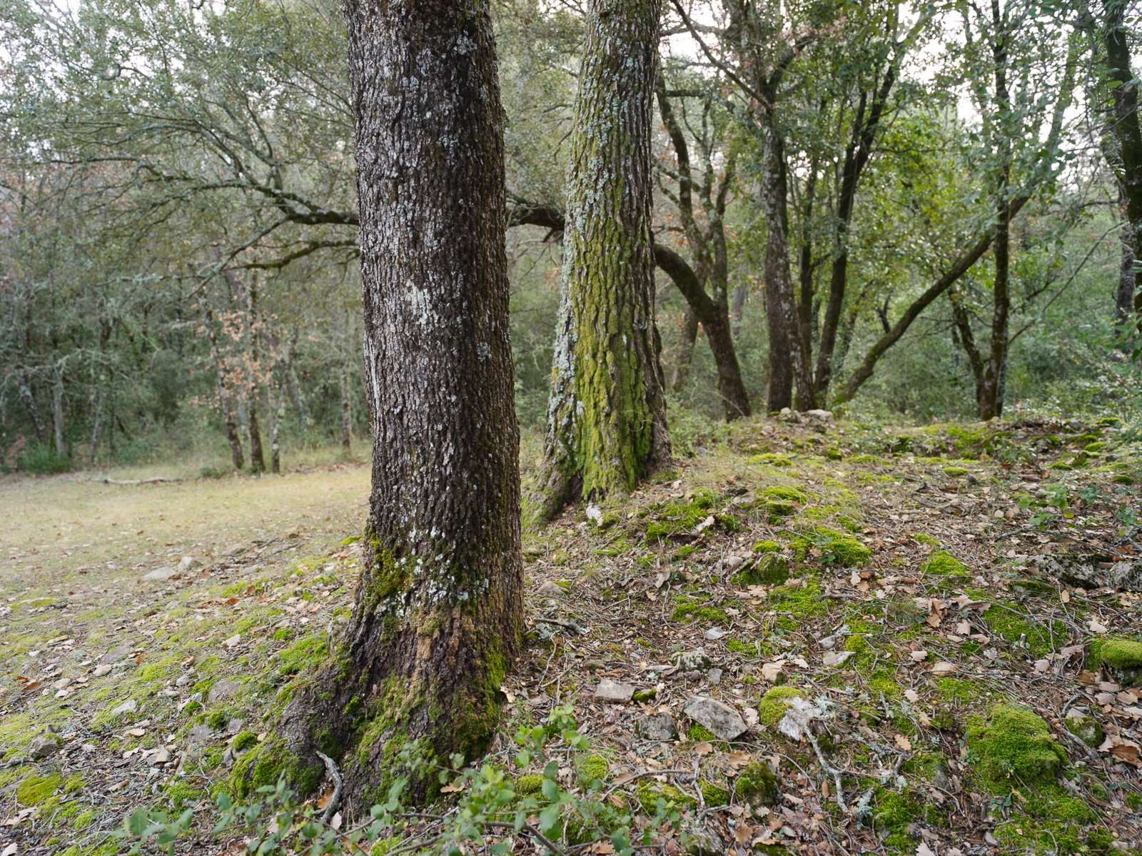
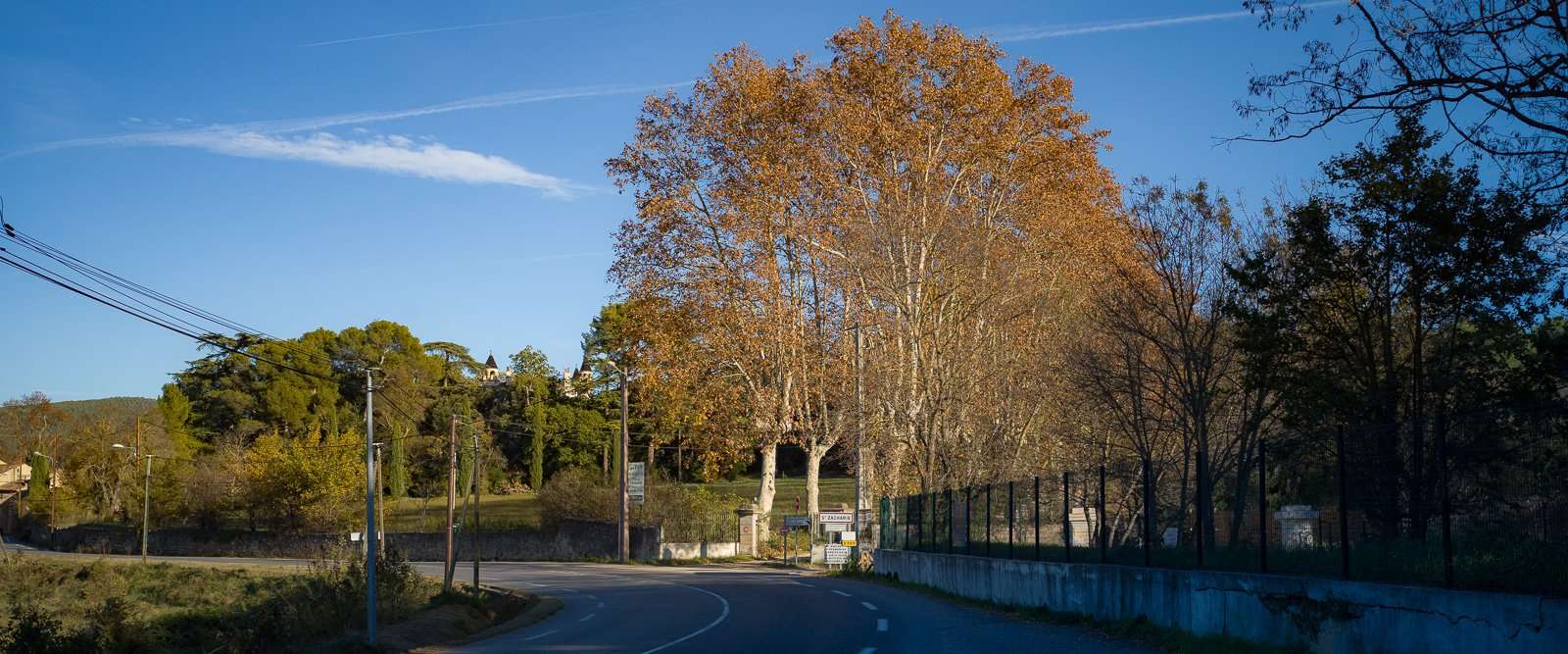
My photos largely fall into two categories: slightly abstract b&w images such as the ones in the previous post, and what's being called terroir photography on this blog, i.e. documentary style images showcasing local cultures based mainly on the agricultural, culinary and architectural tropes of an area, typically shaped by the climate and the landscape. This, to me, is more interesting in colour. And since it is all about nuances of colours, textures, clothes, dishes, foliage, colour and transparency of the air, quality of the light ... I love the subtlety the X1D has to offer in its files. Not all systems are friendly to the preservation of the quality of the light, in particular.
As you can see, none of the above 3 photographs is particularly vibrant. They are more lifelike than interpreted or boosted. I'm just not very good at creating intense colour and when my pics depart from realism, they typically do so in contrasty b&w. Also, France is not a very colourful country compared to Australia, the American South West, South Africa, ... There are few red and blue birds around here, flowers are small and fragrant rather than huge and bold, winter paints everything grey brown (in my neck of the woods, at least) and I love to photographs those little nuances like others enjoy the intense red, yellow and blue of the Pilbara (mind you, I wouldn't mind a few weeks down there myself ;) )
So, what's special about the X1D, in colour?
Technically, I couldn' say. In fact, I think Jim Kasson found more bit depth in the GFX 100 than in the X2D, but don't quote me on that. What Hasselblad does brilliantly is map the pixels from a sensor to files colours that feel super natural. Natural is the important aspect for me. And I believe that involves not just colour, but management of tones, particularly in the highlights. It's also not exactly synonymous with neutral but that's a fight for another day.
Every manufacturer has their signature colour science. Even Sony, who used to produce monstrosities with its early A7r, is now very good in terms of colour management. And what about Fuji, and its emulation of filmstocks we all loved, a bold colour palette, but a soft tone curve? It's fantastic, and many users love it. But I have a thing for naturalness, and Hassy does that better than anyone else, even Leica. Leica has sublime colours, but they are a bit more an interpretation of reality than an absolute search for natural likeness, with every new camera imparting its own subtle style. Neither better nor worse, just a different choice of positioning.
So, does that mean Hasselblad cameras are just for neutrality bores? Yeah, y'all go buy something else so the prices can drop!!
But, no. You can shift and twist Hasselblad colours like any other. But, when you do, you begin to lose that uniquely natural starting point that is characteristic of Hasselblad. That's why people with that sort of PP style simply cannot wrap their minds around why anyone would want the expensive paperweight that is an X-series Hassy.
That said, I believe you need to push really hard to lose the benefits entirely. This below, has been enhanced to meet the impression the trees made on me, rather than stick to the duller OOC look. But it remains natural and believable.
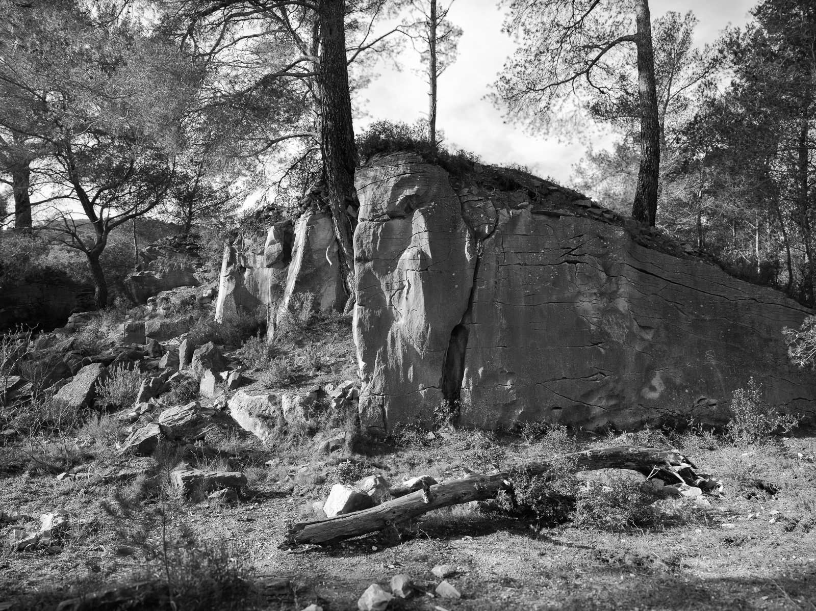
And I also feel that very natural and subtle starting point translates well into b&w. And, although I can easily go overboard with contrast, the pair below clearly shows how subtle b&w images can be with the X1D.
And the supremely transparent XCD lenses complement this. Let's not forget the optics in the evaluation of any system, particularly now that most cameras have become very good.
While I've not used the X2D or more recent V series lenses, my feeling is that Hasselblad is injecting a tiny bit of subjectivity into its more recent products. The V lenses look a tad more organic to me, and the X2D looks a tad more pretty, closing in very slightly on the Leica ethos (meanwhile, the Karbe generation of lenses have strayed far from the Mandler vibe and ever closer to the Hasselblad rigor, so the convergence feels mutual).
In my mind, that newfound organicity(??) is very welcome, as the X1D / XCD pairing can sometimes feel a little dry and humourless. And the possibility of using files SOOC rather than having to process most of them must be fun. But it also makes me feel that the X1D is a one of a kind landmark product that will never be remade, and that's why I am so fond of it and unwilling to let it go.
My frame of reference is often filmmaking. A movie must keep us captivated, in the zone, for hours. Just one blown highlight, one unnatural colour scheme, can snap us right out of it. Everything in film photography must be believable. And yet, the colours can be shifted to extremes, with some scenes very blue, others very yellow, some very dark, some almost white, some very dull, some extremely contrasty. And yet, always believable.
It sounds easy, but it's really not. Just look at the highlights around the sun, or forest shots in 99.9% of photographs, and you'll snap out of believability super fast ;)
Pricy (as in 5 or 6 figures) cine cameras have lowish resolution compared to (really) cheap cameras. But their colour science is top notch. The preservation of highlight detail is a major priority. Cine cameras focus on highlights, because not a single eye in human history has ever witnessed clipping. Photo cameras focus on low light because many togs need to be able to handhold exposures in dim conditions. Film used to lean towards the cine camp (and for good reason, it used the same medium) and I feel Hasselblad and Leica are the two brands that get us the closest to that (personal) ideal of total data preservation. Fuji is not inferior in any way, but focuses more on obtaining a polished look inside the camera, by default (the file quality then lets you do what you want, but few users will).
The first pic above is typical X1D. Very close to what my eyes saw. The second is an interpretation with colour shifts and 2.4:1 crop to imitate a movie frame. I like both but my preference goes to the first, because I can't help feeling the second has lost a little bit of what makes the system exceptional.
This is why I would love love love love love (! ;) ) Hasselblad to release profiles. While not atrocious, my colour grading skills aren't the best. Certainly not as good as Hassy's colour scientists, or a top talent in a Hollywood production.
With profiles, we would get some variety, different starting points than the neutral standard LUT, without losing its qualities. That would be so, so nice.
Back to wine. I love Burgundies, Sancerre, good Chianti and Nebbiolo ... all of these can be intense, but good samples focus more on the nuances that highlight both the terroir and the work of the winemaker. Two neighbours will produce wines with slight variations that would be completely masked if the wines were over-oaked or unbalanced. That balance and nuances are what Hasselblad brings to ... the table ;)
What the X1D does is ensure that - often with some PP - I can almost always faithfully recreate the scene that was in front of me, the atmosphere, the light, the colours. It always feels natural and true to the original, or how I perceived the original. And the PP involves contrast, luminance, local retouching, but no (or very little) work on the colours themselves. A scene that felt cold, flat and dull, will look the same on the photograph. A vibrant scene will feel the same in the final image. As you can see on the photographs on this page, there are many moods, all faithfully and naturally reproduced. I'm not saying other systems can't do that, only that the X1D does it spectacularly well :)
Okay, enough from me. Here are a few more colour photographs. Let me know if you see what I see, or whether you think I've completely lost my marbles ;)